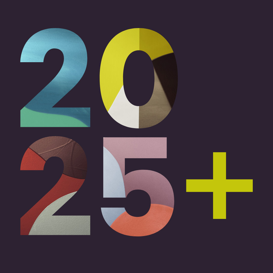

TREND 2025
Interpreting the colours of Inner
Designer Mike Klar takes his approach to bringing NCS Colour Trends to life. He interprets the direction of Inner through the redecoration of his studio and a painting. Explore the project and take part of his perspectives on colour and design work.
Introducing Mike Klar
If there's one topic I'm passionate about, it's colour design. Colour can do more than just decorate a wall - but colour is not just colour. It is based on our subjective perception. With the NCS - Natural Colour System, colour tones can be precisely described on any surface, be it fabric, paint or packaging. NCS understands colours just like our eyes and has different tools for correct and intuitive colour management.
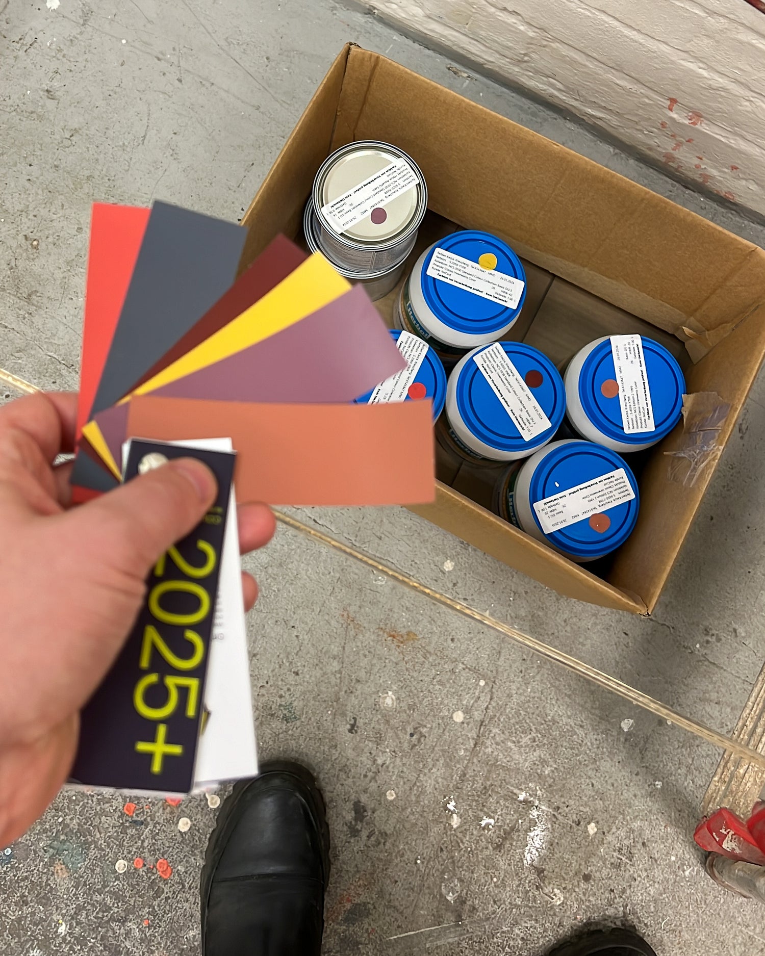
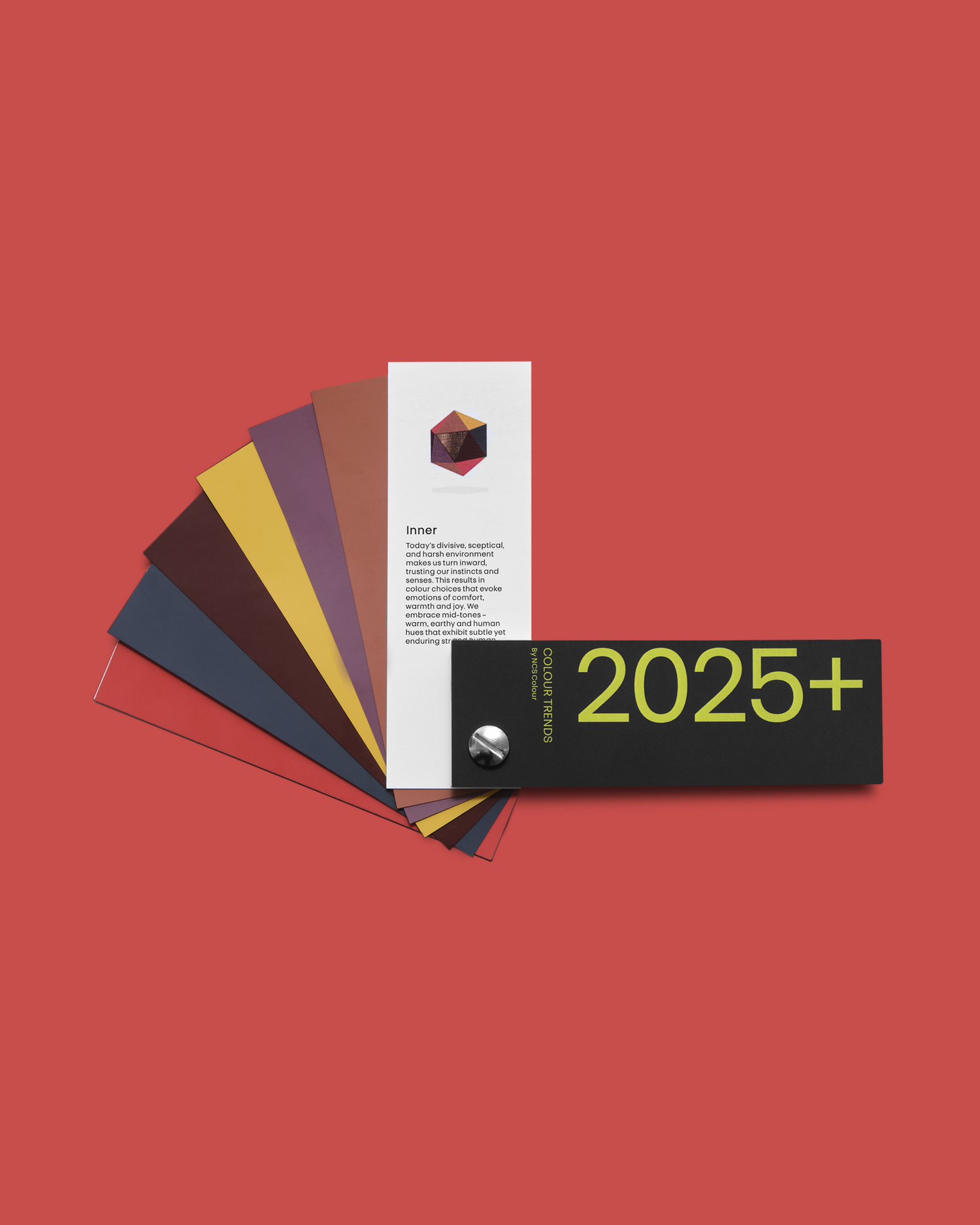
I was allowed to choose one of four new 2025+ colour trends that NCS has just launched: a curated palette of six curated hues for the term INNER.
INNER describes a world of colour that symbolizes a turning inwards. Consisting of warm, earthy and humane mid-tones that have a subtle and timeless strength. Moments of calm in turbulent times. A palette that is also familiar to me in my living environment.
the project
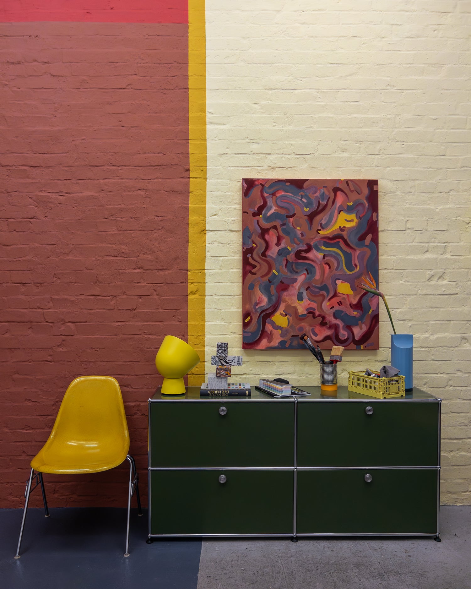
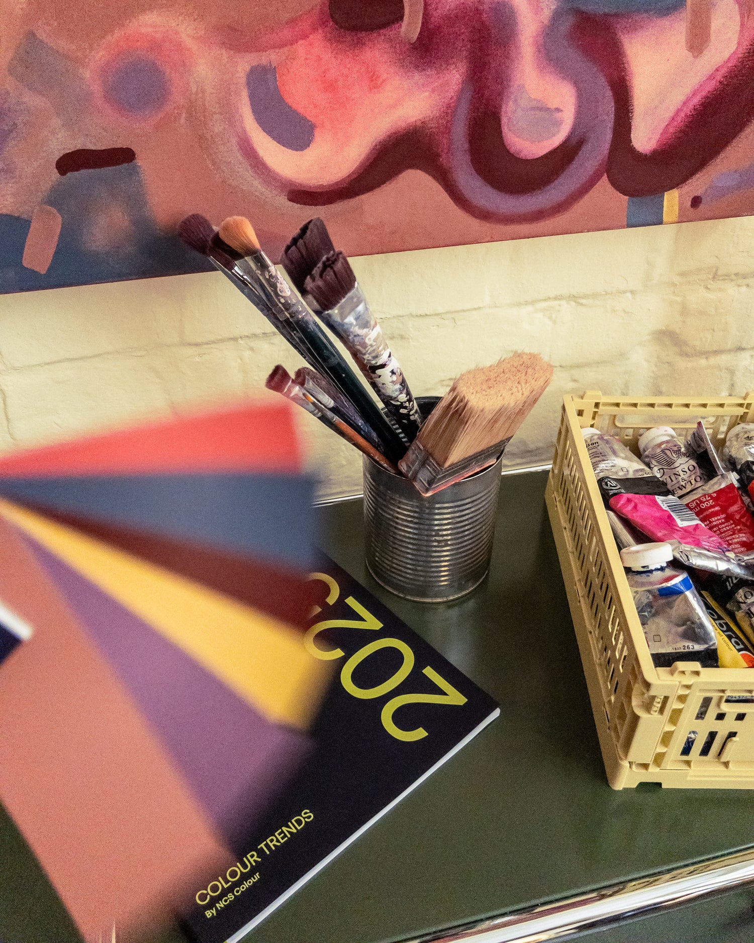
Designing the studio
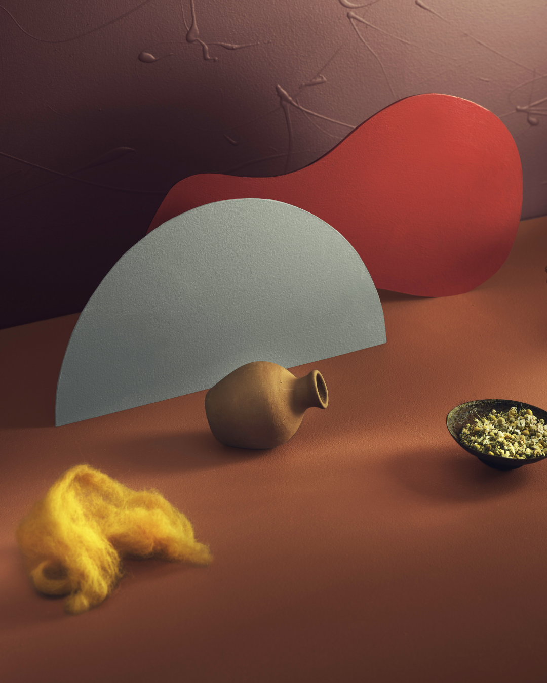
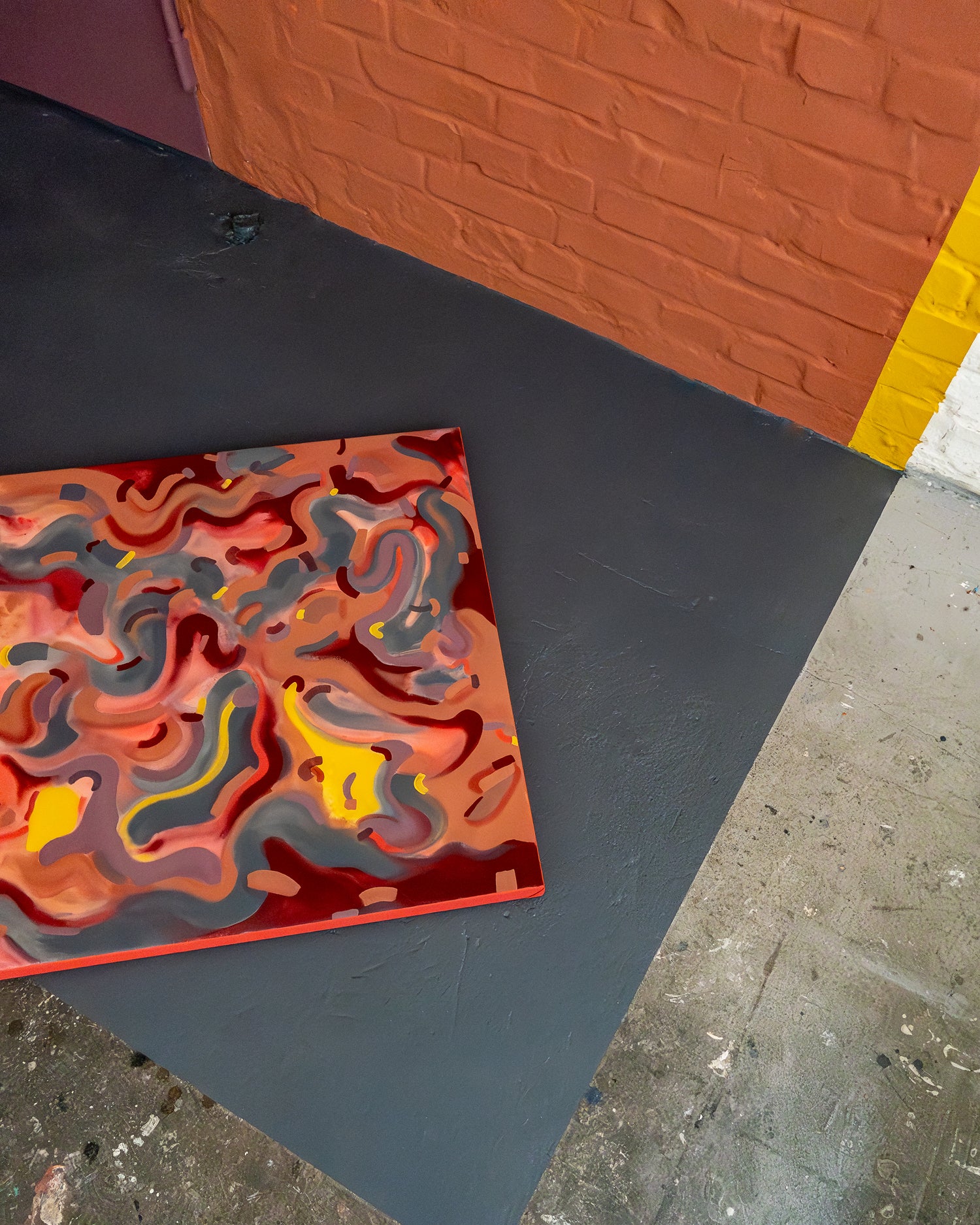
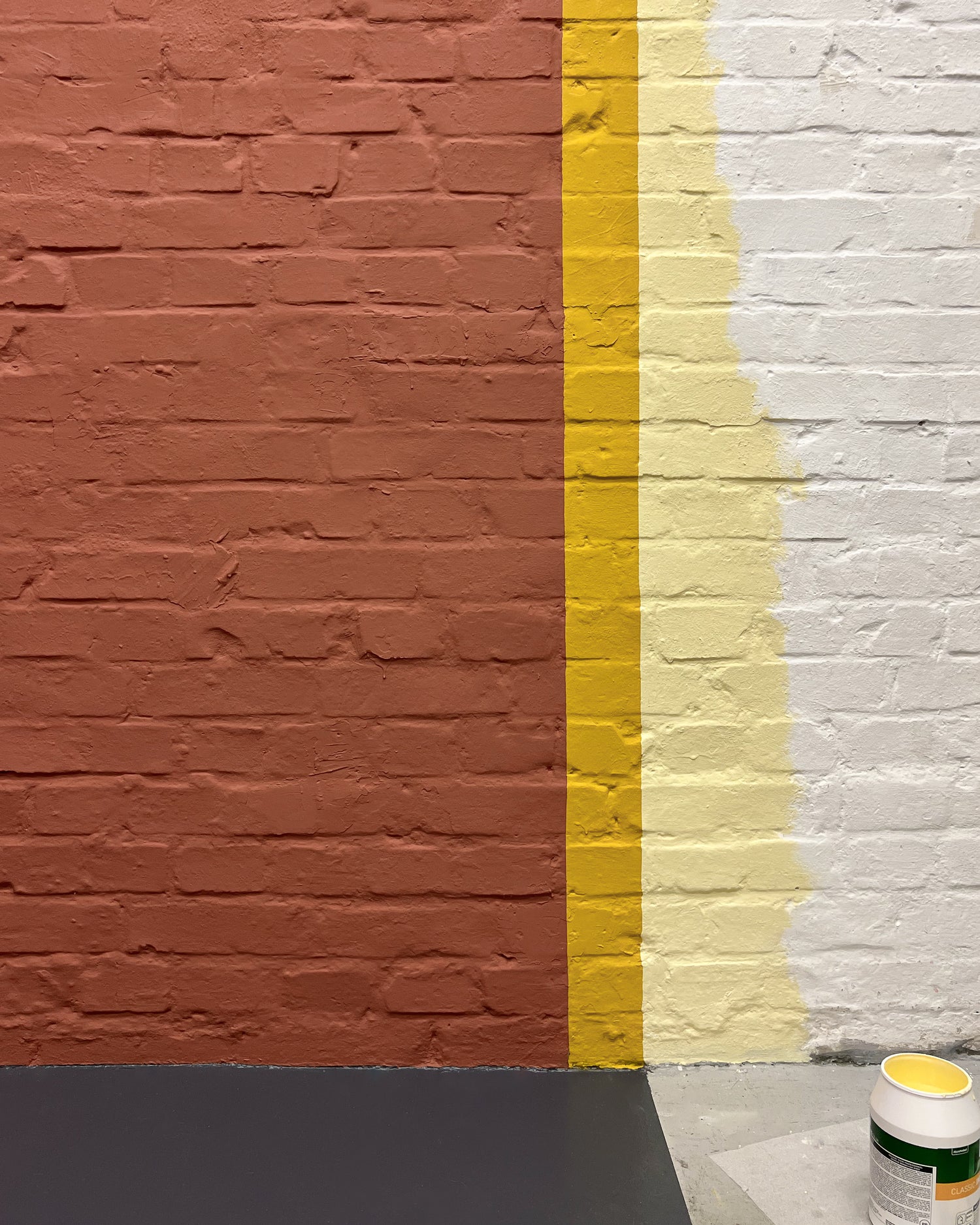
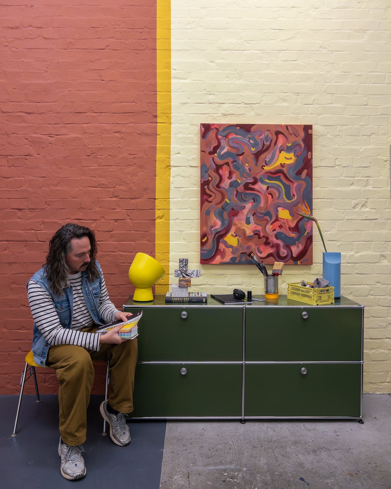
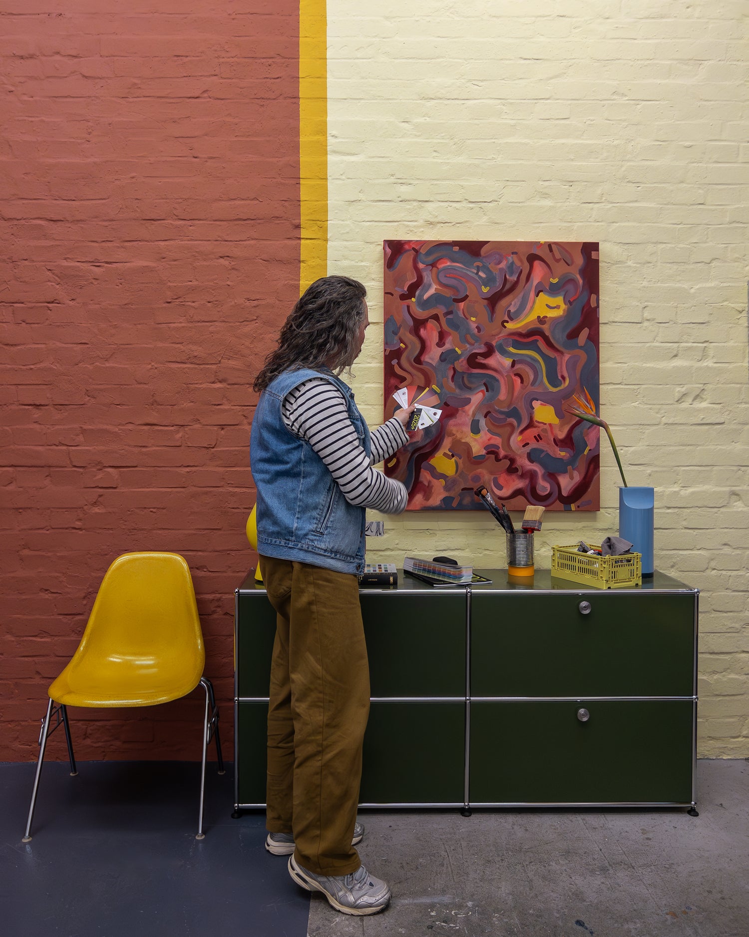
My idea was to create a "room within a room" in my new studio, in which, in a second step, I created a canvas painting from the same colour palette to provide a stage for my "interior" on the outside.
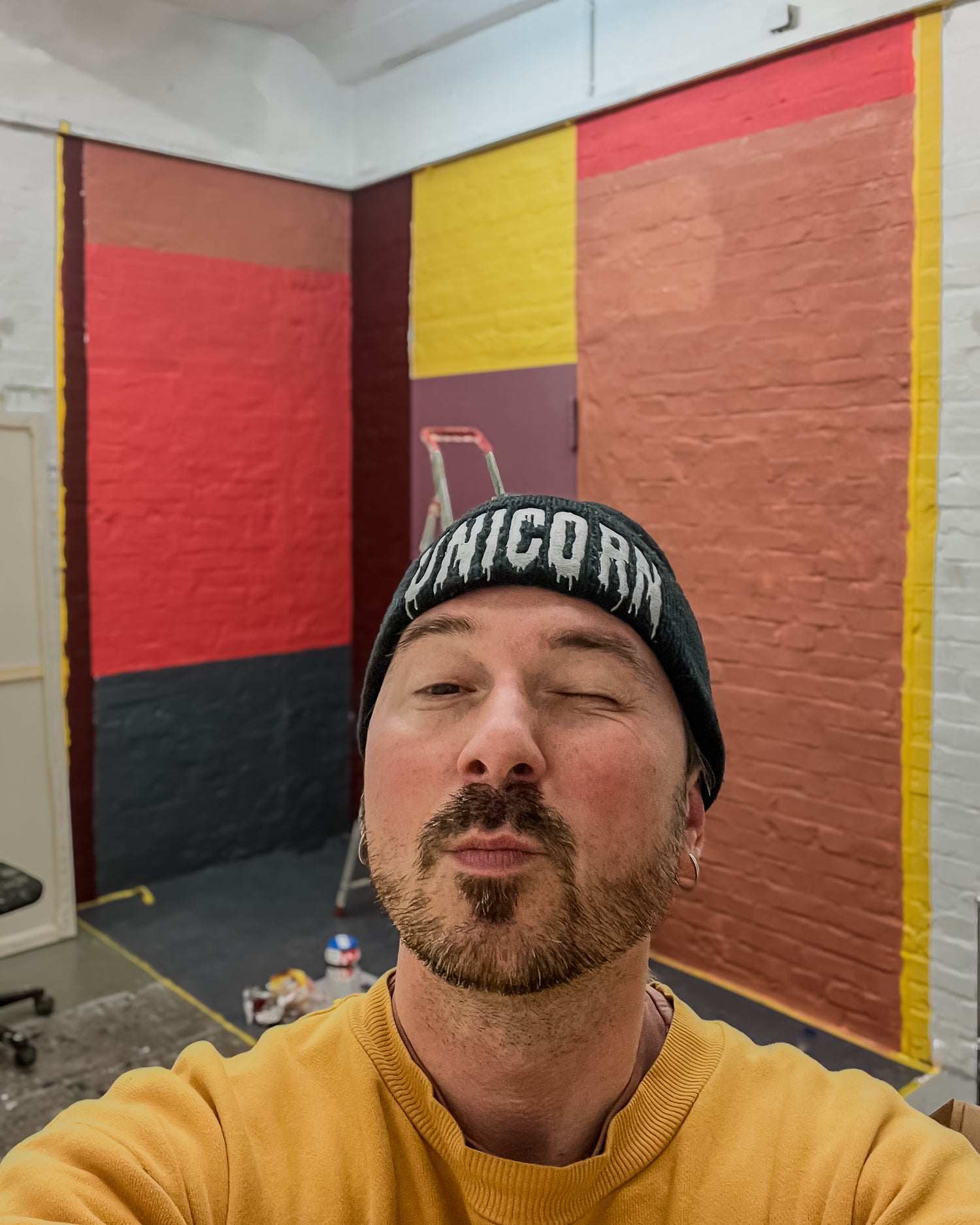
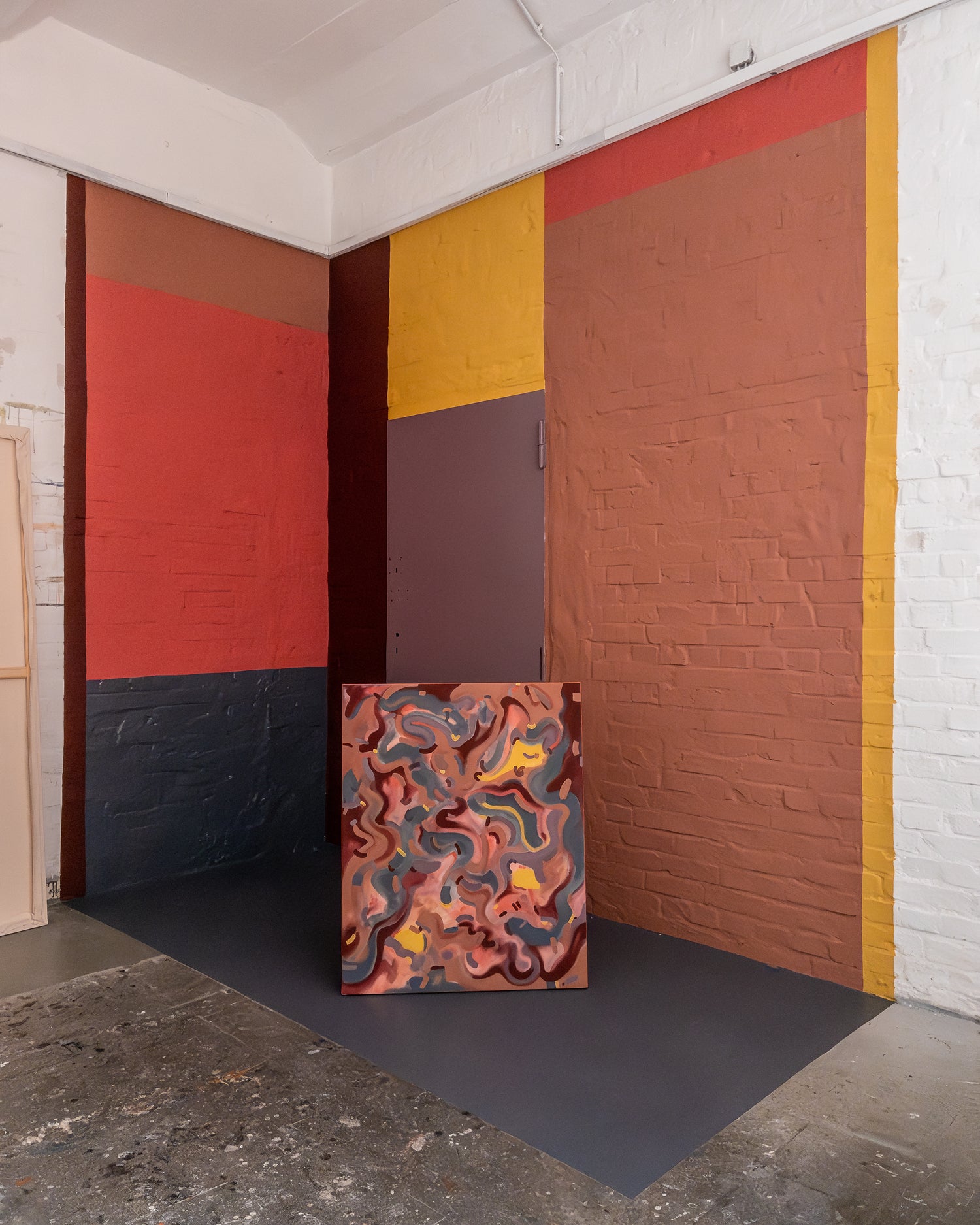
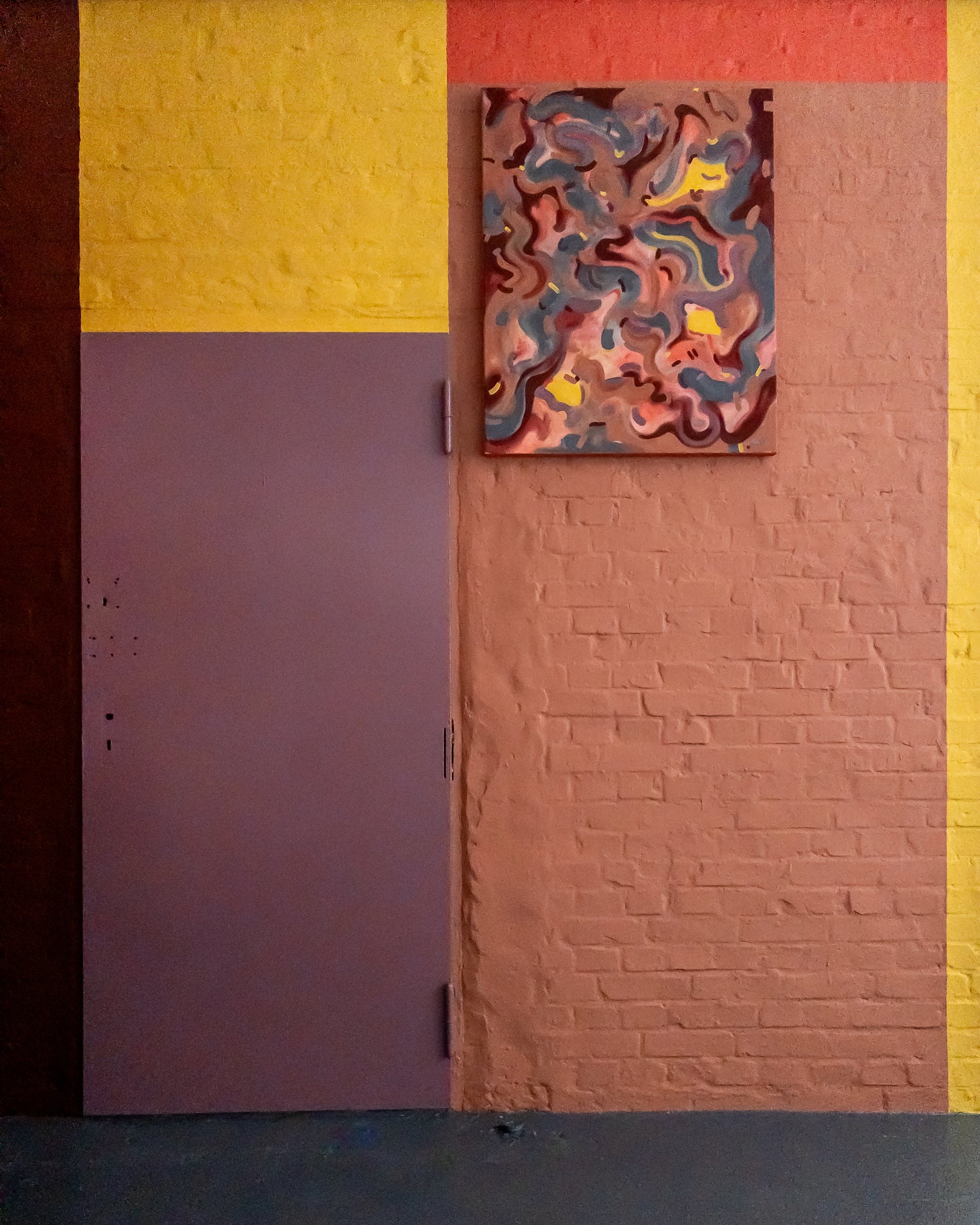
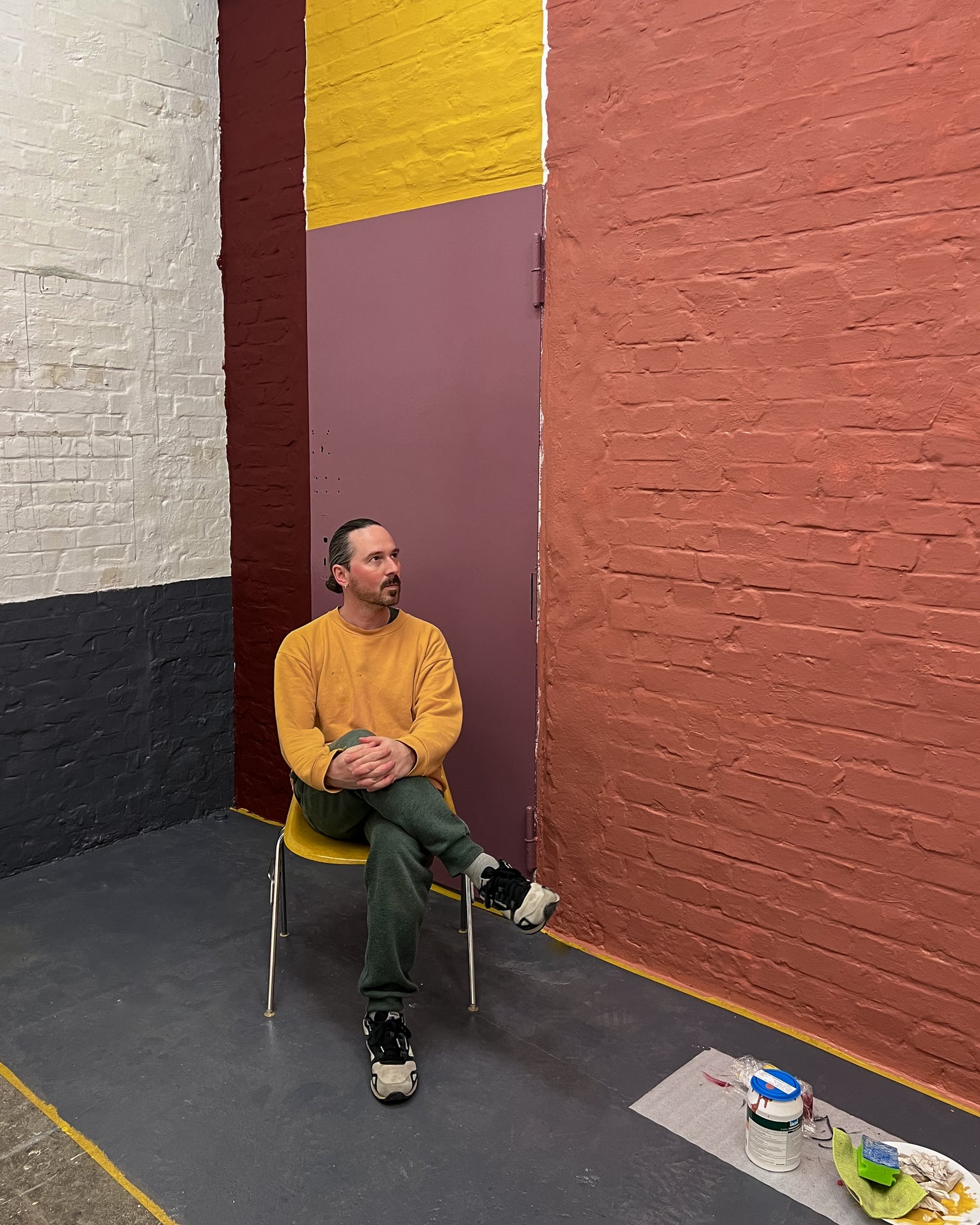
The deliberately formal wall design is based on the "blind" door, which no longer has a function, and takes this as the starting point for the division of space. For me, it symbolizes access to the "inner door", what we find when we go within ourselves in a contemplative or creative process.
DESIGN TOOLS
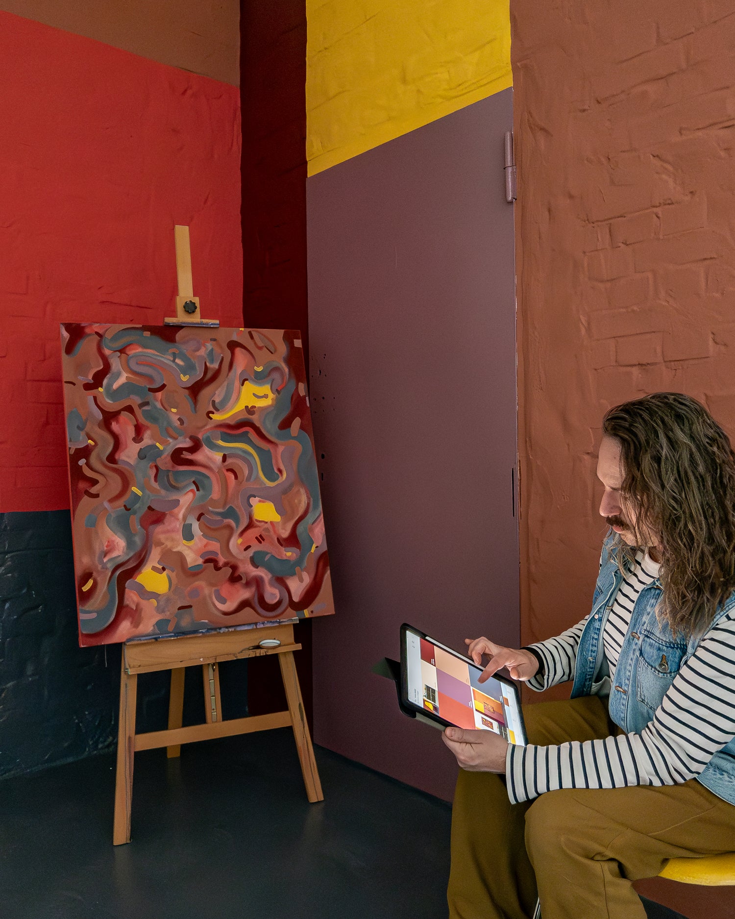
The creative process
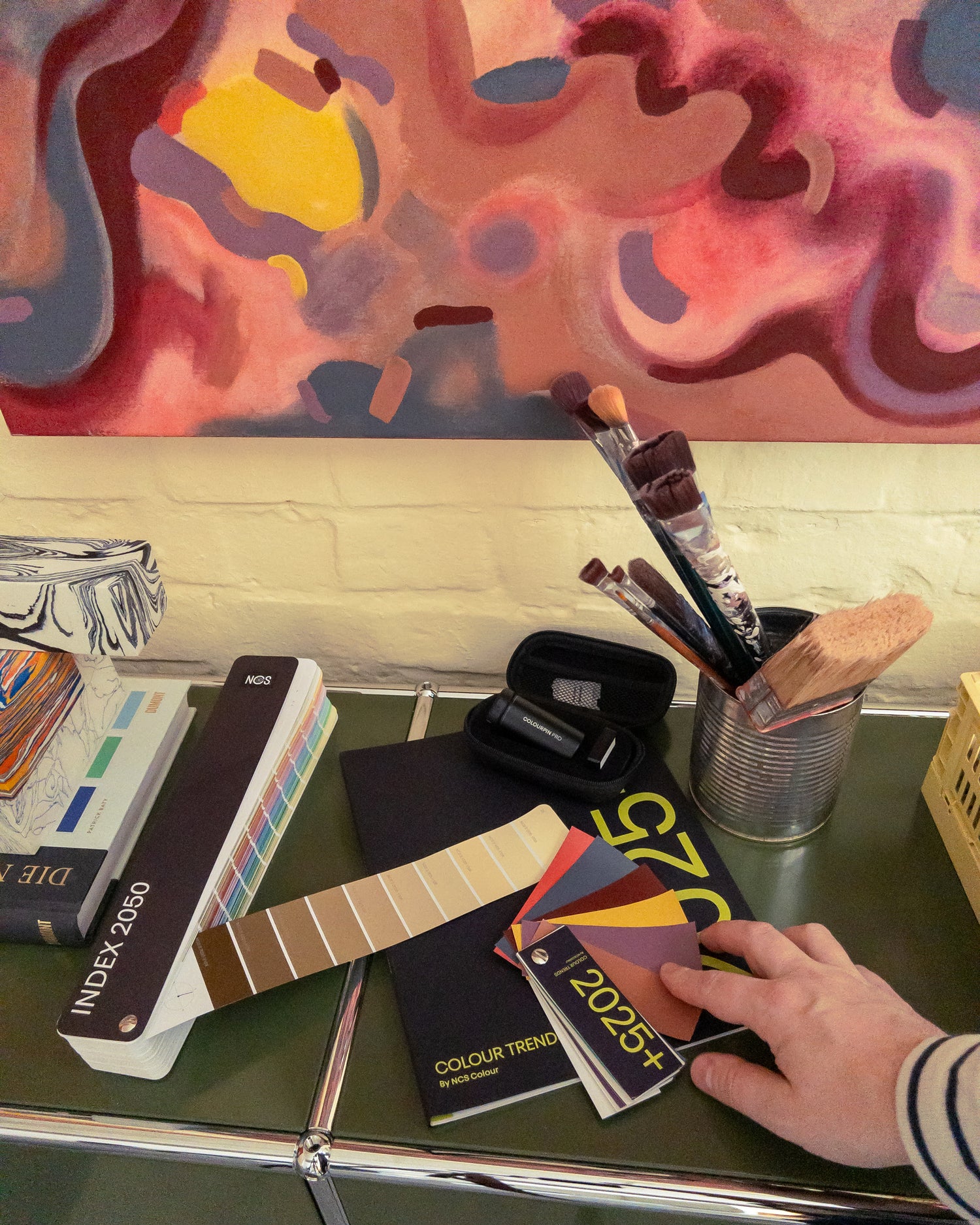
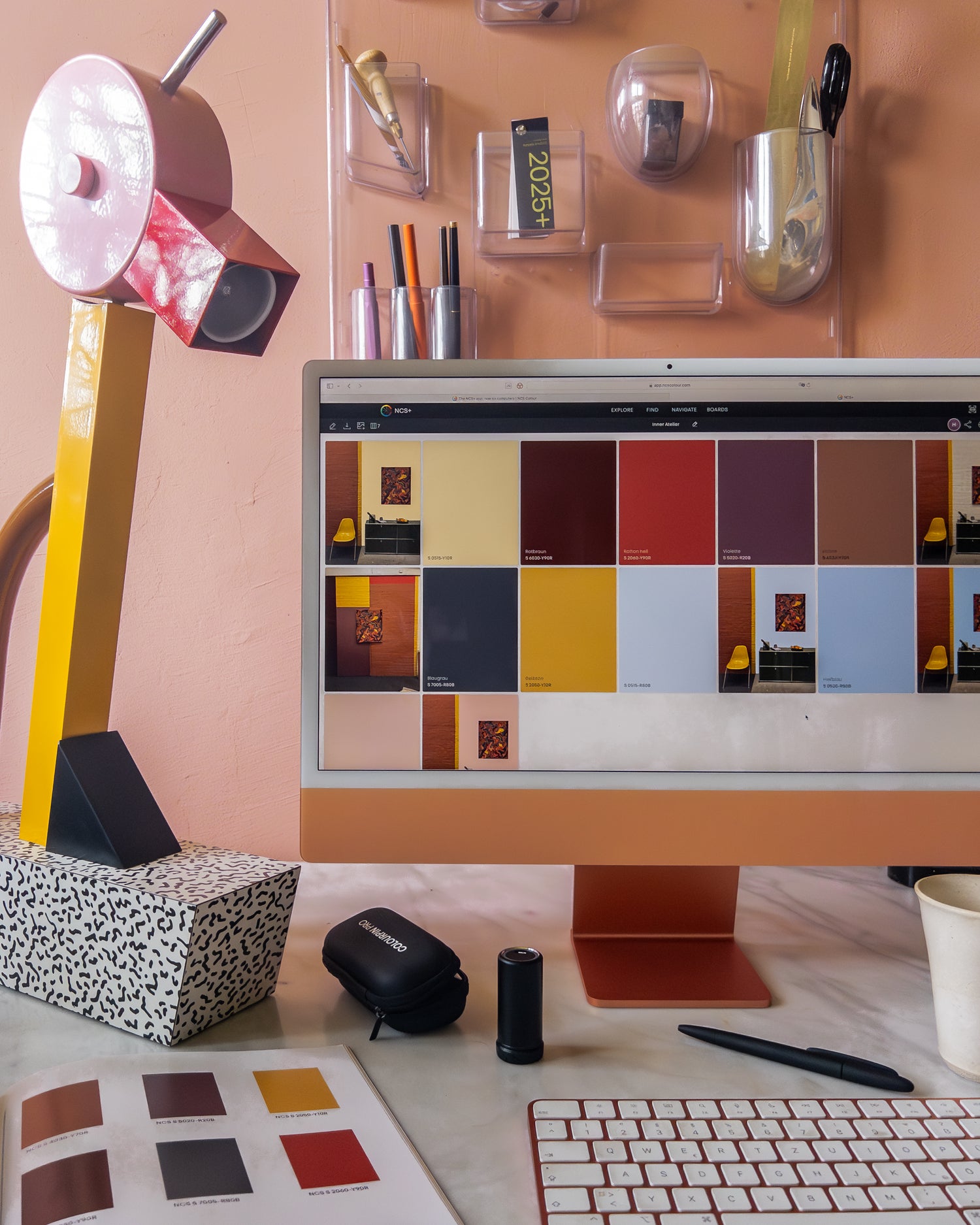
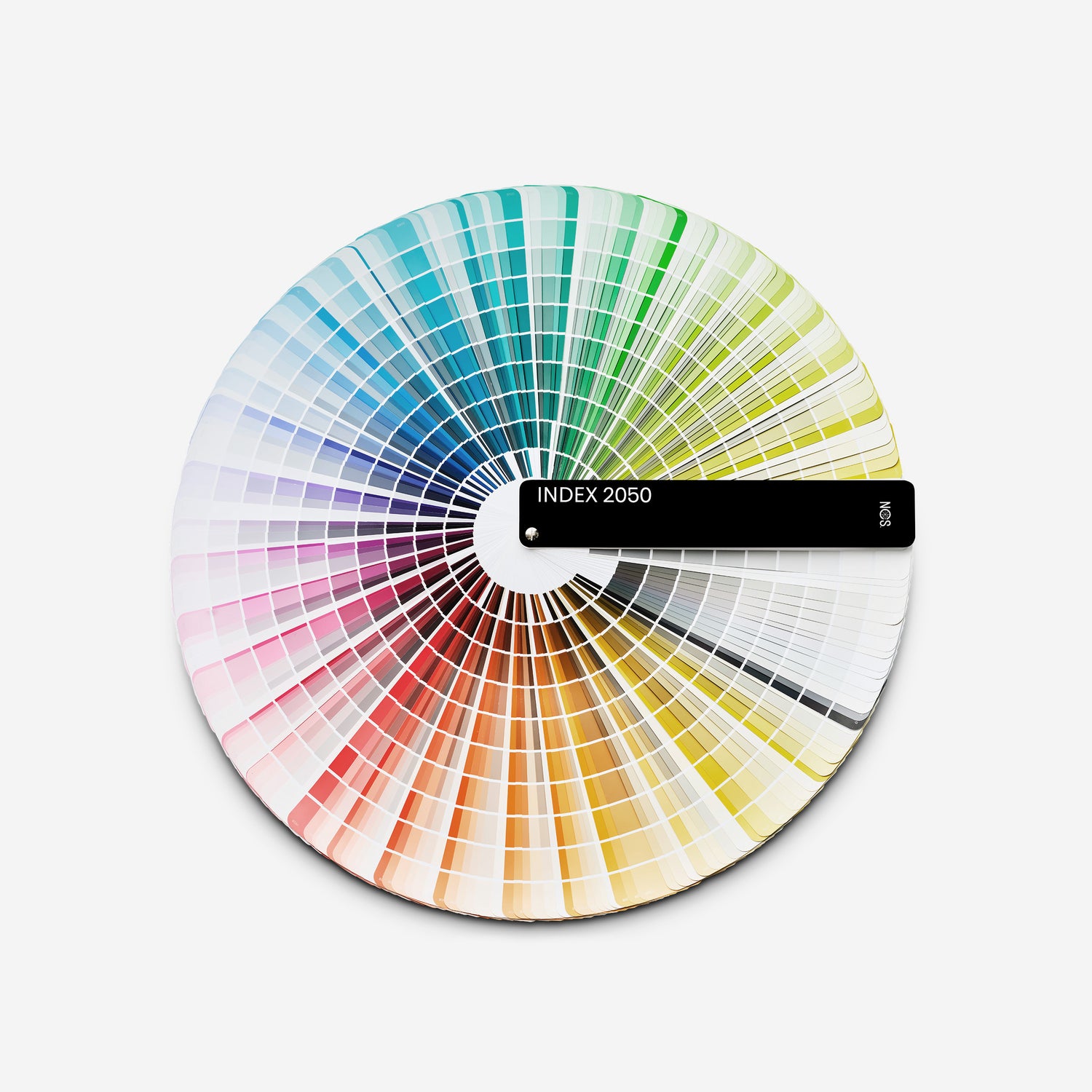
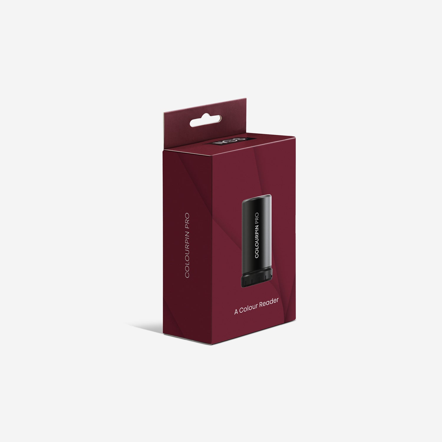
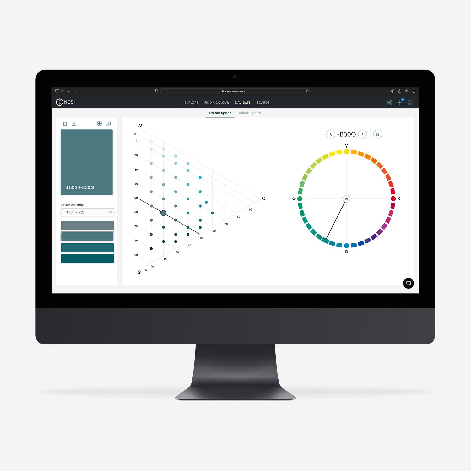
The colour effect depends heavily on the context. Based on my picture on the subject of INNER, I worked with the tools from NCS for the rest of the room design. The front part of the room was to be designed in a more "open" colour. Using Colourpin Pro, with which you can measure every tone in the environment and get an exact colour match, I could try different options. Together with NCS Index 2050 and NCS+ Pro I tested my selections.
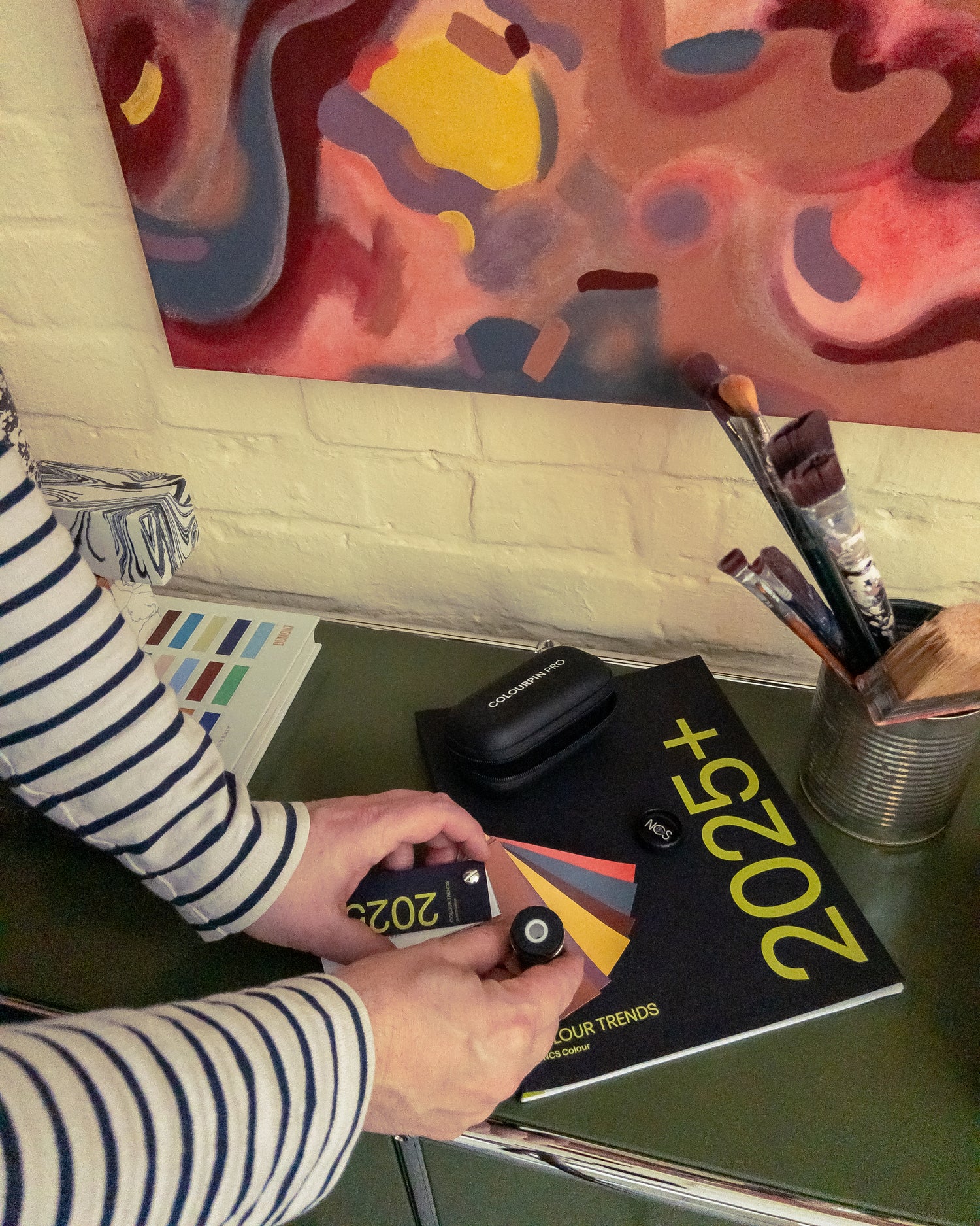
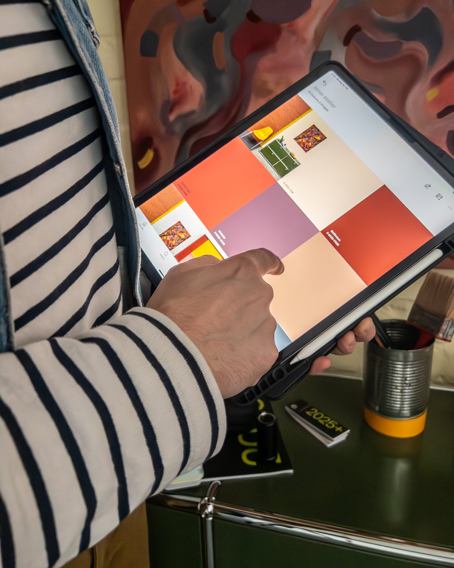

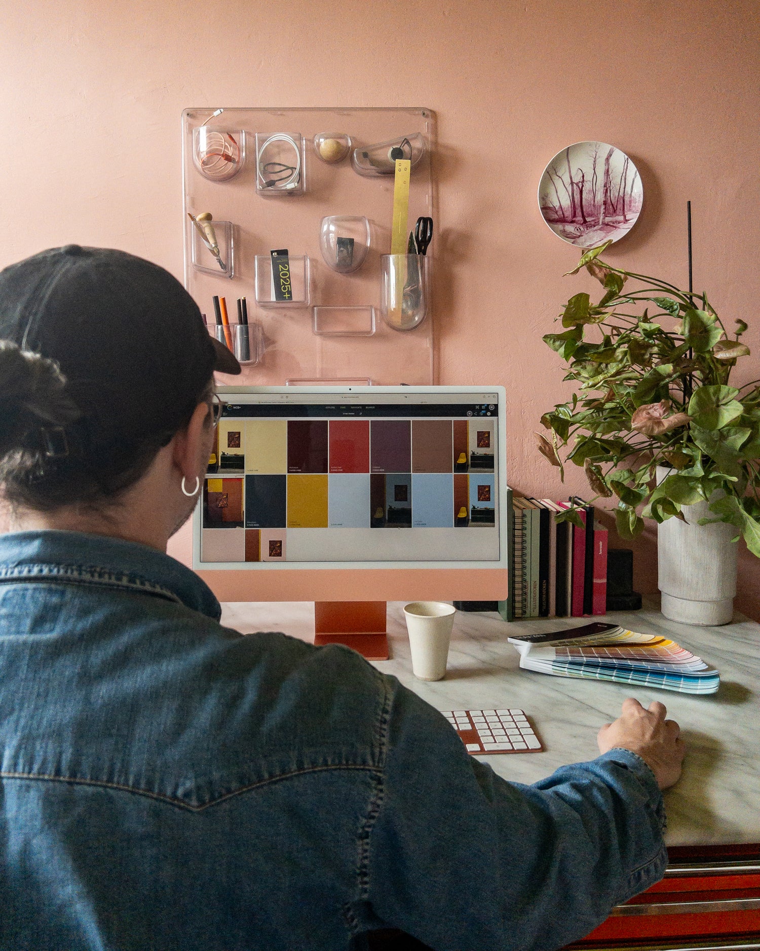
Digital colour
NCS+ Pro was of great help as it allowed me to visualise my ideas and try different colour combinations, all within the moodboard.
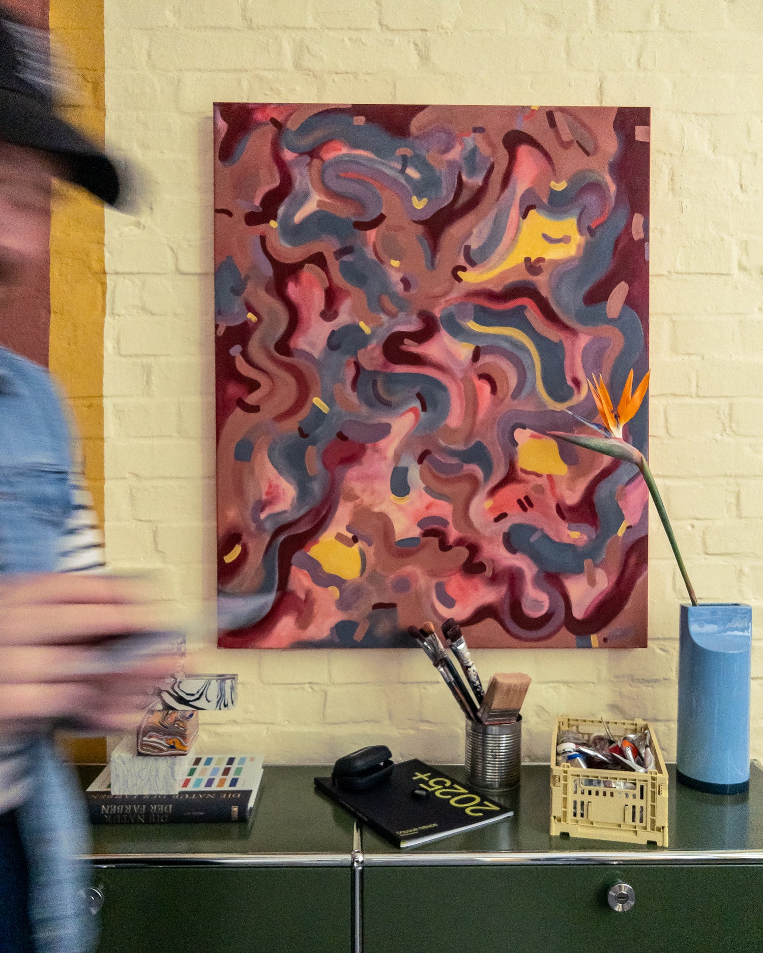
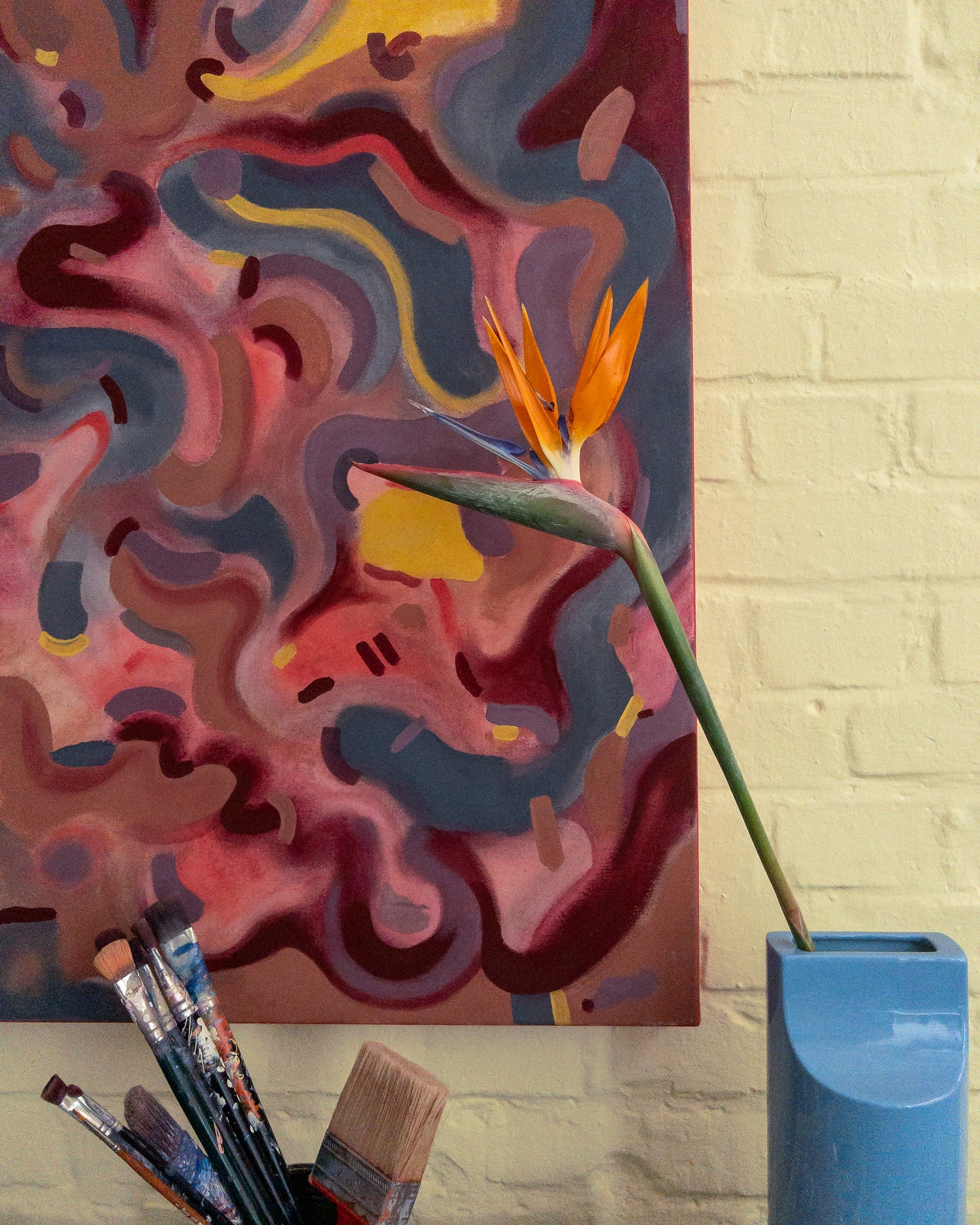
The styling is rounded off by a stronger yellow of the chairs, the olive of the sideboard and a light blue vase, which forms a gentle complimentary contrast and thus draws more on the colors of the "outside world" (sky blue + grass green). For me, the bird of paradise flower forms a final synthesis in its complex form & colorfulness to the organic-warm color world of the picture.
It was exciting for me to interpret the given trend direction Inner in my own way, and to further develop the project with the help of the NCS tools. The easy switch between analog and digital work and the professional handling of colour values made my work easier. I am already looking forward to the next project with NCS+.
The products of Mike Klar's project
The colours of Inner


Explore NCS Colour Trends 2025+