


Day is the hour of presence. Chromaticness rises, the colours gain a voice and a body, and the room warms and advances to meet you.
Its palette is rooted in the physicality and memory of the ground – ochre, rust, sienna, umber – and in the music of light, a precious luminous yellow of transmission and benevolence. It feels human and lived-in, like terracotta weathered by time.
Where Morning surfaces dissolve, Day surfaces stay present at noon. They have enough chromaticness to highlight a wall and enough warmth to make a large surface feel generous rather than loud.
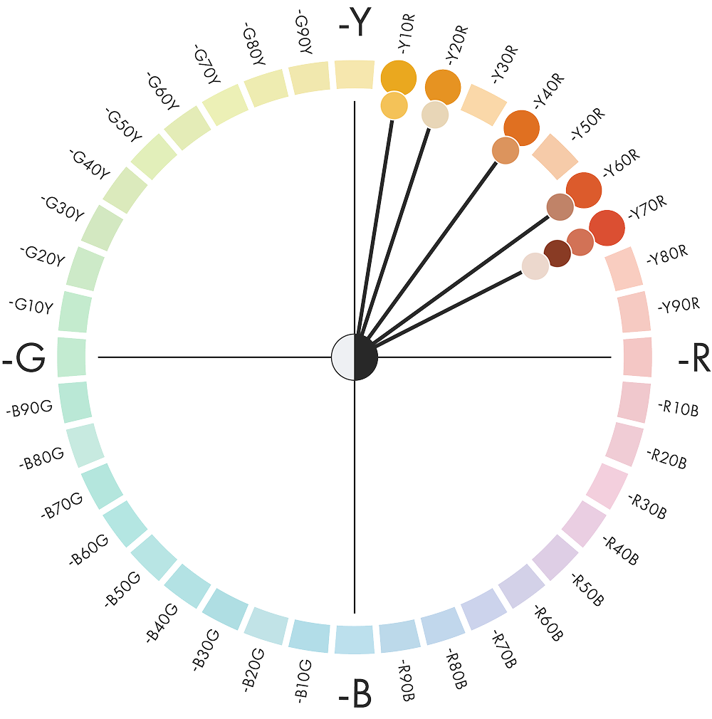
Hue: A single warm sector, from yellow (Y10R) to terracotta (Y70R)
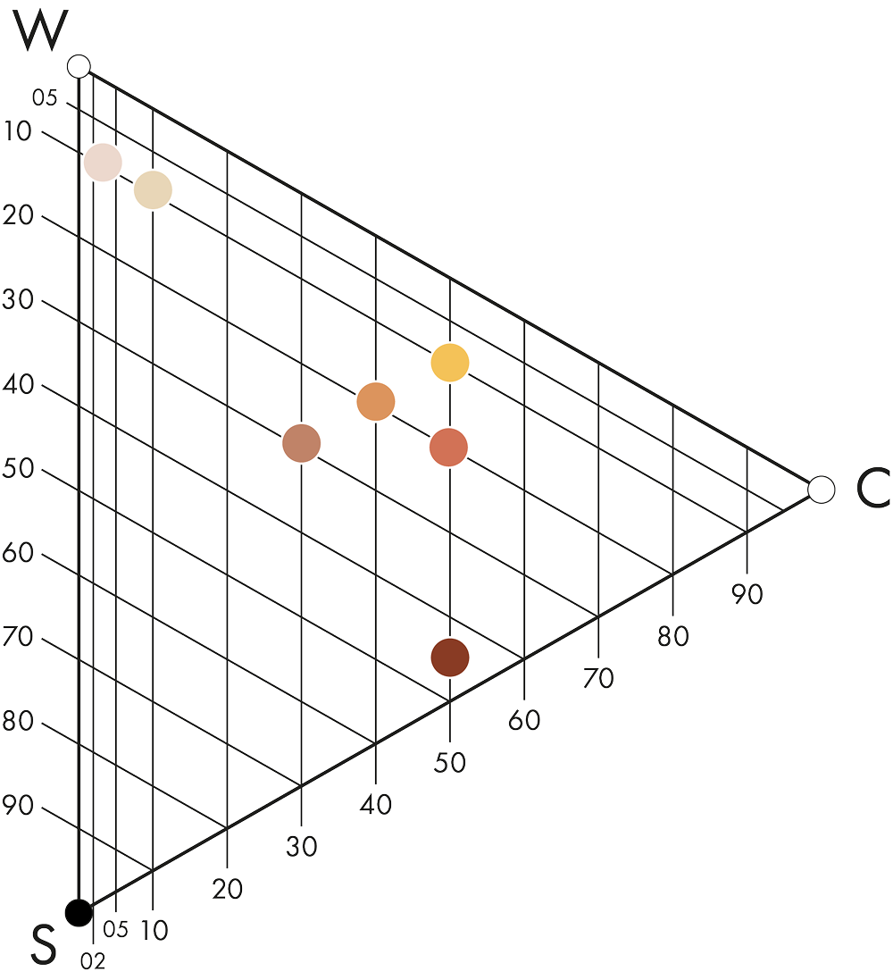
Nuance: Chromaticness from 07 to 50 and blackness from 09 to 45, so contrast comes from nuance rather than hue


What shapes the Day colour area?
2028 is the year we return to reality. We learn to switch off our devices, and authenticity, human craftsmanship and time become the new luxuries.
With that comes a need for warm colours: yellows, oranges and reds that are chromatic without being aggressive. The warm heart of the palette sits at the earthen, sun-baked red-yellow end, the terracotta and brick that give Day its body. This was the single strongest point of agreement across all the forecasts we compared.
Day materials are earth made visible. The colour lives inside the material itself, coming from clay, ochre, iron oxide, plant dye and wax. That is why these surfaces can carry real chromaticness without feeling synthetic.
The full story of Morning, Day and Evening is in the Colours Beyond 2028+ white paper.
From colour area to space
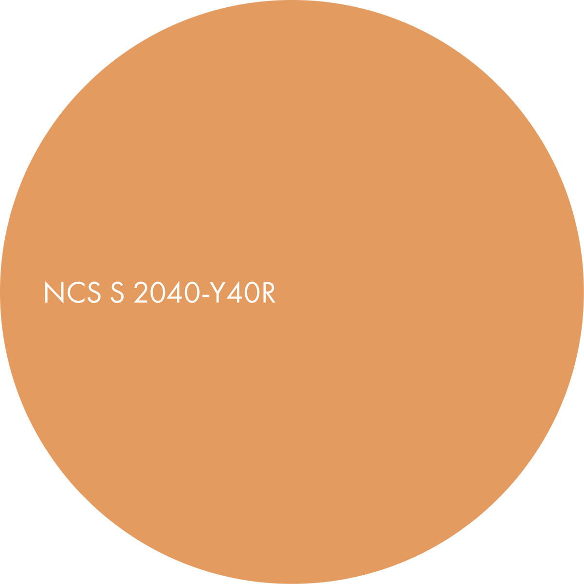
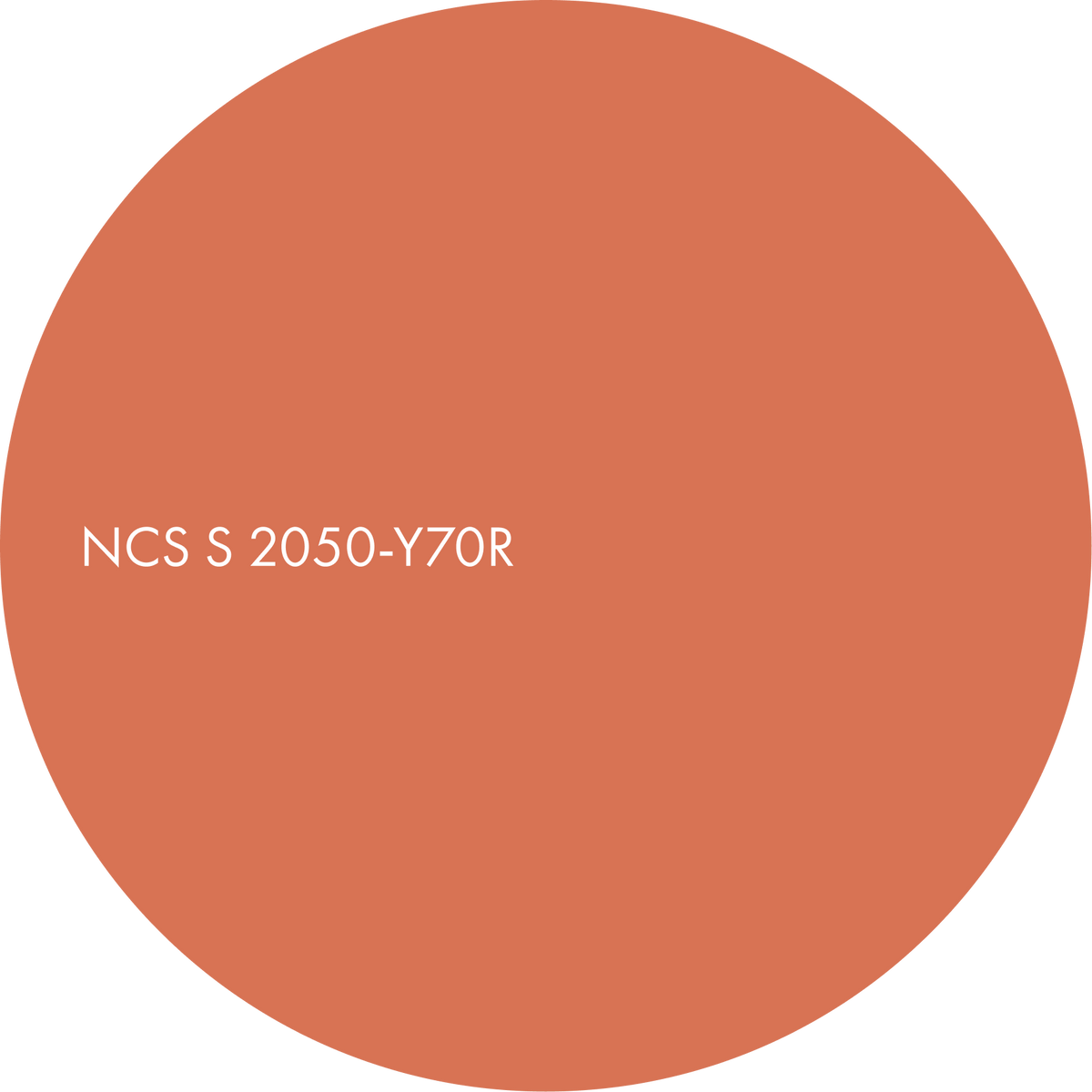
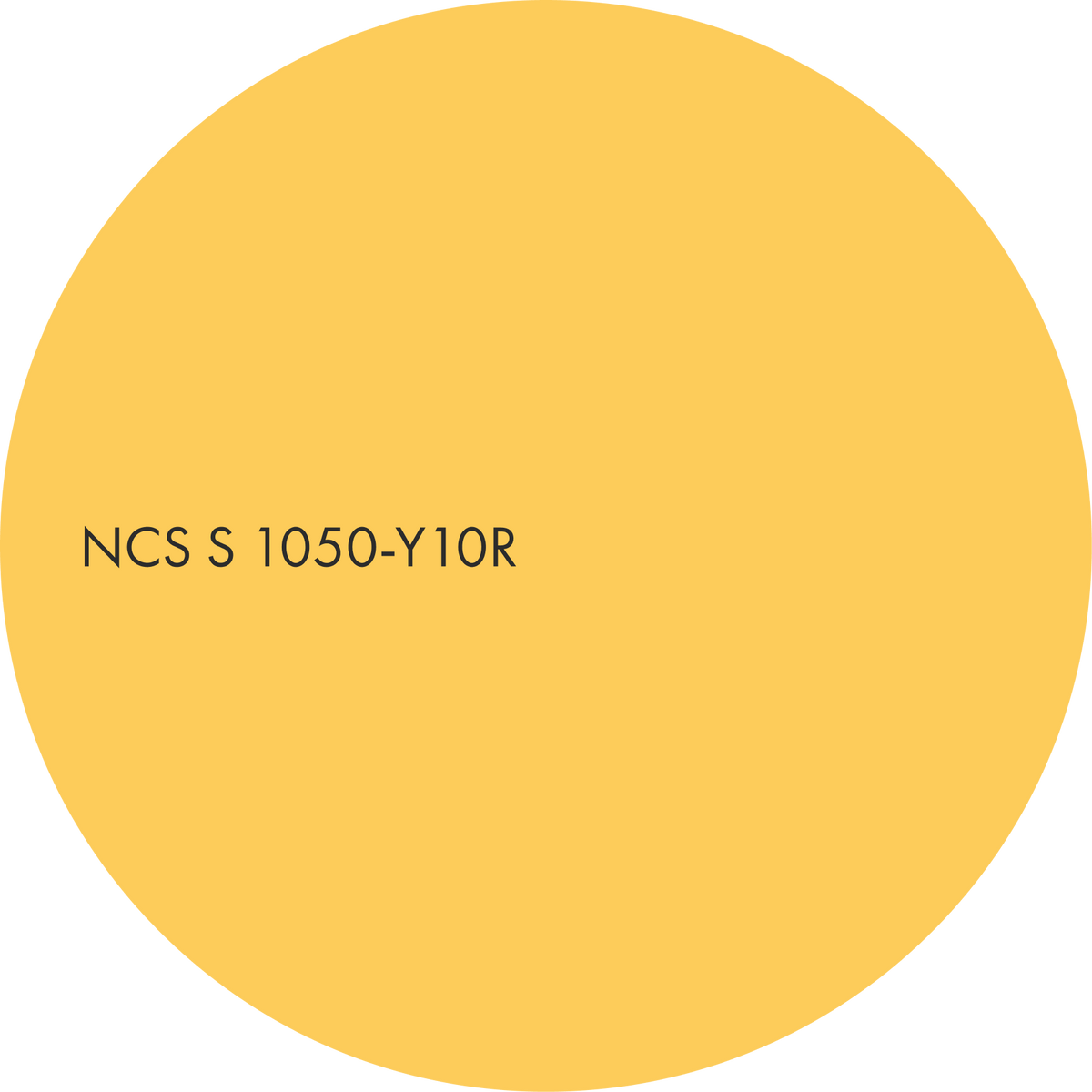
Day is built on three hero colours: NCS S 2040-Y40R, S 2050-Y70R and S 1050-Y10R. Four supporting colours extend the palette, adding contrast in nuance for more dynamic combinations.
All seven colours share very similar hues, between Y10R and Y70R, so they can be combined freely within the Day mood.
The three combinations of Day show how the colour area unfolds across surfaces and materials. Each one plays the same daylight warmth at a different volume, from a broad amber field to a single-hue study in depth, offering designers an adaptable palette for warm, sociable interiors. The third combination is available on sign-up.

Amber presence
A warm amber ochre covers the main surface (S 2040-Y40R), deepened by a terracotta secondary colour (S 2050-Y70R) and highlighted by a brighter, higher-chroma yellow accent spark (S 1050-Y10R).
All three sit within a single warm sector of the colour circle, between Y10R and Y70R, so the harmony is close and the contrast lies in nuance rather than hue. The effect is a room that feels sun-warmed and whole, the amber advancing gently and the terracotta giving it ground.
This is the most complete statement of the vernacular, earthen day.

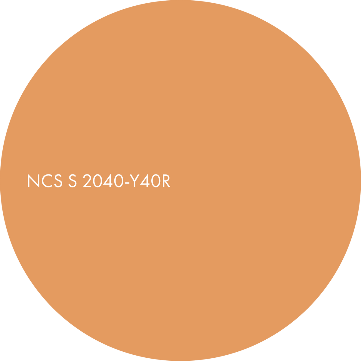
A sun-baked apricot with an earthy depth. Main.
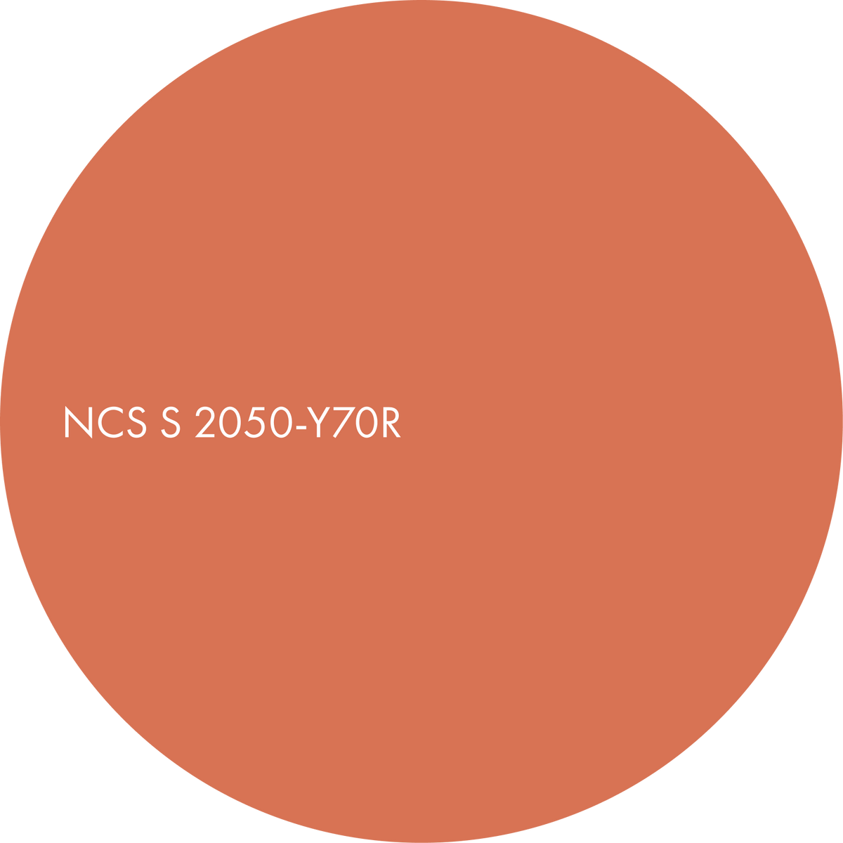
A lively red-orange with the character of terracotta. Secondary.
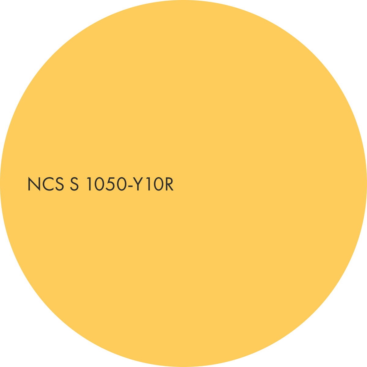
A clear, chromatic yellow full of light. Accent.

Material suggestions
– hand-glazed zellige in honey, amber and ochre
– terracotta and cotto tiles
– amber and honey cast glass
– copper and brass details
Suitable for
– kitchens and dining spaces
– restaurants and cafés
– social workplaces
Sunny earth
The bright yellow now leads (S 1050-Y10R), with a muted brown to keep it honest (S 3030-Y60R) and a pale cream accent to give it air (S 1010-Y20R).
The dynamic here is a deliberate contrast of nuance against similarity of hue: high chroma next to low, light next to deep, all within the same warm family. The muted brown matters: it grounds the composition and stops the yellow from tipping into sweetness.
The result is the atmosphere of a room that is optimistic without being naive.

A radiant yellow brimming with optimism. Main.
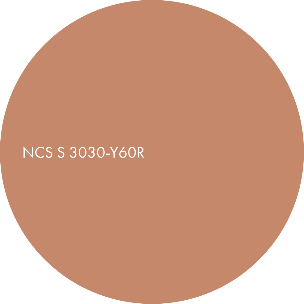
A muted clay colour with a gentle orange-red character. Secondary.
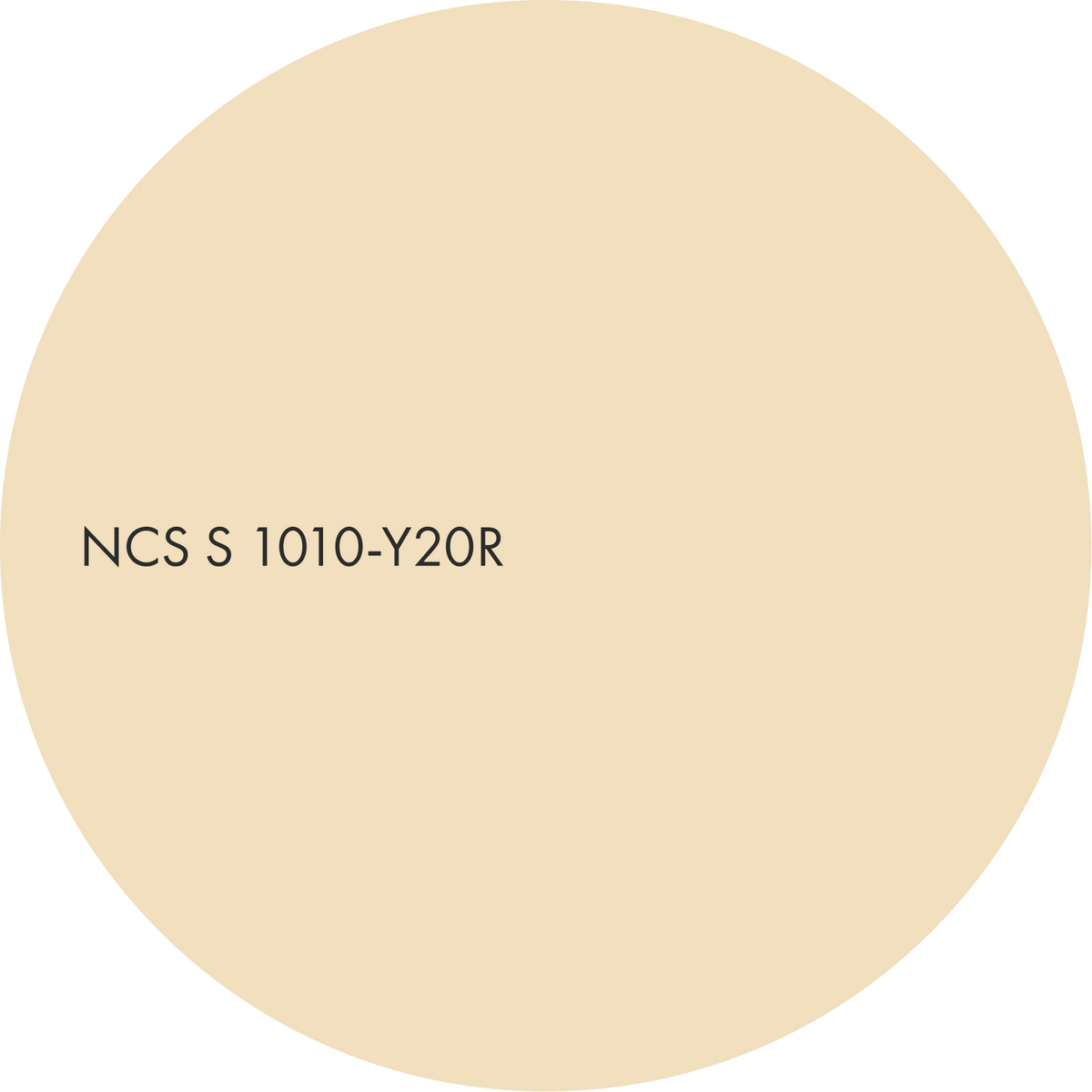
A soft sand tone that feels light and natural. Accent.

Material suggestions
– travertine and warm limestone
– lemon cast glass with trapped bubbles
– chalky yellow wax surfaces
– cane, rattan and honey oak
Suitable for
– living rooms
– learning and creative spaces
– hospitality lounges
Terracotta, layered
All three colours share the same hue, Y70R: a terracotta main colour (S 2050-Y70R), a pale blush that is the same hue drained almost to whiteness (S 0907-Y70R) and a deep burnt sienna accent (S 4550-Y70R).
The composition is built from nuance alone. Change nothing but blackness and chromaticness, and the room gains real depth with no dissonance.
The wall, the object and the light are all clearly of one earth.

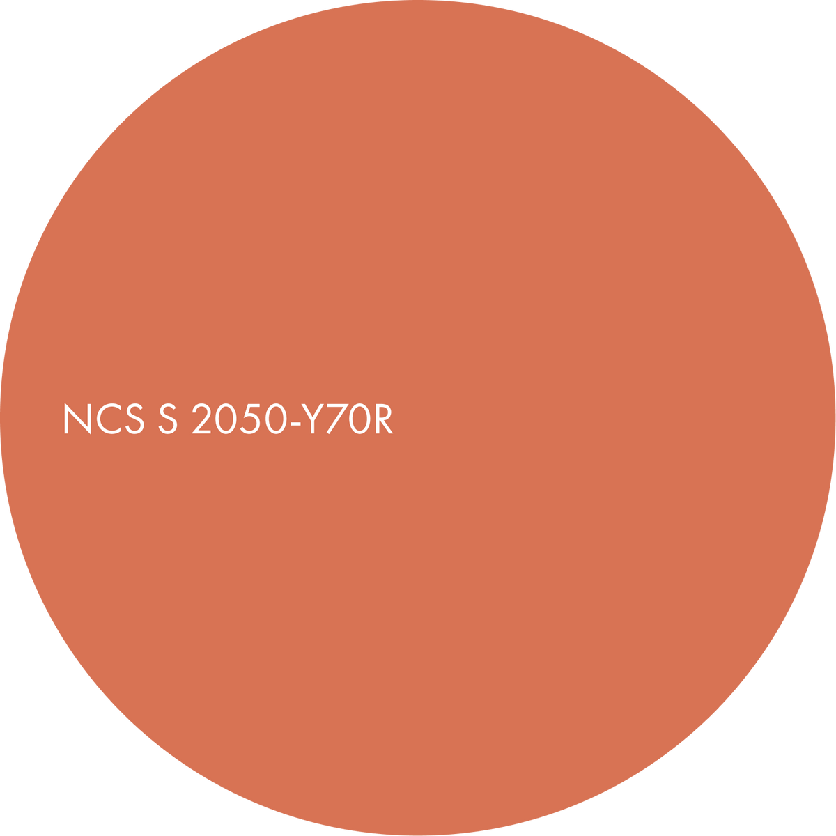
A vivid terracotta orange with plenty of energy. Main.
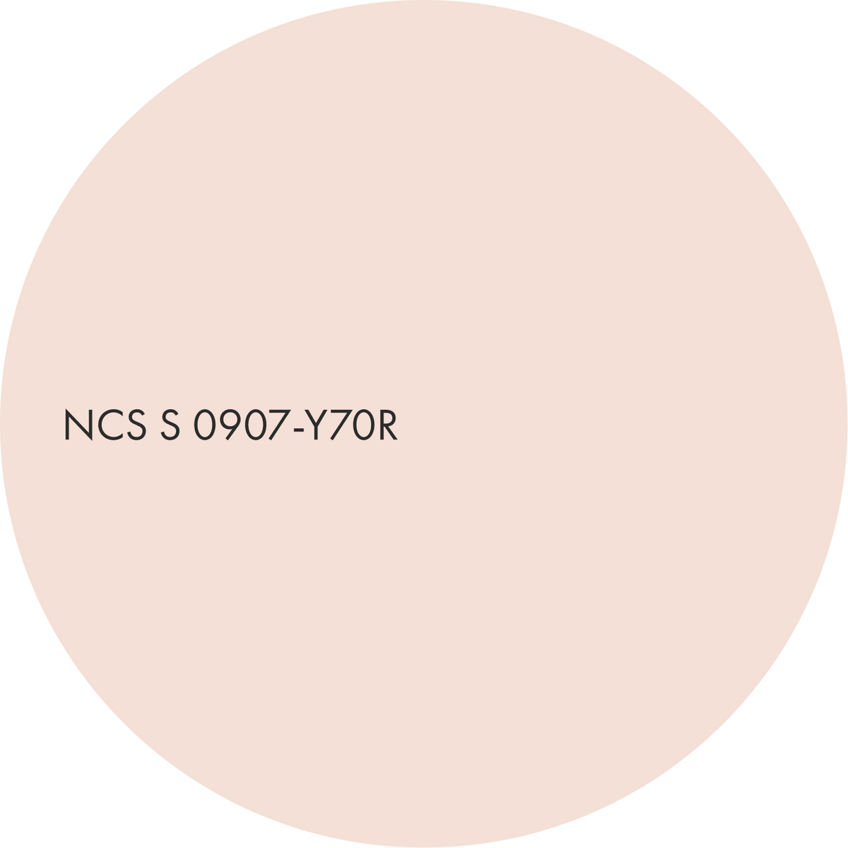
A pale neutral with a soft blush of peach. Secondary.
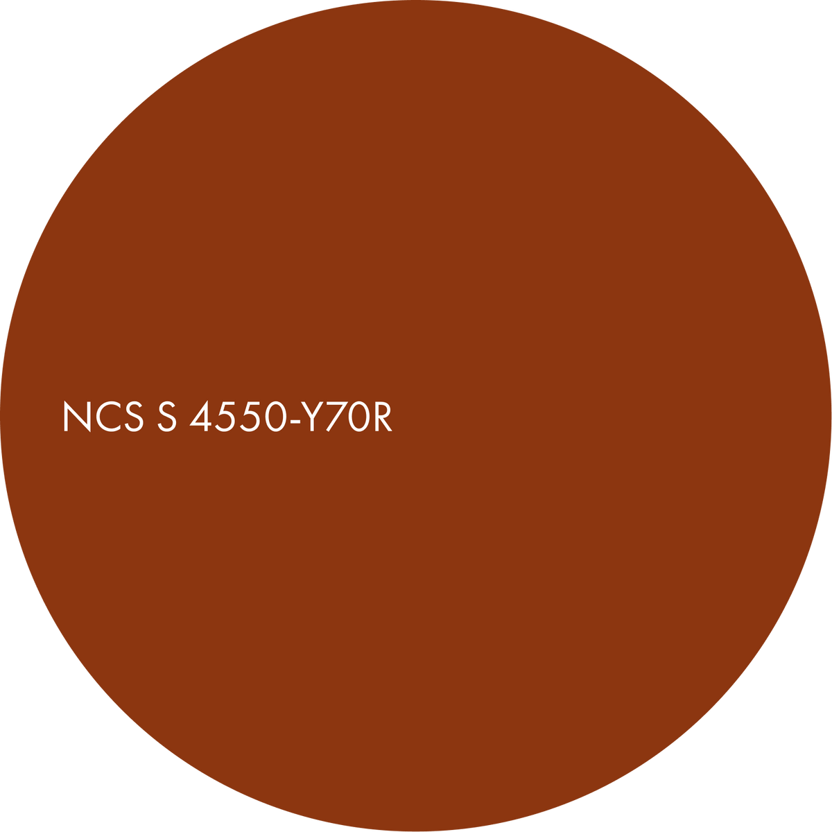
A deep rust with a burnt, earthy richness. Accent.

Material suggestions
– imperfect ceramics, from a blush glaze to a burnt sienna body
– terracotta and cotto tiles
– raw clay with visible maker's marks
– sienna-veined marble
– copper details
Suitable for
– dining rooms
– hotel and restaurant interiors
– retail spaces
Discover more from Colours Beyond 2028+

Morning

Evening
Colours of Day


