
NCS COLOUR TRENDS 2025+
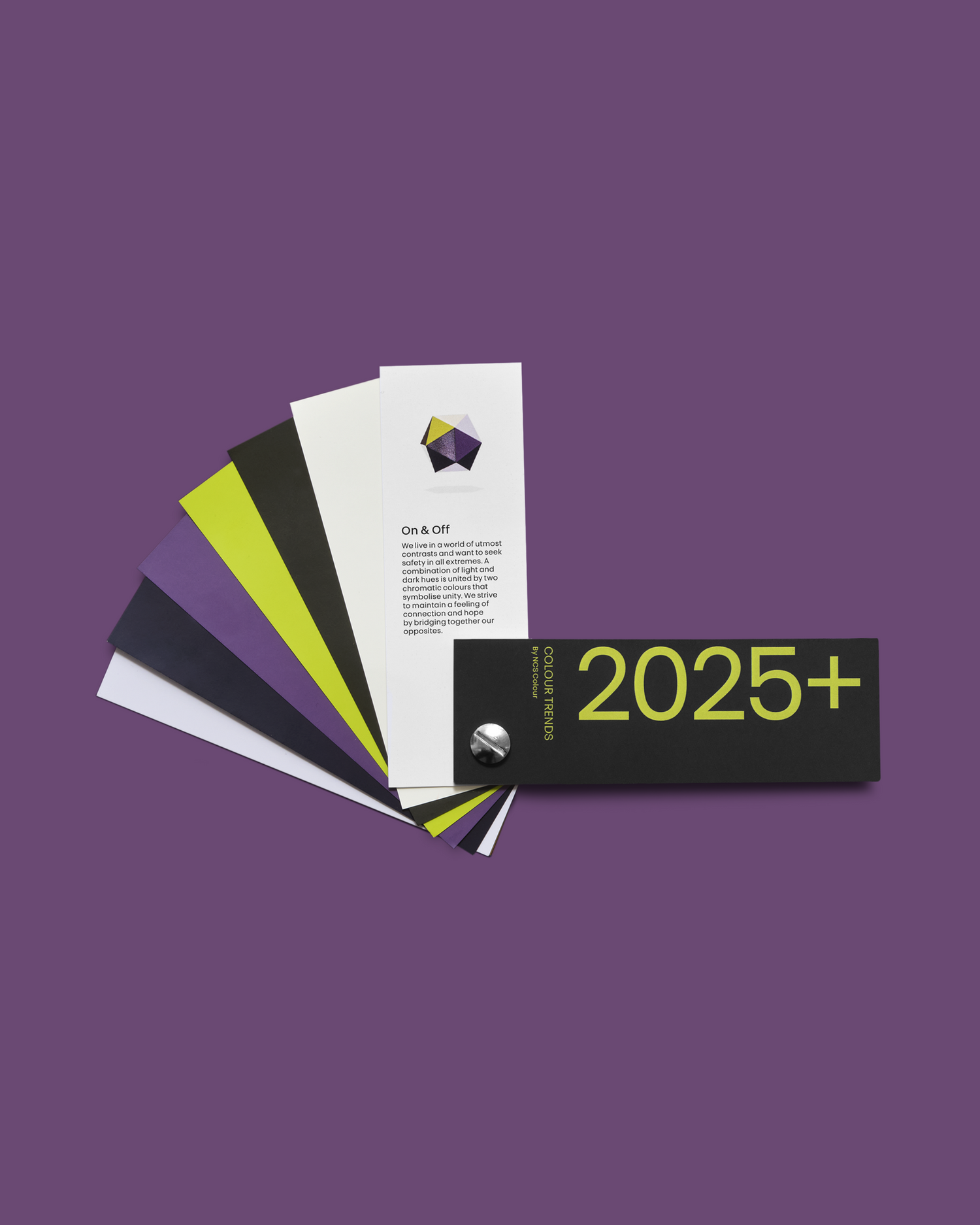
We live in a world of utmost contrasts and want to seek refuge in all extremes. Light and dark hues are combined by two chromatic colours that symbolise unity. We strive to express a feeling of connection and hope by bridging our opposites.
the drivers
Trend direction
Let's turn our eyes to contrasts. Times are extreme, and there is a difference in how we perceive things, creating
a feeling of division. Many different problems occur simultaneously and are often catastrophic and described as polycrisis. Psycho-emotional perspectives, the climate, the data, our resources, the energy, our food, everything. Social and traditional media enforce this, projecting one extreme after another. This is fascinating and confusing to observe. We feel crisis fatigued, and the world is considered insecure. Safety is a keyword.
To be united and find hope
Our wish for luxurious feelings grows strong in times of crisis and polarisation. Low chromatic dark and light colours are important and give us a careful feeling of luxury, highlighted by some chromatic powerful, energetic colours that do not occupy too much space. At the same time, we are careful with too chromatic colours.
Contrasts in design can be fantastic and, many times, essential. We want this, but we also want to link this contrast. In this mood, all of us are heroes. We inspire ourselves to understand and unite. We heal a divided society. We build bridges. We connect. We seek unity and hope.

on & off
The colour palette
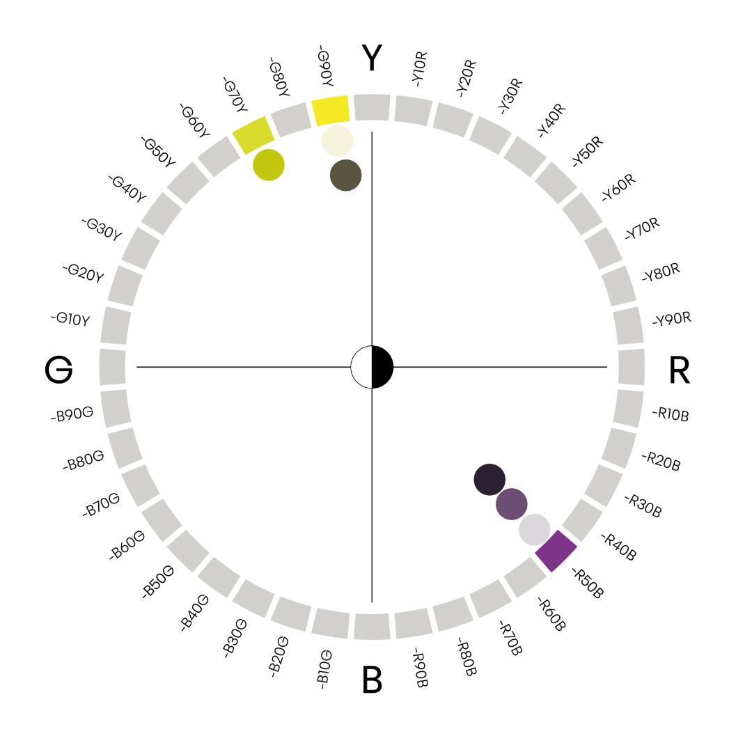
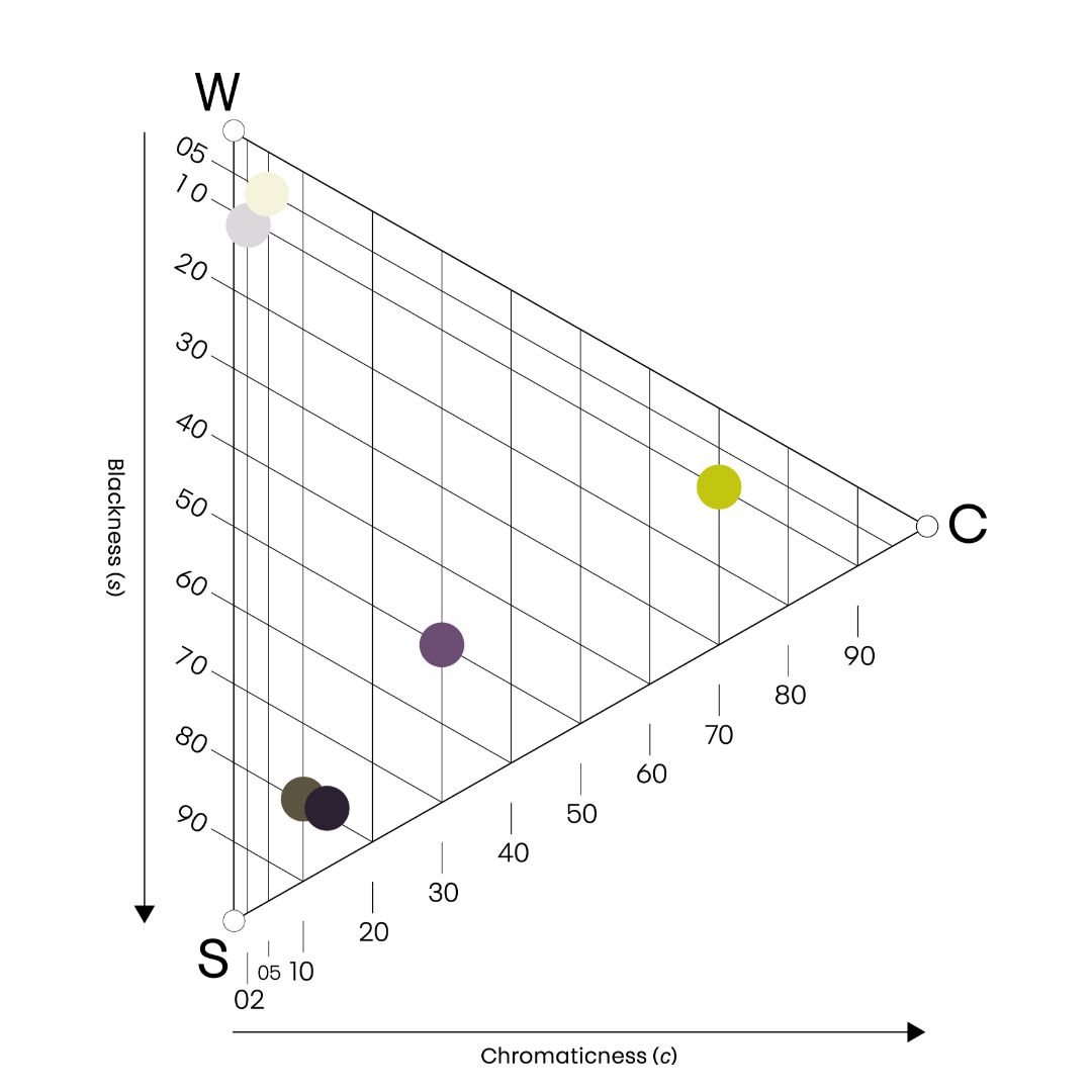
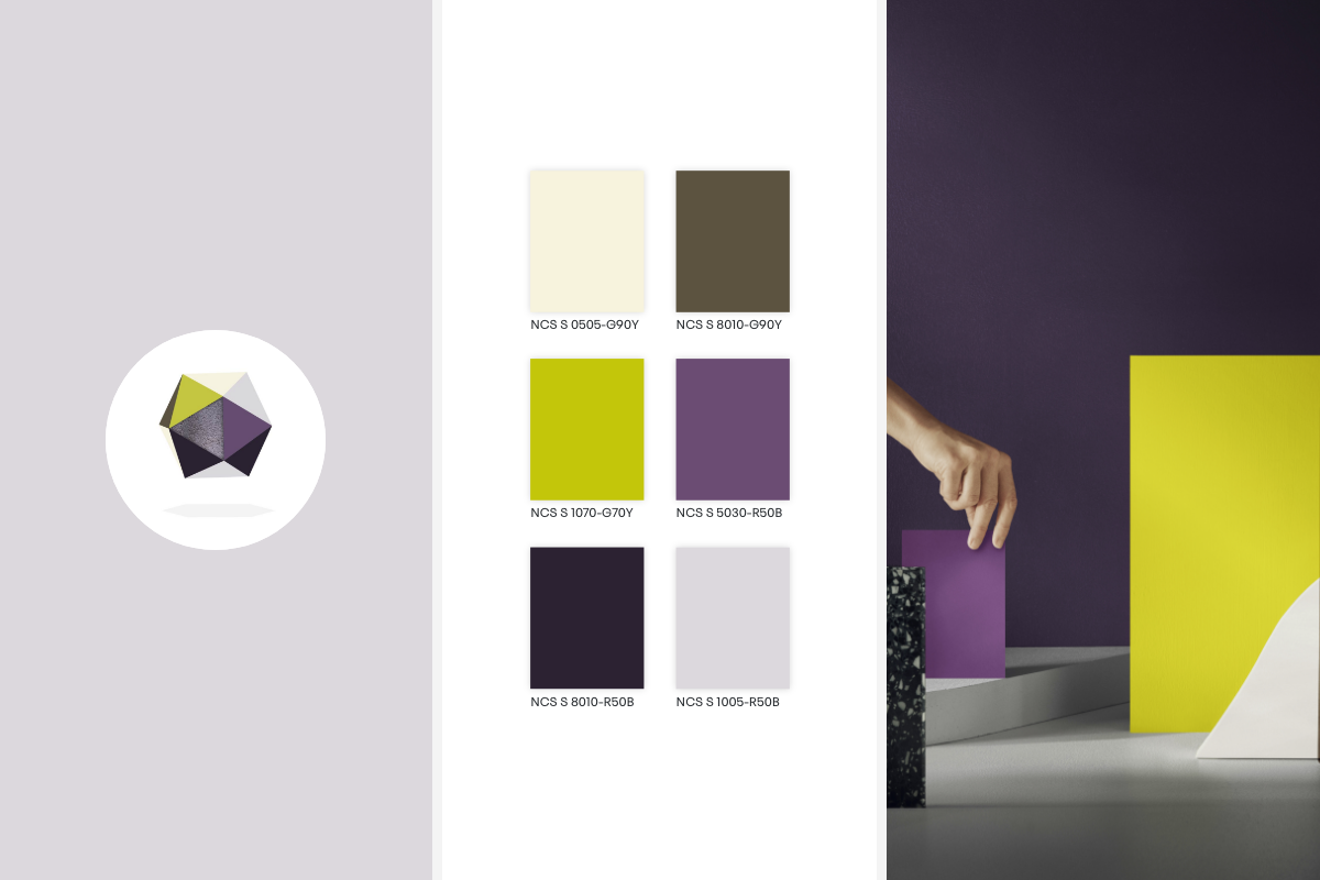
In this trend direction, the bold use of dark-tinted colours is very important. We want to have darker, bigger surfaces and to balance this darkness with light colours. This focus drives a direction towards using light and dark colours, unified by other colours. To find comfort, we must connect both sides with colours that can be perceived in darkness and light.
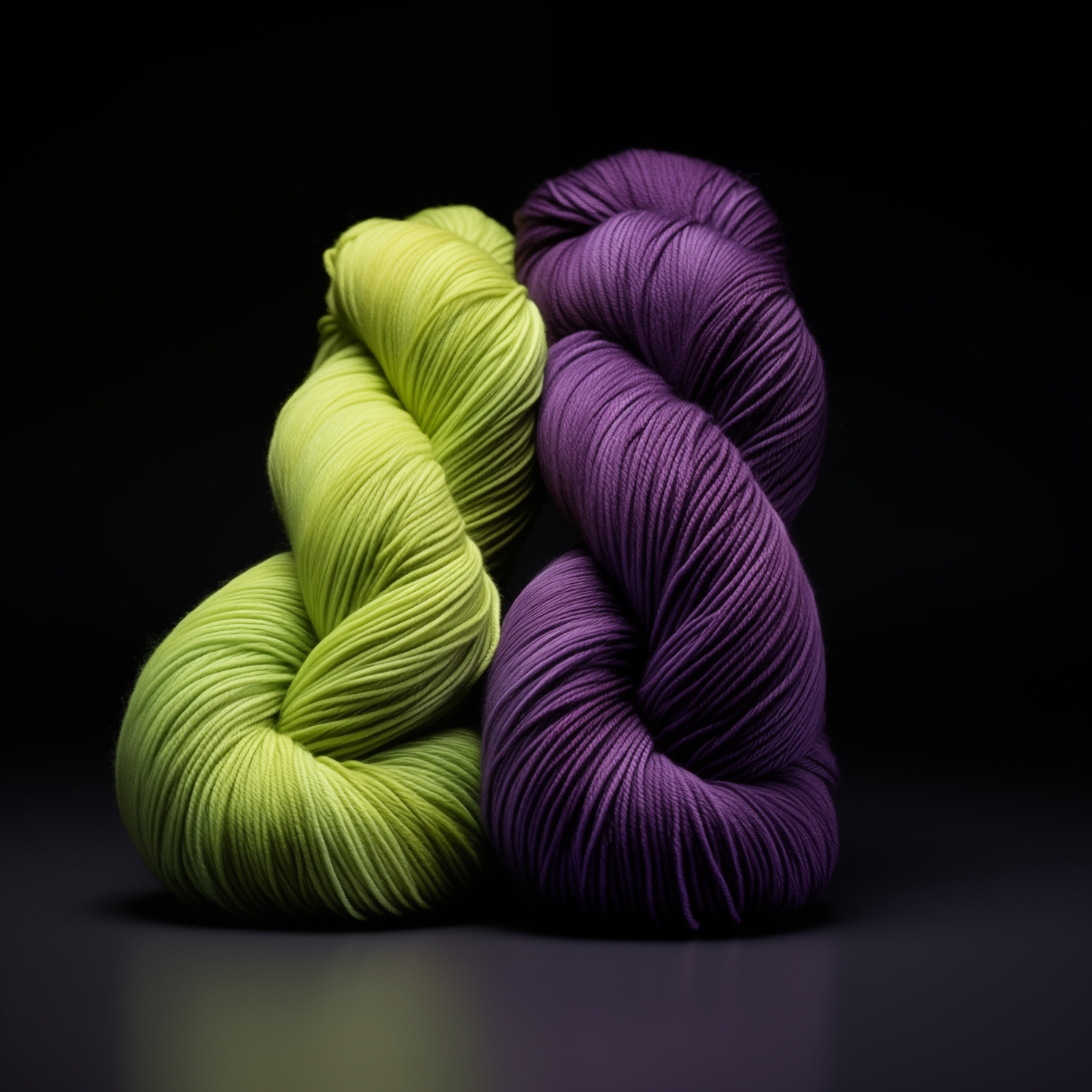
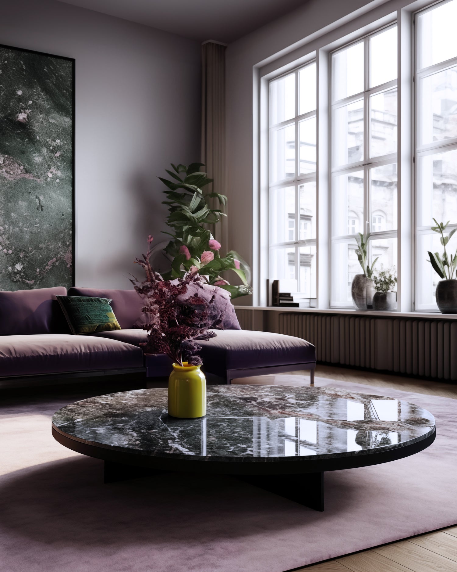
We bridge the contrast with the essential high chromatic and luminous green-yellow colour that stands out in darkness and light. A transcendent purple blends into the dark colours and is subtle in light. These colours become beacons of light in our darkness and guide us to colours in full light. When we see both tinted darks and tinted whites together with chromatic details, we can live in a world that is both On & Off.
MATERIALS AND FINISHES
Raw material
We are in a phase where we want to ensure everything looks and feels sustainable. Dark and light colours, together with the chromatic yellow, green and purple, are colours that are perfect for our recycled plastics. This is becoming a new crucial raw material. From having used plastic grains of different colours, we now use recycled plastics as a ground raw material and produce new material consisting of different colours and textures. They should still feel recycled with rough surfaces but more monochromatic than before.

