Daring to think outside the white box
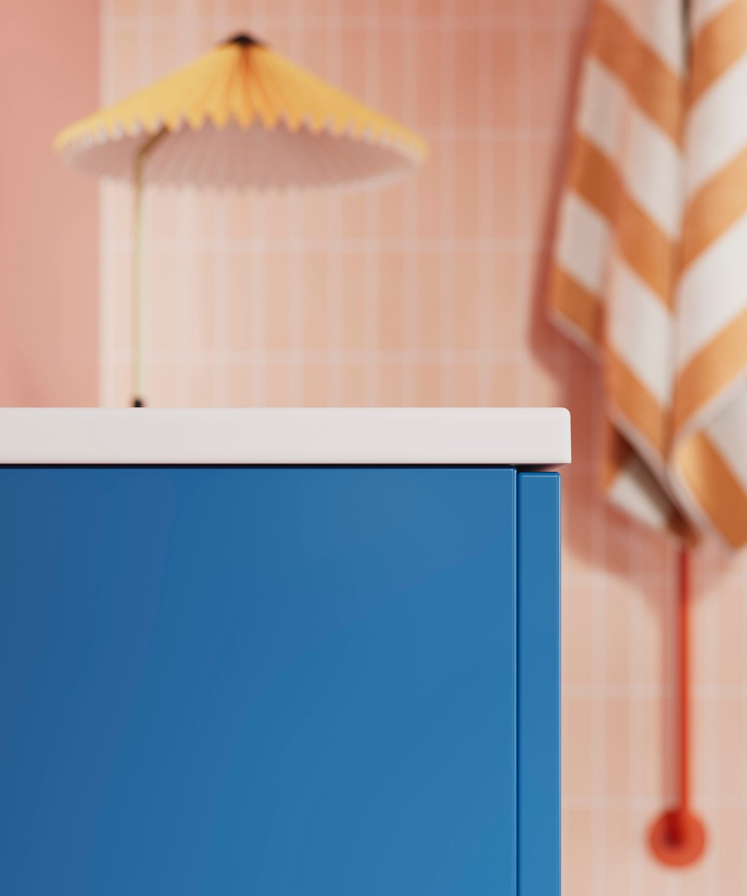
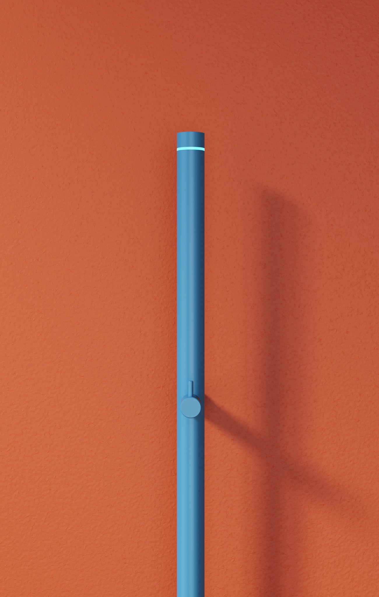
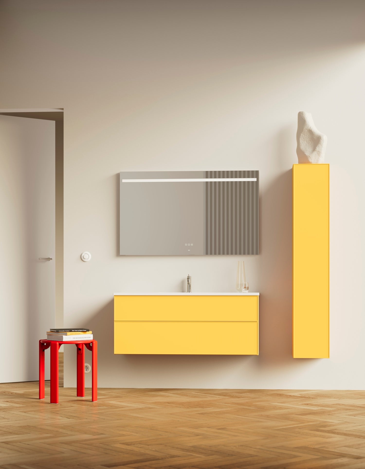
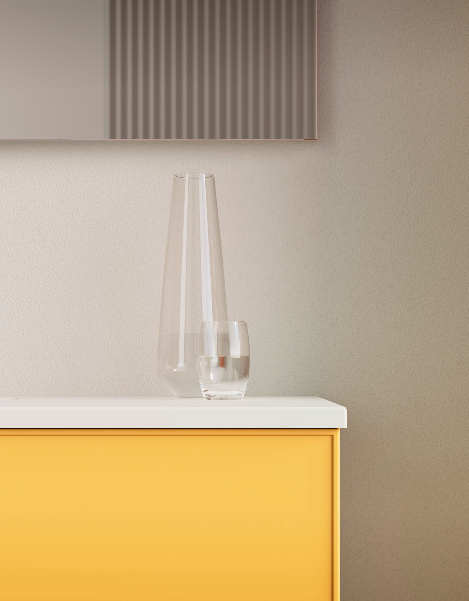
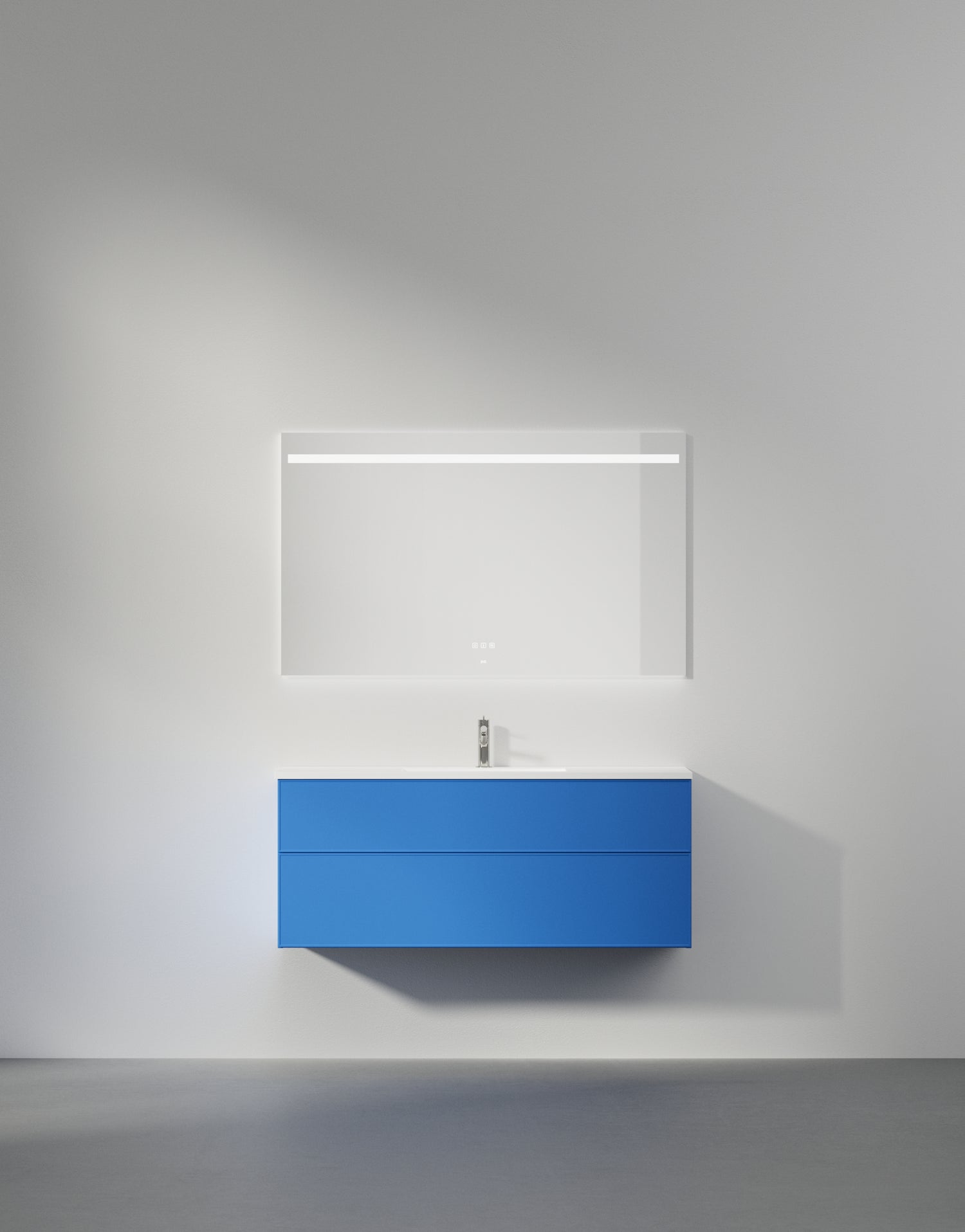
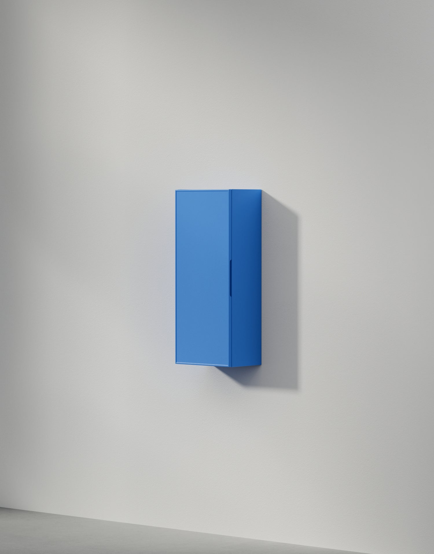
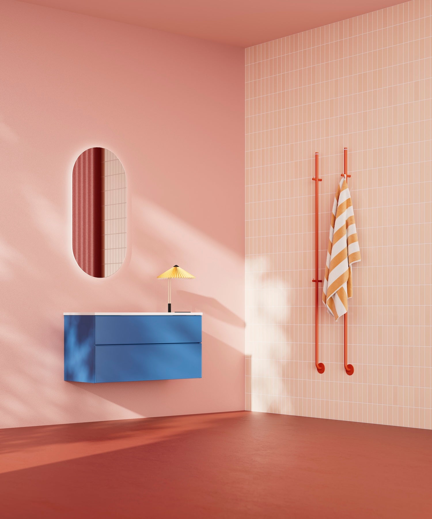
Bathroom manufacturer INR has created the colourful collection "Outside the white box". The lively line adds a twist to the classic all-white bathroom, with the aim to challenge the norm of white as the dominating colour choice. All furniture is identified and manufactured in NCS notations. We sat down with Maria Palm, Creative Marketing Manager at INR to dive into the inspiration behind the collection – discover the story below!
Describe the meaning of "outside the white box". What inspired you to make a colourful collection?
The norm among consumers who choose bathroom furniture in Sweden today is to choose a 60 cm wide chest of drawers in white. In our neighboring countries, people are somewhat more daring, but the fact is that the majority of all the furniture we sell is white. With our colour collection, we wanted to challenge this and encourage the consumer to dare to choose something different – to think outside the white box, quite simply.
How did you go about choosing the colours?
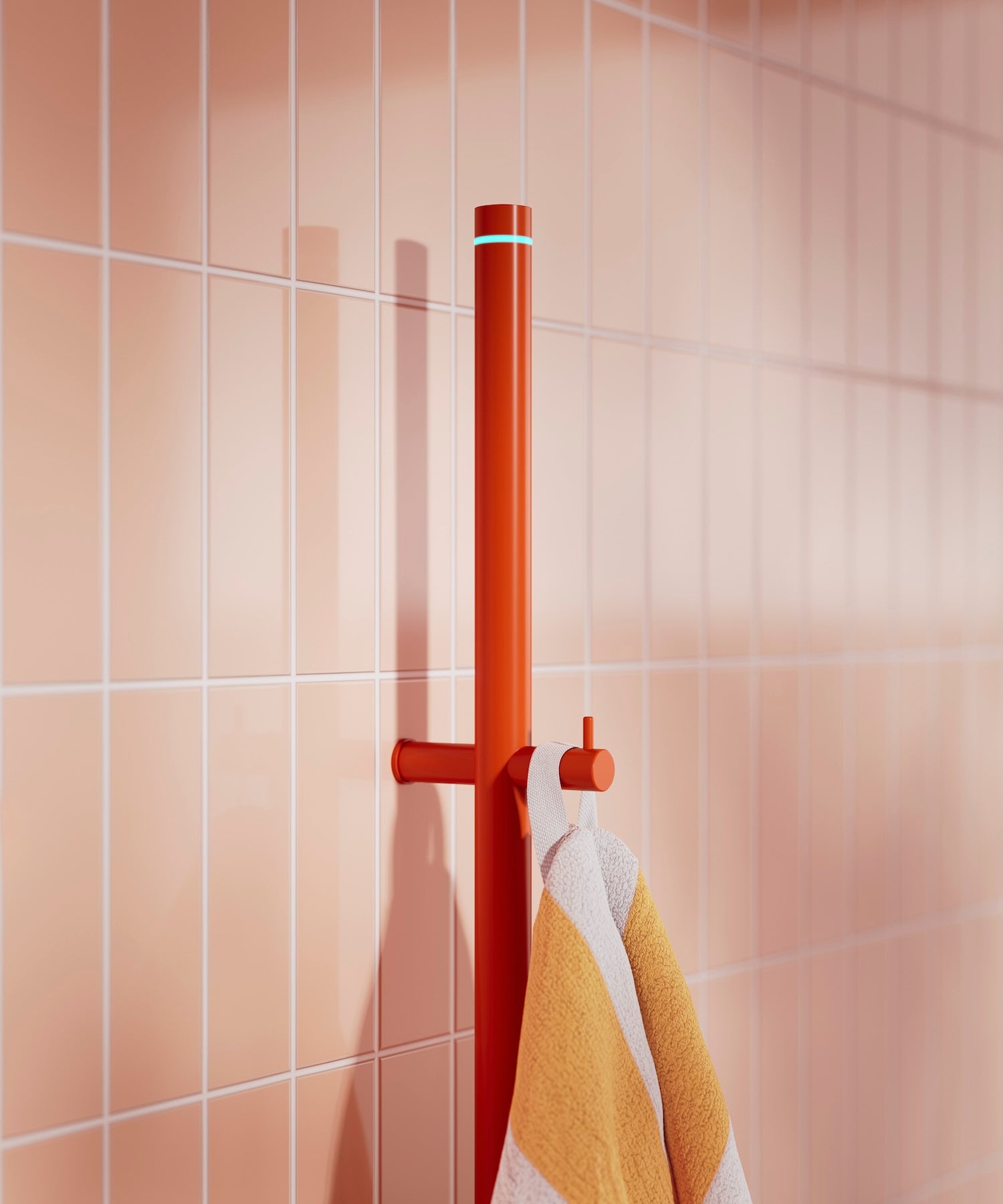
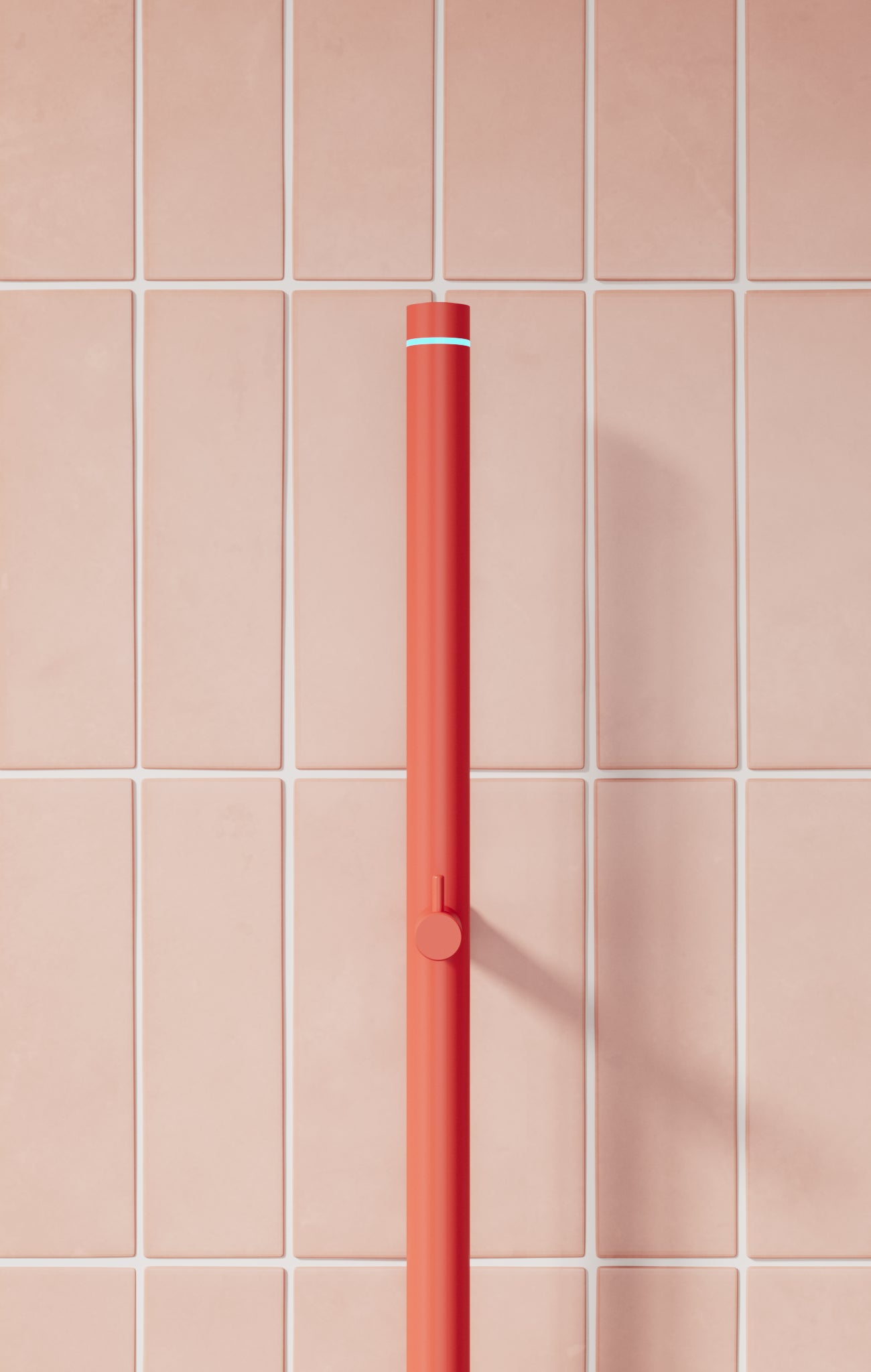
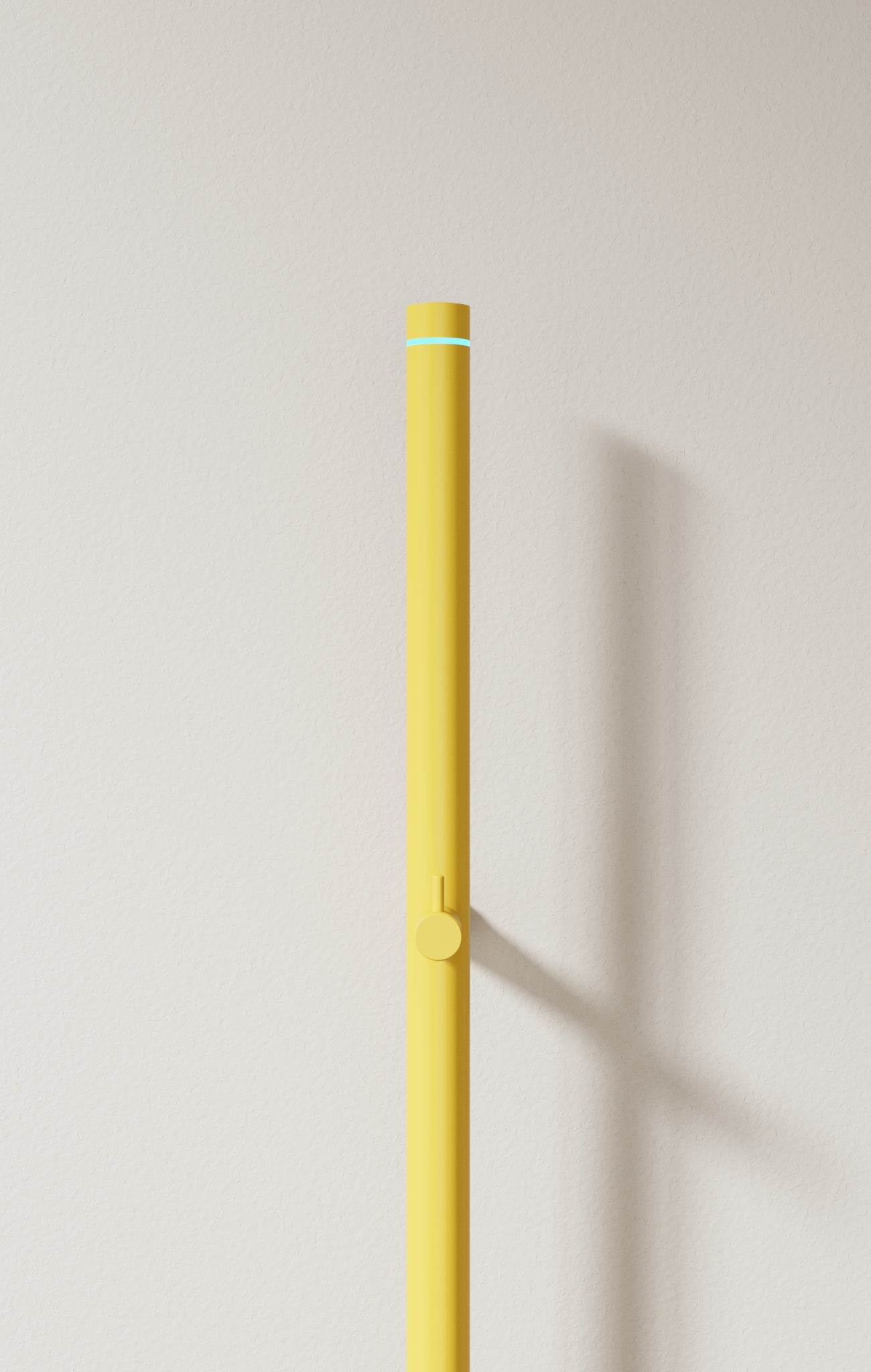
We wanted to create something that stood out and that made people stop and think 'Wow, I didn't know that was possible!'. We were a few designers working together and experimenting – and the more we laboured, the more colour we added. We probably thought that these particular colours would not sell in large quantities – precisely because they were so daring – but it has actually been the opposite. The fire red (NCS S 0585-Y70R) colour of the heated towel rail has become very popular.
How do you think colour choices affect people's feelings and experiences of your furniture?
We are convinced that we feel better by surrounding ourselves with colours that we like and that we can influence both ourselves and others through colour. The bathroom in particular has traditionally been very grey and white and we think that many people have gotten really tired of it and feel that it is quite boring that all bathrooms look the same. By decorating the bathroom in colour, the bathroom becomes more than just that dull room where you go to the toilet, shower and brush your teeth.
"We know that colour makes us feel good, so why do we always choose white? I see a clear trend that we are moving from beige to more personal and colourful decor. Now is the time for us to explore how this can be applied to the bathroom!"
– Lina Lindberg, Art Director at INR
How long have you worked with NCS, and why?
Aspen introduced NCS as a colour choice for its bathroom furniture around 2013 to give consumers more opportunities to decorate in a personal way. In 2019, we further developed the concept and introduced five accent colours to make the choice easier for consumers.
"NCS is valuable for us because it helps us strengthen and communicate our message that you can personalise your bathroom furniture beyond the standard options. At the same time, we use NCS as a tool to test new colours before including them in our standard range."
What is important to you when you manufacture furniture in colour?
In addition to all wooden surfaces being sealed with our surface treatment TX Top Extreme, which protects against moisture and wear, it goes without saying that the colour should be right and feel right. We feel that many consumers are a little afraid to choose a colour that stands out, so our designers have selected five colours (the Accent Collection) that fit well in most Scandinavian bathrooms and with most finishes and tiles. We see that many people stick to these five colours, even though more and more dare to try something else.
You offer all NCS 2050 Standard colours, which are most popular?
The sand colours Earth (NCS S 5005-Y20R) and Sand (NCS S 3005-Y20R) are going down very well with our customers right now, and that is perhaps not so strange because they are trendy colours. Another reason is probably that we work actively to produce environmental images that highlight the colours in a harmonious context. We feel that many consumers want to decorate exactly as in the picture they have seen and like. Our green Forest (NCS S 5005-G50Y) is another colour that is also getting a lot of attention.
How do you integrate colour trends into your collections? What challenges do you face when experimenting with new colours and shades?
Trends are an important part of our collections, but since you don't renovate or rebuild the bathroom that often, we try to keep our recommendations at a level that lasts over time. The challenge – which we choose to see as an opportunity – is to add up the total for all parts of the bathroom, i.e. not the furniture. The colours we choose must work together with our metals and finishes on faucets and shower walls. Here, product developers and designers work closely together to find the right shades that work together.
How do you balance between following current colour trends and creating timeless design classics?
Colour trends move somewhat more slowly in the bathroom than in, for example, the living room. Precisely because the interior costs a lot, should last over time and not need to be replaced after five years. After all, we have the Scandinavian way of thinking with us in everything we do. We work closely with nature in terms of colour and try to choose colours and finishes that create calm and harmony.
Tell us about INR's history and as a company. What is important to you today?
INR has its history partly in the manufacture of shower walls (Inredningsglas, founded in 1988) and partly in the manufacture of bathroom furniture (Aspen, founded in 2002). In 2017, we came together under a common brand (INR) and that was also when the starting shot went to get the total together in the bathroom – in our communication and image material and more.
It is important for us at INR to be able to offer a wide selection of products that harmonize with each other in color, shape and quality. It should be easy to choose bathroom fittings, simply put. Then we have the tailored leg, which is an important part of INR's identity. If the consumer wants something that is not in our basic range, we do everything we can to help.
