MDW 2023
4 MAY, 2023
A colourful report from Milano Design Week.
Fuorisalone 2023
The NCS Colour team is back from some exciting days in Milan, where Milano Design Week took place yet again. MDW was first launched in 1961 as the Salone del Mobile, a furniture trade fair. Over the years, it has evolved into a broader platform for design and creativity. Milano Design Week also hosts several events and shows, such as Fuorisalone, which takes place in different areas of the city and offers a more informal, experimental approach to design. MDW is considered as one of the most important design events in the world, attracting thousands of designers, architects, creatives, and design enthusiasts from around the globe.
During three sunny, crowded days, in the presence of designers, brands and hundreds of events, we gathered a lot of inspiration and what colours that were most frequently used.
Some of the main themes we noticed:
- New materials
- Outdoor
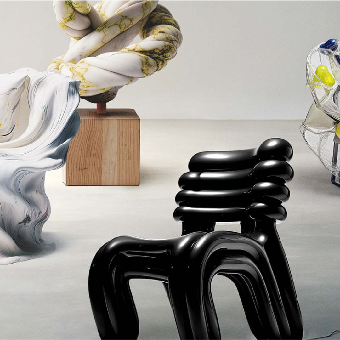
- Organic shapes
- Gold
- Woven textiles
- Tiles

Jakarta Creative x ICAD Collective at Superstudio.
The colours:
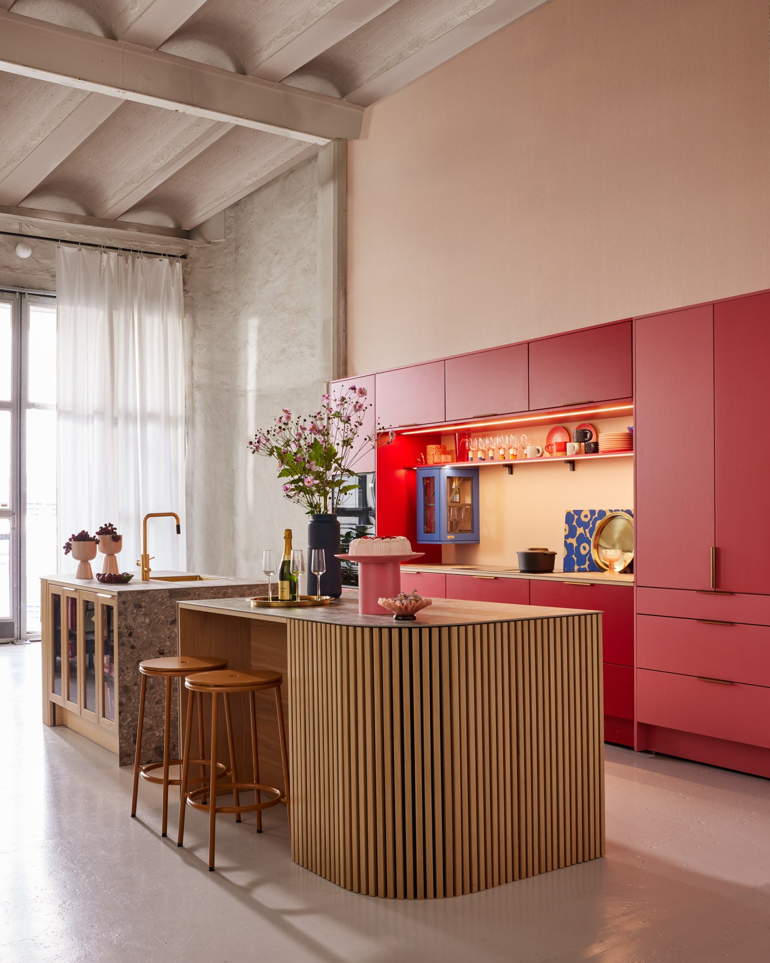
Amongst cobalt blue, yellow (Y), yellow-red (YR) and pure red (R) were quite prominent. Mostly as pop colours amongst more muted and neutral shades.This is in line with our colour trend forecast. We are beginning to embrace more and more chromatic colours, driven by the younger generations that have been focusing on more chromatic colours in recent years. This has now become a more generic direction. We see that pure red (-R) and the very popular reddish blue (-R80B) are taking an important role in our change in attitude toward chromatic colours.

Chromatic blue at B&B Italia.

“This is Denmark” at Alcova. Poet Sofa, design by Finn Juhl.

Red pop of colour at Moooi showroom.
Neutrals

Neutrals and apricot details at Moooi.
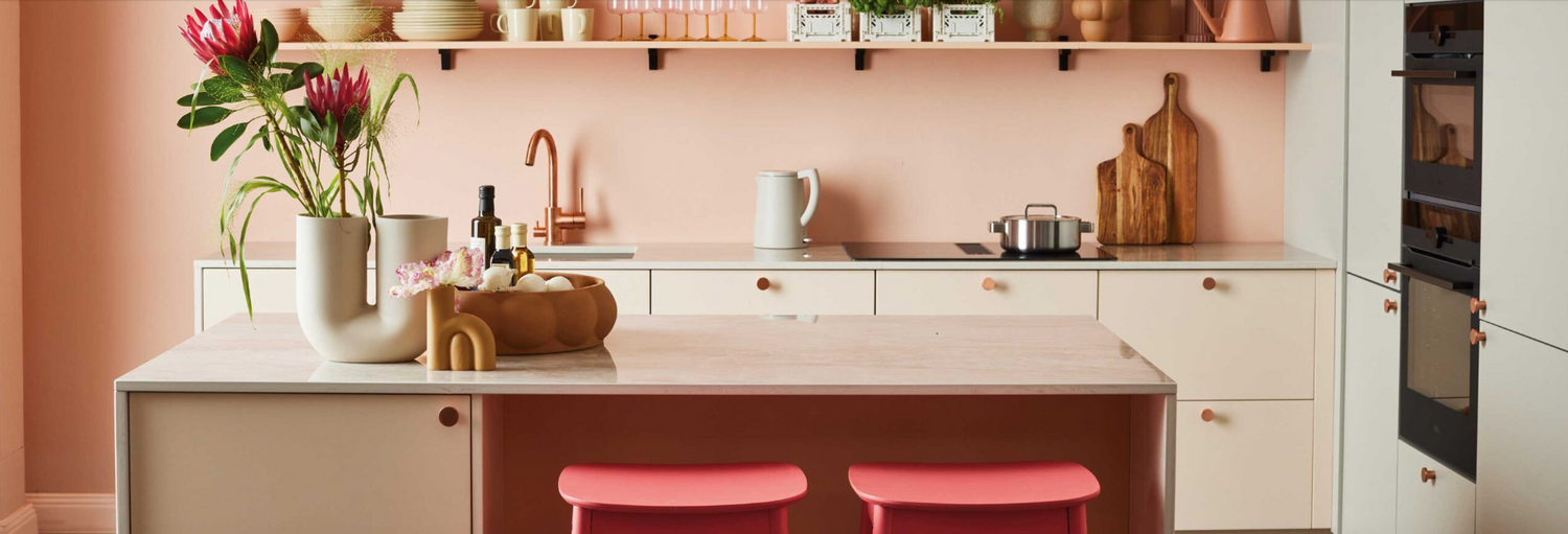
Parallel with the chromatic pop colours, we saw a lot of natural, earthy colour schemes. Many of us still want to use and be surrounded by colours that should look natural and unrefined. Neutral, low chromatic colours with a tint of warmth are prominent, such as a low chromatic orange (-Y60R) or apricot.
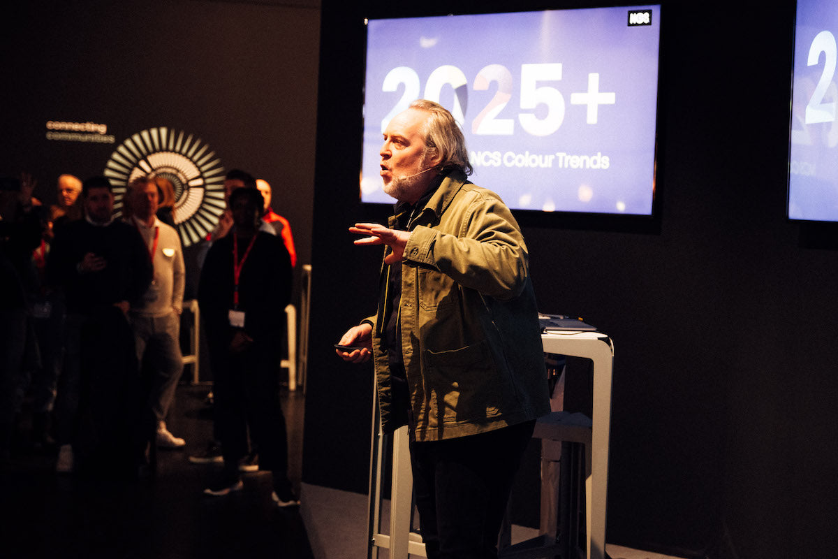
Curious to learn more about our colour trend forecast?
