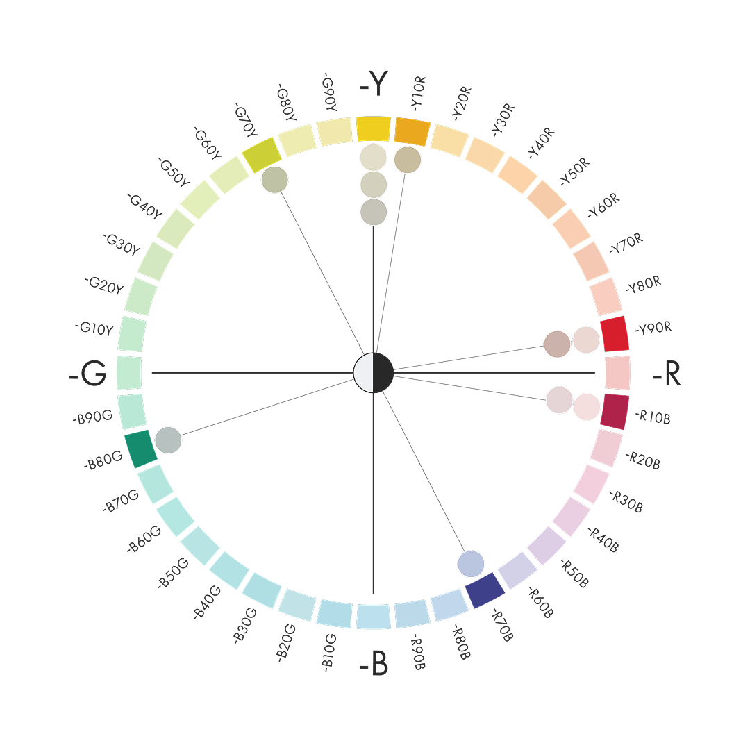
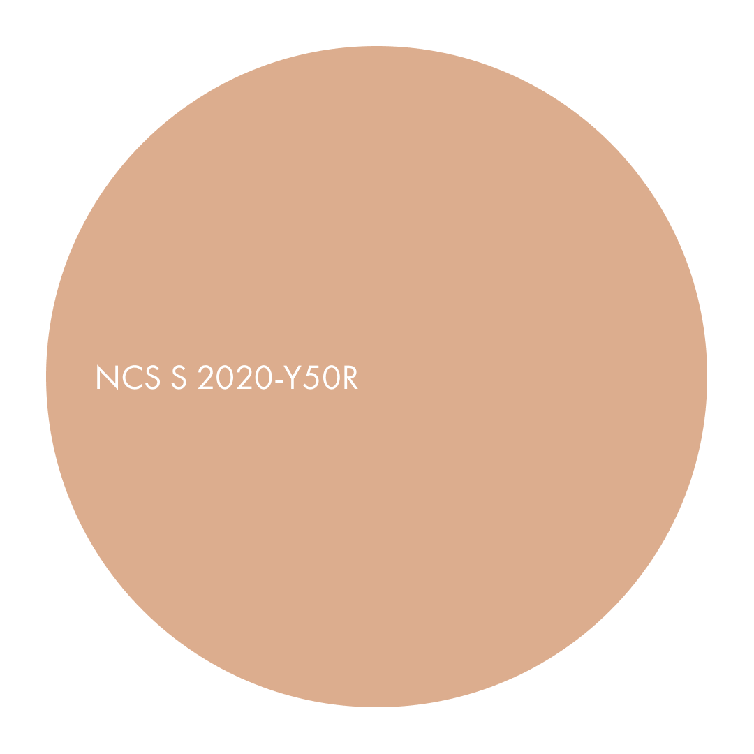
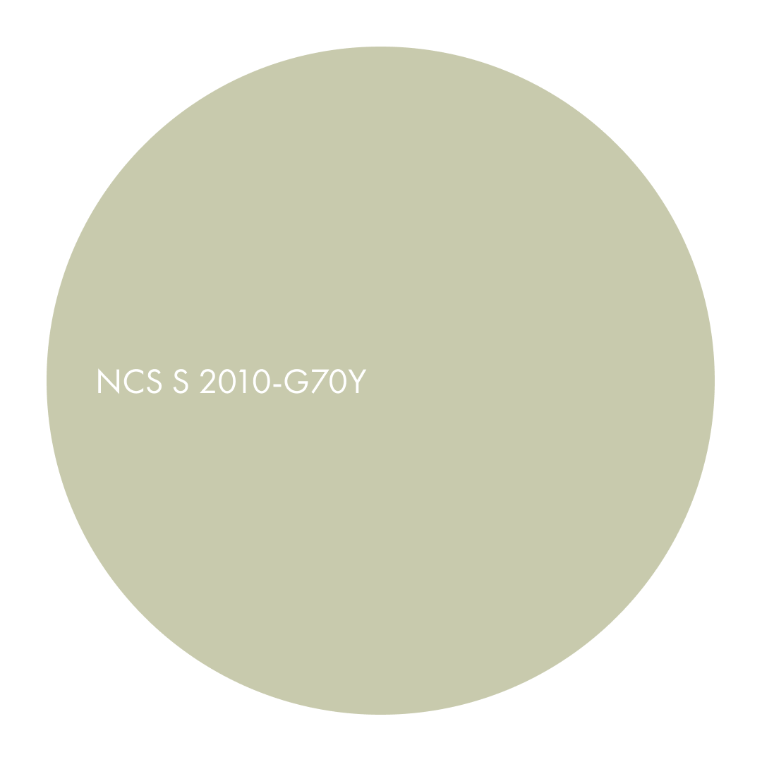
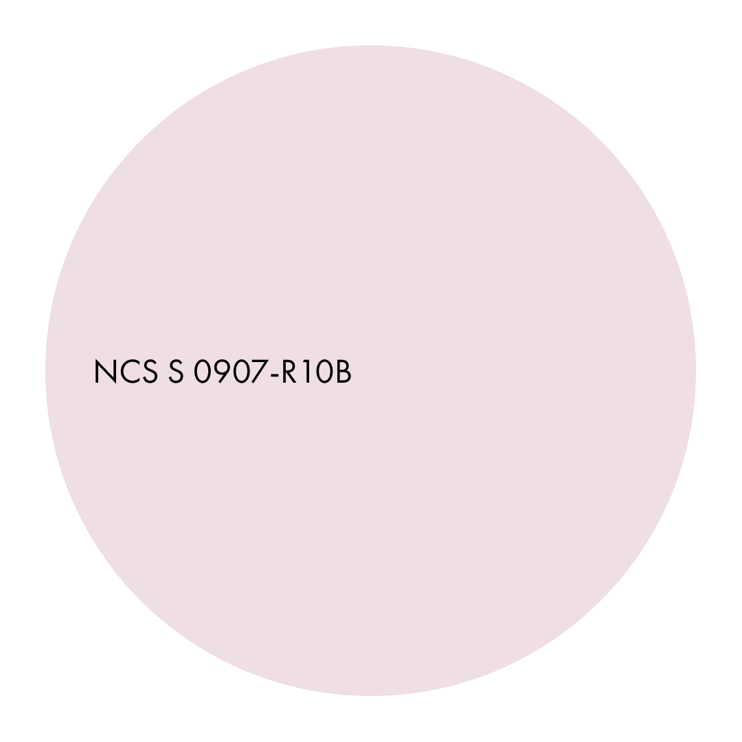
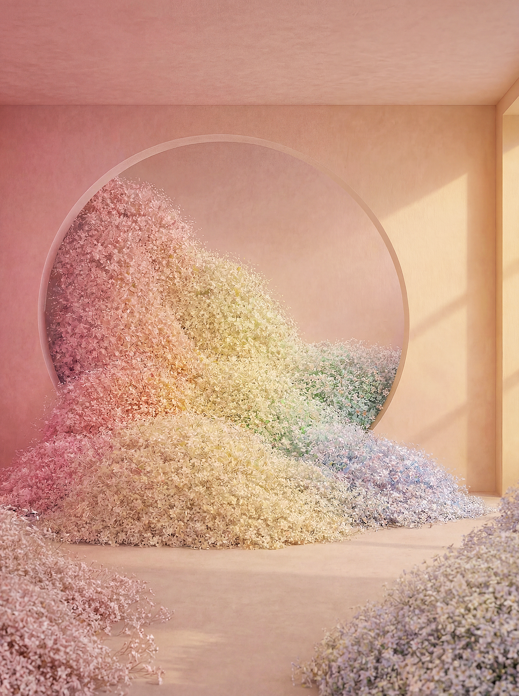
Abstract palette of softly muted Y–R–B nuances with mineral depth and near-neutral balance. A restrained and tactile colour area defined by low chromaticness and powdery tones that introduce material warmth, cultural subtlety and refined decorative character to interiors.
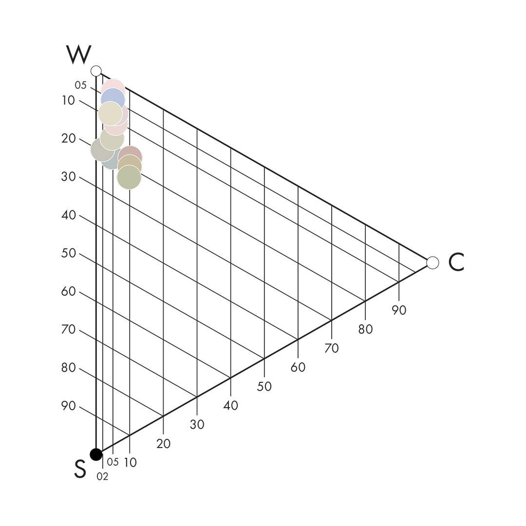
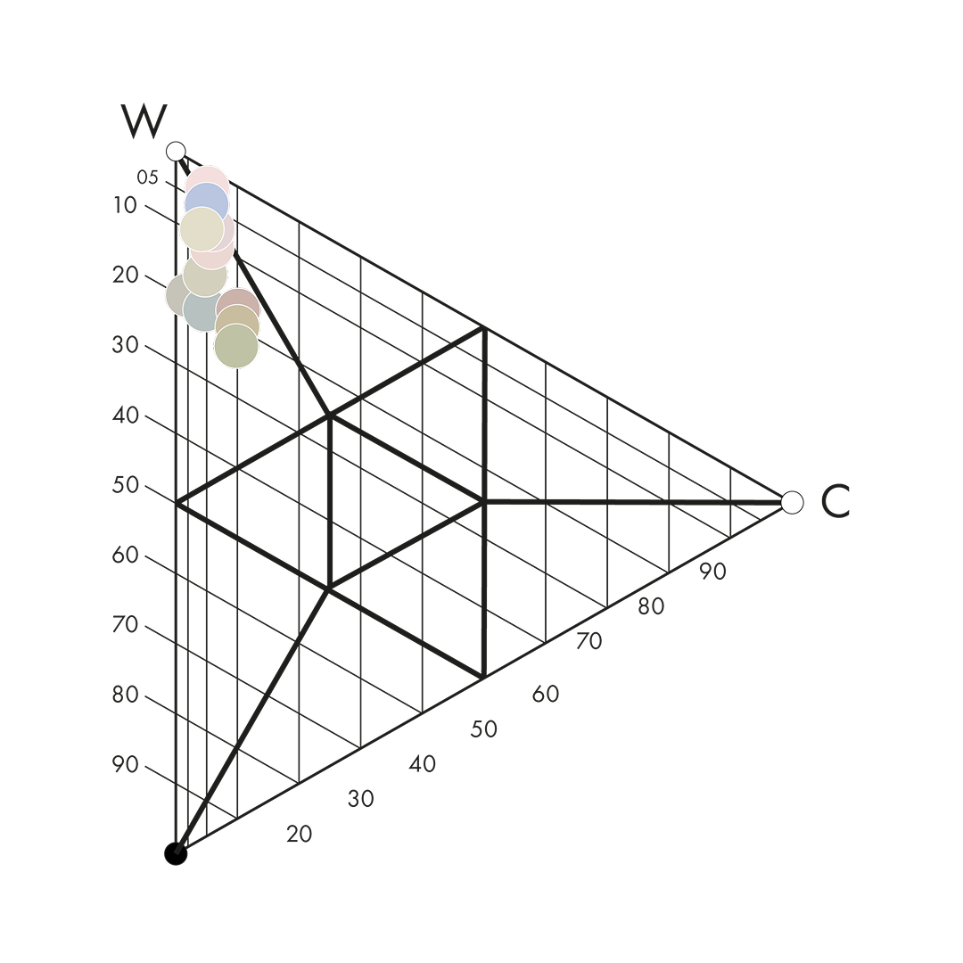
The Dull Pale colour area is defined by low chromaticness and softly balanced nuances. With reduced colour intensity and gentle blackness values, these hues sit close to neutrality while retaining a subtle chromatic identity.
Their muted character creates a powdery and refined expression. The colour presence feels calm, tactile and composed. Rather than drawing attention through strength, Dull Pale colours work through understatement and nuance.
Positioned in the lower part of the NCS Colour Triangle, these colours evoke mineral pigments, tinted clays and naturally dyed textiles. In space, they soften surfaces, reduce contrast and introduce warmth through material depth rather than saturation.
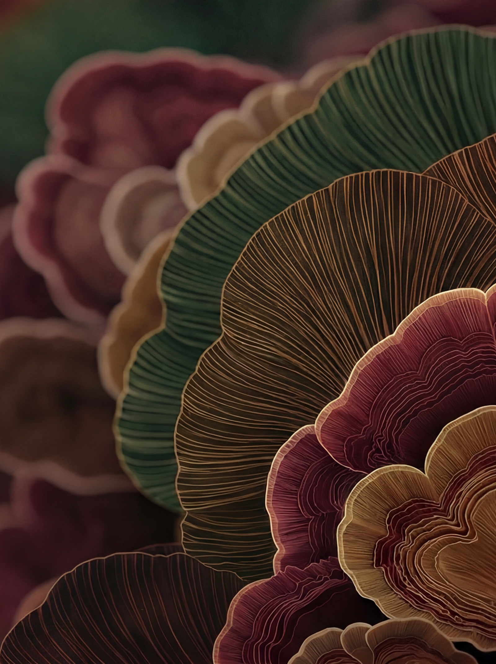
Dull Pale is ideal for designers who seek decorative subtlety within a structured and balanced environment. The colours carry cultural nuance and crafted sensitivity while maintaining spatial calm.