
NCS COLOUR TRENDS 2025+
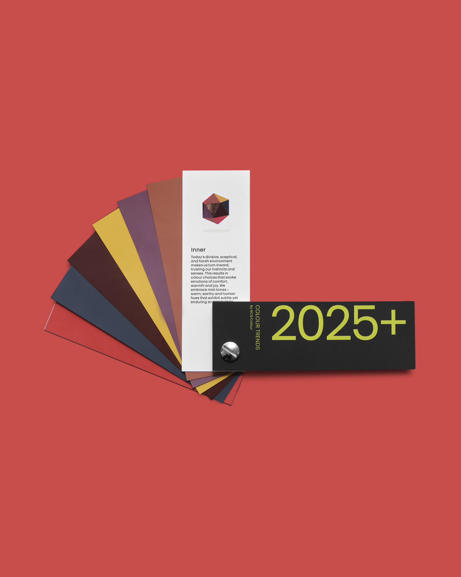
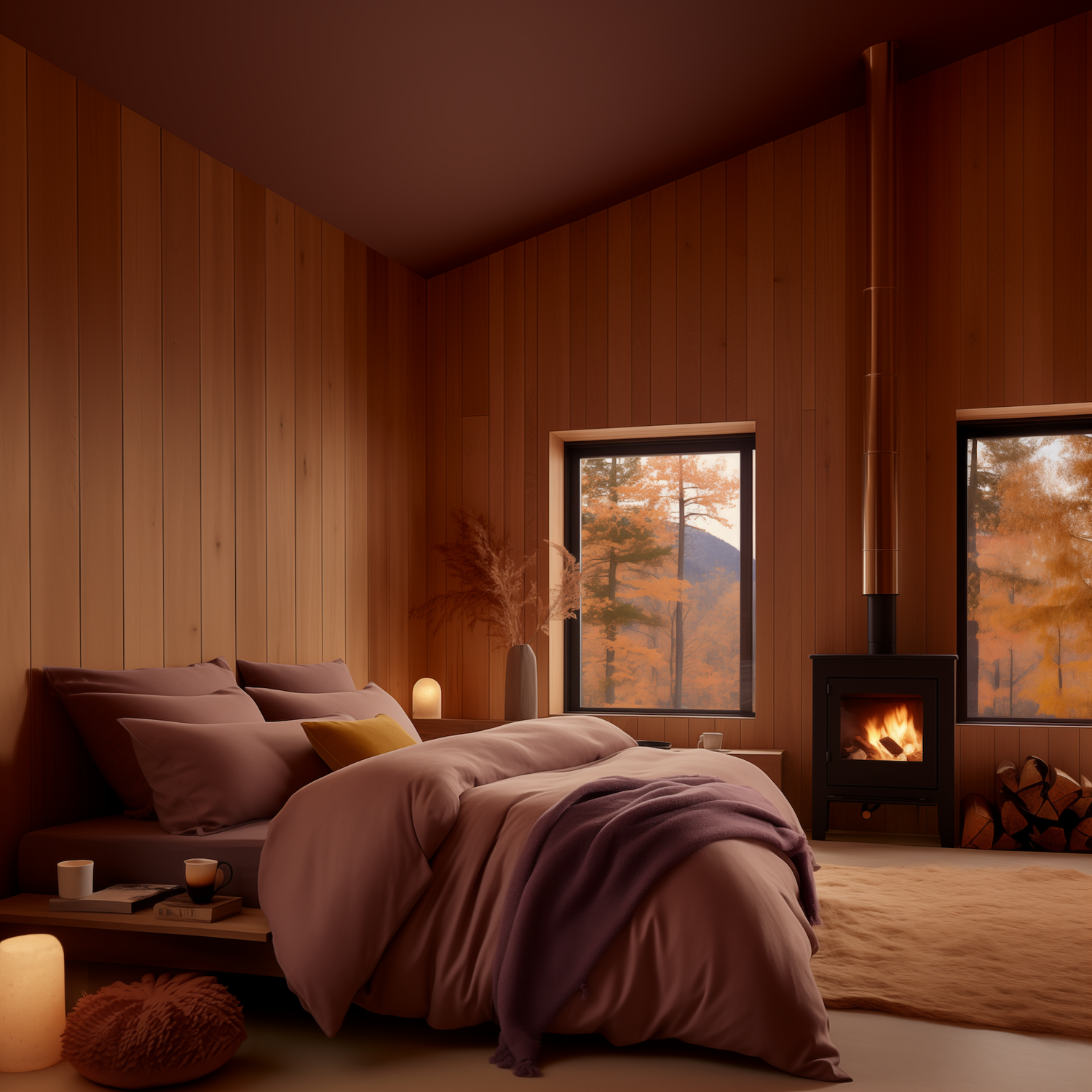
Today’s divisive, sceptical, and harsh environment makes us turn inward, trusting our instincts and senses. This results in colour choices that evoke emotions of comfort, warmth, and joy. We embrace mid-tones – warm, earthy and human hues that exhibit subtle yet enduring strength.
the drivers
Trend direction
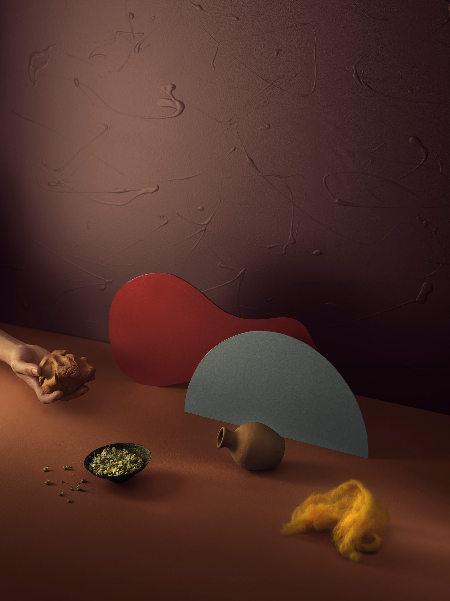
The more blurred our world becomes, the more we seek a deeper understanding of ourselves. We search for something warm, comfortable and understandable to cling to. More and more people indulge themselves in hobbies. Tea ceremonies, for example, with special sounds, aromas, and colours, are growing in importance amongst the younger generations in China. We meditate to look for our inner life and use crafts as healing. In this mood, we disconnect completely from metaverse. We want to experience deep sensor-reality and emotional awareness. We disconnect ourselves from our connected lives, from our cell phones and the Internet.
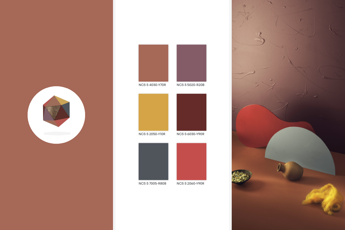
Introspective in our hearts and minds to neuro-design
As we become more physical, we look inward and reflect on our inner selves. Self-examination leads to a fascination with exploring inside our minds. Ultimately, we translate this into a neurodiversity of colours, ensuring our colour choices are relevant for everybody. We base our colour decisions on pure neuro-aesthetics. Neuro-design has become a keyword in our design world, creating designs that better align with our human cognition, behaviour and well-being. It is based on colours that unify us, the colours we see in our inner selves.

Inner
The Colour Palette
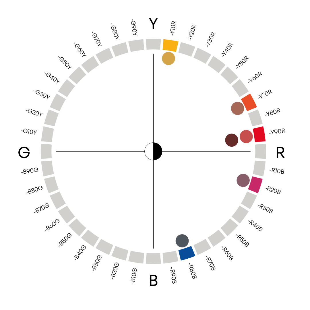
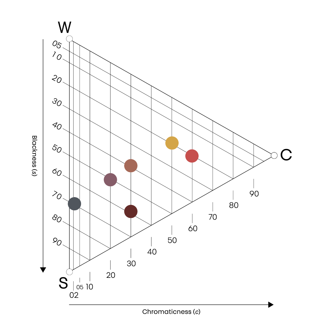
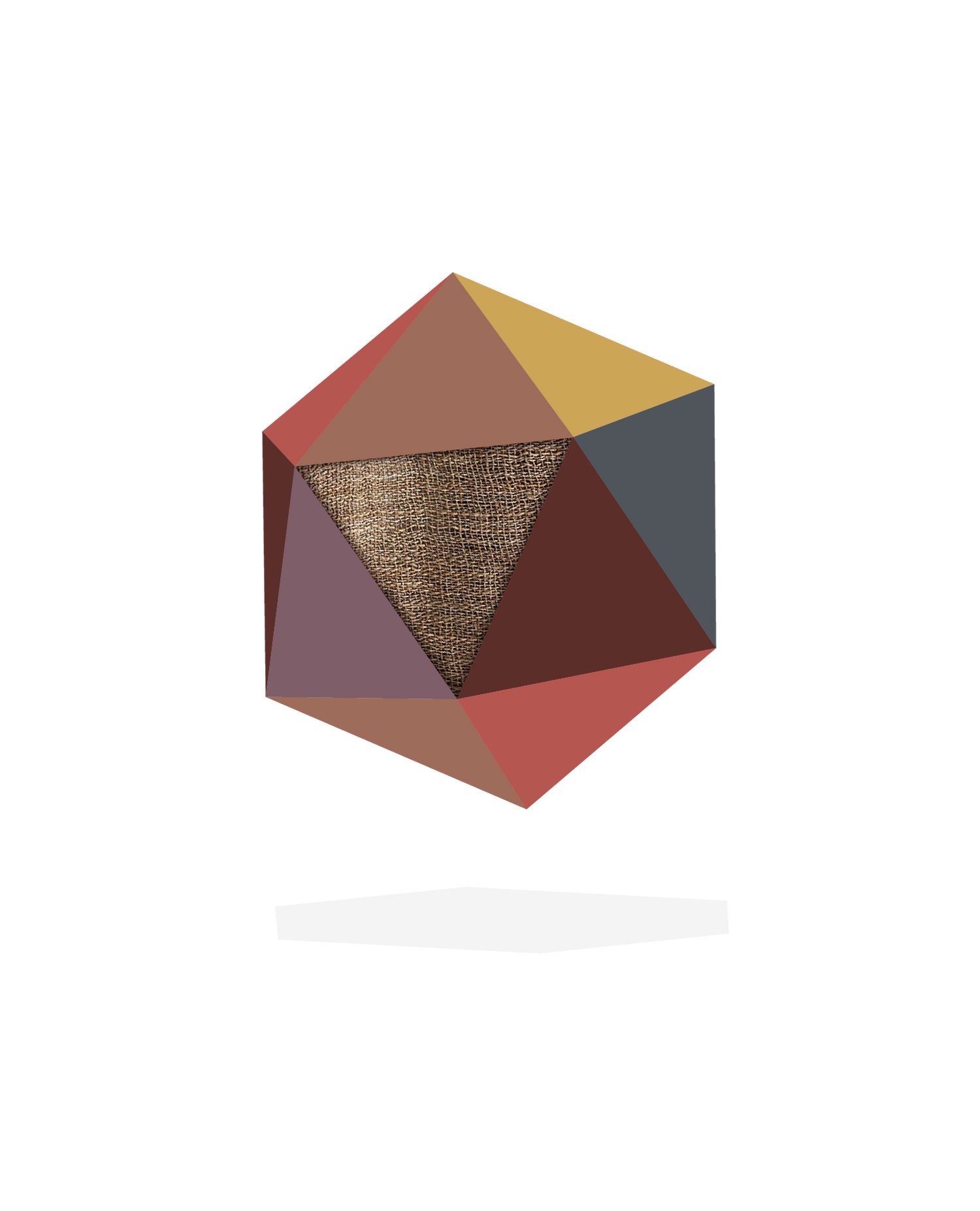
Discover a palette of mature pastels, off-beat inter-tone colours, mid-tones, not loud but strong, human-connected colours. The colours are warm and earthy, reminding us of our inner selves. In a sense, we can call these colours digested, fermented and nostalgic. All the colours are warm: yellow and red or red and blue. They are very similar in whiteness (10-30%), which makes them easy to combine, still with enough contrast to make them feel interesting.
MATERIALS AND FINISHES
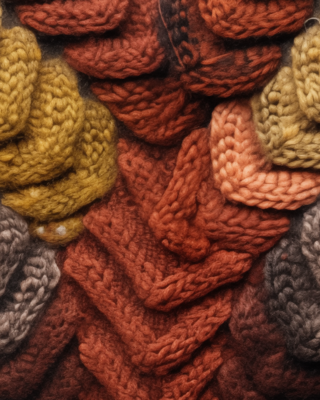
Biocomposites
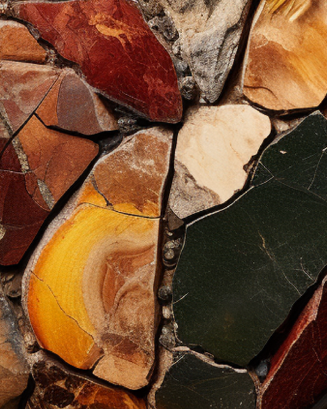
The material we want comes from nature and should be perceived as 100% natural and warm. Pigments like okra and Tierra de Sienna help us. Our preferred material is biocomposites, where hemp composite plays an important role.
