Colour harmonies

Colour confidence with the NCS System
Short intro
The NCS System
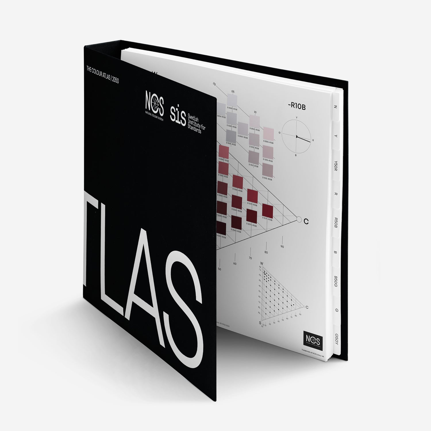
The foundation of our products is NCS – Natural Colour System®, a cross-industry colour system used around the world for colour communication between designers and manufacturers, retailers and customers. It is based on how we perceive colours visually.
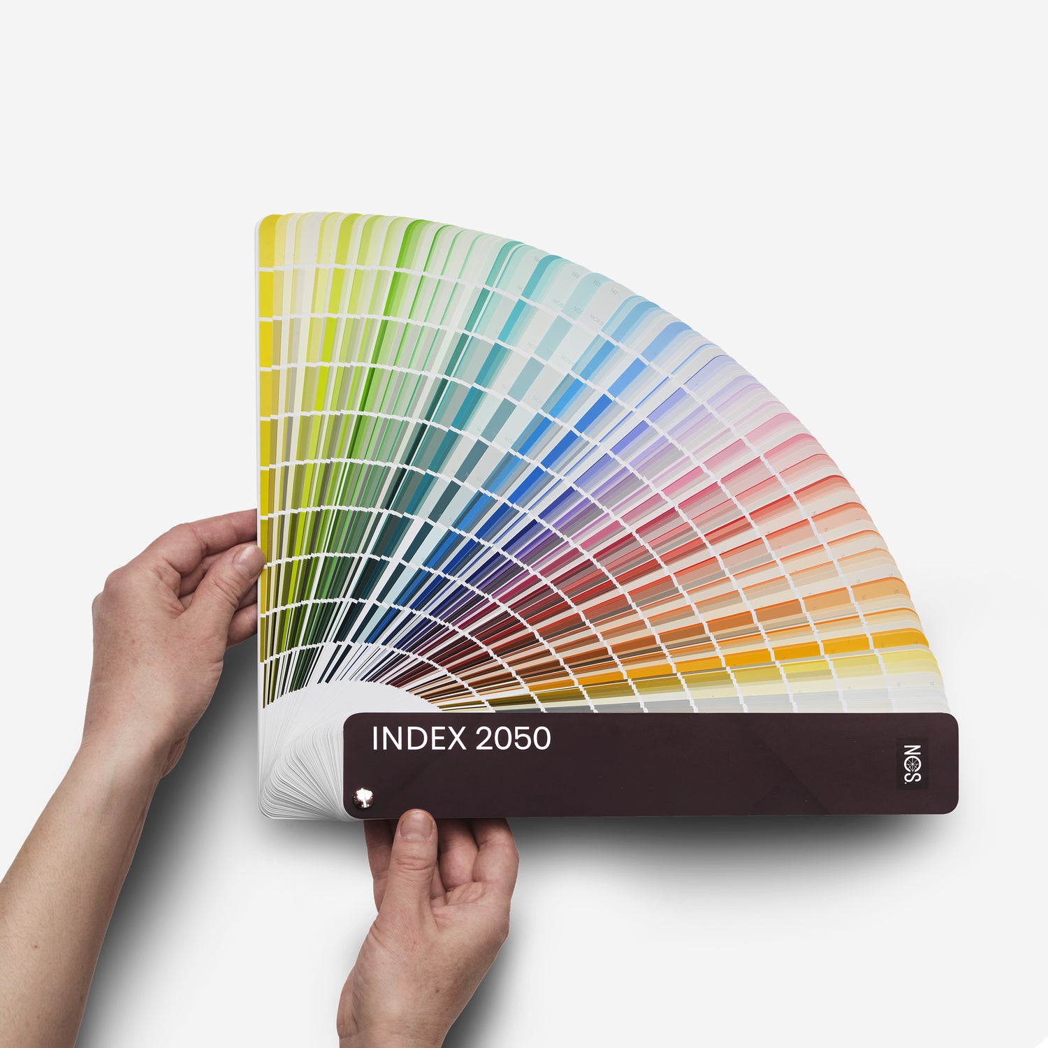
The NCS System allows you to describe any imaginable surface colour and be given an NCS Notation. This has made the colour system a global standard for the definition, quality assurance, and communication of colour.
A colour system of logic
Use the ingenuity of the NCS System to create harmonious colour combinations. Compositions of colours with one or more of these similarities tend to be more harmonious than others.
With a colour system like NCS that is based on visual perception, you can easily find harmonious colour combinations that bring order to the infinity of possible colour combinations.
Note that the NCS System is based how we perceive colour, hence other surrounding factors will have an effect on how you will perceive the colour in its environment – e.g. light, tinted windows etc.
The possibilities of colour harmonies and combinations open up with the colour language of NCS. On this page, you will learn how to use the NCS System to amplify your colour choices and creation of colour palettes.
NCS+
Access the NCS System digitally
Navigate all of the NCS System and rely on its logic throughout your creative journey.
Sign up
using the ncs system
Creating harmonising colour combinations
The NCS System allows you to validate and refine your colour choices. Translate your inspiration into functioning colour palettes and learn how to use the NCS System in your work below.
Hue
Colours with the same hue belongs to the same colour family. Colours with the same hue are found on the same place in the circle, for example, all nuances of R80B. These colours are all on the same triangle and page in theNCS Atlas 2050. Hue is a common way of combining colours in interior design.
HUE -R80BHere illustrated with 3 different nuances of the hue -R80B.


Nuance
Colour samples with the same nuance have the same position in the colour triangle regardless of hue, but are on different pages of the NCS Atlas. Nuance is useful when choosing colours for a colour assortment or interior design.
NUANCE 3020Here illustrated with 3 different hues of the same nuance 3020.
Chromaticness
Colour samples that have the same chromaticness are found on a straight line parallel to the greyscale between white (W) and black (S). The less chromatic a colour is, the closer it is to the greyscale. Chromaticness is useful in interior design and pattern compositions.
CHROMATICNESS XX05Here it is illustrated with three different colours with the same chromaticness (05).


Blackness
Colour samples that have the same blackness are found on a straight line parallel to the scale between white (W) and the maximum colour (C). The less blackish the colour is, the closer it is to this scale. Blackness is also useful in interior design.
BLACKNESS 20XXHere it is illustrated with three different colours with the same blackness (30).
Whiteness
Colour samples which have the same whiteness are found on a straight line parallel to the scale between black (S) and the maximum colour (C). The less whitish the colour, the closer it is to this scale. Whiteness is useful in pattern compositions.
The whiteness is calculated the following way: 100% - (S + C) = whiteness%.
Here it is illustrated with three different colours with the same whiteness (60). E.g., the whiteness in the nuance 3010 is calculated as 30 + 10 = 40, 100 - 40 = 60, so the whiteness is 60.

NCS attributes
Colour similarities
The NCS System gives opportunities to experiment with other colour attributes as well. The similarities in hue, nuance, chromaticness, blackness and whiteness are NCS elementary attributes and are naturally found in the NCS System. However, other colour similarities such as saturation similarity, lightness similarity and complementary colours can be defined by the NCS System despite not being elementary attributes.
Close related colours
Close related colours are colours that are within ten steps of each other on the colour circle. They can be anywhere on the circle, but they must have a maximum distance of ten steps. Here it is illustrated with three different hues: S 4055-R70B, S 1040-R60B and S 2050-R40B. These colours are also different nuances, which makes them more interesting.

Colours with the same saturation
There are many different definitions of visual saturation. Historically, and especially among artists, saturation means a colour that is strong chromatically. Today, however, there are many different colours called saturated colours. It tends to be more of a personal preference. There are two common definitions of saturation:
- Saturation in a general context:
The chromaticness/colourfulness of a colour percept judged in proportion to its brightness.
- Saturation as defined by NCS:
The attribute of a chromatic colour percept expressing the relationship between its chromaticness and whiteness.
If whiteness and chromaticness are perceived as having the same proportional relation to each other when blackness varies, we speak of colours with the same saturation. In the NCS triangle, they are found on a straight line through from the black point S to a given place on the scale between W and C. The saturation, which is designated by m, is expressed by m = c / (c + w) or m = c / (100 - s).

An example
4030-Y90R has m = 0.5 and 6020-Y90R has m = 0.5.
Colours with the same lightness
A difference in lightness between two colours is probably the most important factor in the visual experience of a pattern or form. Lightness shows how two colours contrast each other. It is also vital for the design and colour schemes of exterior and interior environments, especially for weak-sighted persons (e.g. the elderly) who need lightness contrast between different surfaces to be able to orientate themselves.
Lightness is not the same as whiteness. Whiteness and blackness are elementary attributes in the same way as yellowness, redness, blueness and greenness are, in that they characterize a colour. Lightness is not an elementary attribute, but it can be determined by comparing colours via greyscale or through instrumental measurement. A yellow colour has an inherent lightness, while a blue colour has an inherent darkness.

Inherent lightness
Following the triangle's lines.

Inherent darkness
Against the triangle's lines.
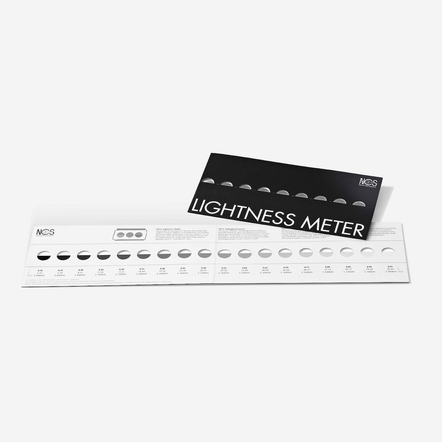
Since lightness is not an elementary attribute, it is not described by NCS notation nor is it directly indicated by NCS symbols. In the NCS Atlas, colours that are alike in lightness are indicated with lines in each colour triangle. The NCS lightness value is indicated with a “v” in the NCS Atlas on the left-hand side of the triangle between W and S. There is also a lightness scale (NCS Lightness Meter) with 18 steps that is a good aid in assessing the lightness of different colours.
Complementary colours
Complementary colours are defined in many ways in literature and reference works. When described as afterimages, you will find them as endpoints of straight lines intersecting the NCS Colour Circle at a point with the approximate position of chromaticness = 20, hue = R75B.
They are not exact opposite colours as the point is not in the centre of the circle. This is because NCS was not constructed according to the complementary colour theory and colour mixing principles.