

100 neue Farben: Design-Zusammenarbeit
Wir haben mit zwei Designern zusammengearbeitet, die jeweils über ein umfangreiches Portfolio verfügen und mit renommierten Kunden und Marken zusammenarbeiten.
Erlauben Sie uns, Ihnen die schwedische Innenarchitektin Cecilia Rosvall (@designbycilla) und die italienische Textildesignerin Silvia Stella Osella (@silviaosella_) vorzustellen.

Cecilia Rosvall
Cecilias Markenzeichen ist die Gestaltung farbenfroher und inspirierender Räume. Sie wird mit einer Auswahl der Farben ein Schlafzimmerdesign entwerfen. Wir begleiten den gesamten Prozess, vom Moodboard bis zum Ergebnis.

Silvia Stella Osella
Silvia Stella Osella ist eine italienische Textil- und Oberflächendesignerin und Farbberaterin mit Sitz in Mailand. Silvia wird aus einer Auswahl der 100 neuen Farben eine Tapete erstellen. Folgen Sie ihrem Prozess unten.
Cecilia Rosvall
Cecilias Markenzeichen ist die Gestaltung farbenfroher und inspirierender Räume. Sie wird mit einer Auswahl der Farben ein Schlafzimmerdesign entwerfen. Wir begleiten den gesamten Prozess, vom Moodboard bis zum Ergebnis.
Silvia Stella Osella
Silvia Stella Osella ist eine italienische Textil- und Oberflächendesignerin und Farbberaterin mit Sitz in Mailand. Silvia wird aus einer Auswahl der 100 neuen Farben eine Tapete erstellen. Folgen Sie ihrem Prozess unten.
Neugestaltung mit Cecilia Rosvall
Bedroom makeover.
Verfolgen Sie, wie Cecilia in Zusammenarbeit mit uns ihr Schlafzimmer neu gestaltet. Um einen dezenten, aber dennoch farbenfrohen Eindruck in ihrem Schlafzimmer zu erzeugen, entschied sich Cecilia für die Wandfarbe NCS S 3005-B50G, für die Inneneinrichtung ein sanftes, kühles Rosa NCS S 3005-R und für ein Regal in der wärmeren Farbe NCS S 3005-Y20R . Sehen Sie, wie es ausgegangen ist!


Moodboarding
Cilla wählte ihre Farben aus der Auswahl unserer 100 neuen Farben. Sie begann mit einer Auswahl eher blauer Töne, einer mit mehr Grüntönen und einer mit Rottönen. Sie wollte, dass ihre endgültige Farbpalette eine harmonische Farbkombination ist, die dennoch etwas Besonderes hat.

Moodboarding
Cilla wählte ihre Farben aus der Auswahl unserer 100 neuen Farben. Sie begann mit einer Auswahl eher blauer Töne, einer mit mehr Grüntönen und einer mit Rottönen. Sie wollte, dass ihre endgültige Farbpalette eine harmonische Farbkombination ist, die dennoch etwas Besonderes hat.
„Für mich ist Nordic Green NCS S 3005-B50G eine Farbe, die sowohl zu großen als auch zu kleinen Räumen unterschiedlicher Art passt.“
Die ausgewählte Palette

S 3005-B50G

S 3005-R

S 3005-Y20R
S 3005-B50G
S 3005-R
S 3005-Y20R
„Für mein Schlafzimmerdesign habe ich NCS S 3005-B50G oder ‚Nordic Green‘ als Grundlage für die Farbgebung gewählt. Je nach Raumrichtung wird die Farbe eher blau oder eher grün wahrgenommen.


Unser neues Nordic Green, NCS S 3005-B50G, ist ein Mittelton, der uns in eine Stimmung der Ruhe und Entspannung verwöhnt. Es handelt sich um eine Farbe, die weder als chromatisch noch als neutral wahrgenommen wird. Cecilia wollte diese spezielle neue NCS-Farbe verwenden, da sie weder zu dunkel noch zu hell ist. Ihr Schlafzimmer ist nach Norden ausgerichtet, und oft werden blaugrüne Nuancen in diesen Fällen eher als violett wahrgenommen. Aber wie Cilla sagt:
„Da es in dieser Farbe, NCS S 3005-B50G, ziemlich viel Grün ist, war das Ergebnis ganz zauberhaft und passt perfekt zu unserem Bett mit seinen Textilien in Blaugrün.“
Unser neues Nordic Green, NCS S 3005-B50G, ist ein Mittelton, der uns in eine Stimmung der Ruhe und Entspannung verwöhnt. Es handelt sich um eine Farbe, die weder als chromatisch noch als neutral wahrgenommen wird. Cecilia wollte diese spezielle neue NCS-Farbe verwenden, da sie weder zu dunkel noch zu hell ist. Ihr Schlafzimmer ist nach Norden ausgerichtet, und oft werden blaugrüne Nuancen in diesen Fällen eher als violett wahrgenommen. Aber wie Cilla sagt:
„Da es in dieser Farbe, NCS S 3005-B50G, ziemlich viel Grün ist, war das Ergebnis ganz zauberhaft und passt perfekt zu unserem Bett mit seinen Textilien in Blaugrün.“
Zartrosa Inneneinrichtung
Die sanfte Rosanuance NCS S 3005-R, die leicht als Aubergine wahrgenommen werden kann, passt hervorragend zur gedeckten blaugrünen Wand.
„Wer weiß, vielleicht streiche ich sogar die Decke mit dieser Farbe! Ich finde, das ist so eine coole Kombination.“


Zartrosa Inneneinrichtung
Die sanfte Rosanuance NCS S 3005-R, die leicht als Aubergine wahrgenommen werden kann, passt hervorragend zur gedeckten blaugrünen Wand.
„Wer weiß, vielleicht streiche ich sogar die Decke mit dieser Farbe! Ich finde, das ist so eine coole Kombination.“
„Ich liebe gedämpfte Pastelltöne und unter den 100 neuen NCS-Standardfarben gibt es viele Favoriten! Außerdem sind sie so schön zu kombinieren und lassen sich leicht in Kombinationen kombinieren, die auf Schwarz basieren.“

String-Regal in einem warmen Mittelton lackiert
Angesichts Cecilias mittelgrüner Wände und zartrosa Inneneinrichtung entschied sie sich für das wärmere NCS S 3005-Y20R als Farbe ihres String-Regals. Durch die Kombination der drei Farben entsteht eine Farbpalette, die harmonisch und zugleich kantig ist – ganz so, wie sie es sich vorgestellt hat.
String-Regal in einem warmen Mittelton lackiert
Angesichts Cecilias mittelgrüner Wände und zartrosa Inneneinrichtung entschied sie sich für das wärmere NCS S 3005-Y20R als Farbe ihres String-Regals. Durch die Kombination der drei Farben entsteht eine Farbpalette, die harmonisch und zugleich kantig ist – ganz so, wie sie es sich vorgestellt hat.
Design mit Silvia Stella Osella
Wallpaper creation.
Für Silvia Stella Osella,Textildesignerin & Farb-, Trend- und Nachhaltigkeitsberaterin, spielt Farbe von Anfang an in ihrem beruflichen Werdegang immer eine besondere Rolle. Ob sie eine Tapete entwirft, Textilkollektionen kreiert oder Unternehmen bei der Auswahl der besten Farbtöne für ihre Produkte berät.

Im Mittelpunkt ihres Designprozesses steht die Kunst, einen Raum oder ein Konzept zu schaffen, das die Vision des Kunden und den einzigartigen Charakter des Projekts wirklich widerspiegelt. Es ist wichtig sicherzustellen, dass jede Farbauswahl einem Zweck dient. Silvias Hauptziel ist es, beim Design stets auf Nachhaltigkeit zu achten.
„Bewusstes Design bedeutet auch, die richtigen Farben zu finden, solche, die wirklich bedeutungsvolle Geschichten um uns herum verkörpern können, und solche, die hoffentlich über die Zeit Bestand haben.“
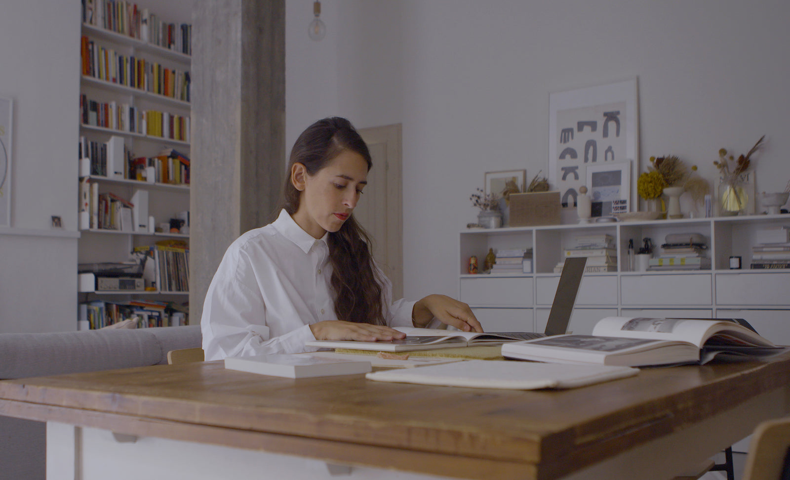
Silvia findet ihre Inspiration normalerweise durch den Besuch von Messen, die Analyse von Trends, die Verfolgung von Konferenzen und so weiter.
„Was viele ‚Inspiration‘ nennen, ist für mich tatsächlich zu 90 % eine Frage der Forschung! Dann steckt natürlich noch mehr dahinter: Und das kommt von meinen Reisen, Kunstausstellungen, Büchern usw.“
Dies entspringt ihrem festen Wunsch, etwas Sinnvolles schaffen zu wollen, etwas, das den Menschen tatsächlich lange erhalten bleiben möchte.

Es ist schwierig, über Farben und Design zu sprechen, ohne das Thema Kreativität anzusprechen. Wir fragen Silvia, was dieses Wort für sie bedeutet?
„Es bedeutet etwas, ohne das ich mir ein Leben nicht vorstellen könnte und das praktisch jeden Aspekt meines Lebens durchdringt. Ich betrachte es nicht einfach als etwas, auf dem ich meine Karriere aufgebaut habe, sondern vielmehr als eine Art, das Leben zu erleben, die meiner Meinung nach jeder hat, nur in unterschiedlichen Formen und Ausprägungen!“
Silvia findet ihre Inspiration normalerweise durch den Besuch von Messen, die Analyse von Trends, die Verfolgung von Konferenzen und so weiter.
„Was viele ‚Inspiration‘ nennen, ist für mich tatsächlich zu 90 % eine Frage der Forschung! Dann steckt natürlich noch mehr dahinter: Und das kommt von meinen Reisen, Kunstausstellungen, Büchern usw.“
Dies entspringt ihrem festen Wunsch, etwas Sinnvolles schaffen zu wollen, etwas, das den Menschen tatsächlich lange erhalten bleiben möchte.
Es ist schwierig, über Farben und Design zu sprechen, ohne das Thema Kreativität anzusprechen. Wir fragen Silvia, was dieses Wort für sie bedeutet?
„Es bedeutet etwas, ohne das ich mir ein Leben nicht vorstellen könnte und das praktisch jeden Aspekt meines Lebens durchdringt. Ich betrachte es nicht einfach als etwas, auf dem ich meine Karriere aufgebaut habe, sondern vielmehr als eine Art, das Leben zu erleben, die meiner Meinung nach jeder hat, nur in unterschiedlichen Formen und Ausprägungen!“
Die Schlüsselfarben aus Silvias Projekt

S 1502-Y20R

S 4502-Y50R

S 3005-Y

S 3005-B

S 8005-B
S 1502-Y20R
S 4502-Y50R
S 3005-Y
S 3005-B
S 8005-B

„In letzter Zeit spiele ich viel mit ungewöhnlichen Neutraltönen, ich denke, diese Farbtöne haben viel Potenzial! Sowohl in den nordischen Mitteltönen als auch in den Great Greys habe ich tolle neue Farbtöne gefunden, die ich in mein Tapetendesign integrieren kann.“
Silvia erzählt uns, dass ihr die Tiefe, die die 100 neuen Farben vermitteln, sehr gefällt.
„Ich habe wirklich das Gefühl, dass die von NCS ausgewählten Farbgeschichten so viele Atmosphären perfekt verkörpern, etwas sehr Zeitgenössisches, aber gleichzeitig Vertrautes und Beruhigendes.“

„In letzter Zeit spiele ich viel mit ungewöhnlichen Neutraltönen, ich denke, diese Farbtöne haben viel Potenzial! Sowohl in den nordischen Mitteltönen als auch in den Great Greys habe ich tolle neue Farbtöne gefunden, die ich in mein Tapetendesign integrieren kann.“
Silvia erzählt uns, dass ihr die Tiefe, die die 100 neuen Farben vermitteln, sehr gefällt.
„Ich habe wirklich das Gefühl, dass die von NCS ausgewählten Farbgeschichten so viele Atmosphären perfekt verkörpern, etwas sehr Zeitgenössisches, aber gleichzeitig Vertrautes und Beruhigendes.“

„In letzter Zeit spiele ich viel mit ungewöhnlichen Neutraltönen, ich denke, diese Farbtöne haben viel Potenzial! Sowohl in den nordischen Mitteltönen als auch in den Great Greys habe ich tolle neue Farbtöne gefunden, die ich in mein Tapetendesign integrieren kann.“
Silvia erzählt uns, dass ihr die Tiefe, die die 100 neuen Farben vermitteln, sehr gefällt.
„Ich habe wirklich das Gefühl, dass die von NCS ausgewählten Farbgeschichten so viele Atmosphären perfekt verkörpern, etwas sehr Zeitgenössisches, aber gleichzeitig Vertrautes und Beruhigendes.“
Silvia erklärt, dass der größte Spaß an ihrer Arbeit darin besteht, dass jedes Projekt so unterschiedlich ist.
„Mit einem großartigen Satz an Tools wie denen von NCS kann ich meine Ideen und meine Kreativität in eine universelle Sprache übersetzen. Ich entwerfe gerade ein neues Hintergrundbild für 2024 und diese Farbtöne haben mir so viele Anregungen gegeben!“
Da Silvia in der Regel mit einer Vielzahl von Kunden und Projekten arbeitet, verläuft jedes Projekt auch anders.

„In letzter Zeit spiele ich viel mit ungewöhnlichen Neutraltönen, ich denke, diese Farbtöne haben viel Potenzial! Sowohl in den nordischen Mitteltönen als auch in den Great Greys habe ich tolle neue Farbtöne gefunden, die ich in mein Tapetendesign integrieren kann.“
Silvia erzählt uns, dass ihr die Tiefe, die die 100 neuen Farben vermitteln, sehr gefällt.
„Ich habe wirklich das Gefühl, dass die von NCS ausgewählten Farbgeschichten so viele Atmosphären perfekt verkörpern, etwas sehr Zeitgenössisches, aber gleichzeitig Vertrautes und Beruhigendes.“
Silvia erklärt, dass der größte Spaß an ihrer Arbeit darin besteht, dass jedes Projekt so unterschiedlich ist.
„Mit einem großartigen Satz an Tools wie denen von NCS kann ich meine Ideen und meine Kreativität in eine universelle Sprache übersetzen. Ich entwerfe gerade ein neues Hintergrundbild für 2024 und diese Farbtöne haben mir so viele Anregungen gegeben!“
Da Silvia in der Regel mit einer Vielzahl von Kunden und Projekten arbeitet, verläuft jedes Projekt auch anders.
„Ich habe das Glück, an vielen verschiedenen Projekten zu arbeiten, sowohl im Innen- als auch im Modebereich, und das macht mir am meisten Spaß! Ich liebe es, wie all diese Vielfalt es mir ermöglicht, jeden Tag neue Dinge zu lernen.“
Mehr über unsere 100 neuen Farben
Unsere 100 neuen Farben liegen im niedrigchromatischen Bereich, um mehr Optionen und eine bessere Kontrolle bei der Arbeit mit diesen Farben zu bieten. Perfekt für Innen-, Außen- und Produktdesign. Mit der Aktualisierung von 100 neuen NCS-Standardfarben kommen auch Aktualisierungen unserer Design-Tools.
Entdecken Sie weitere Produkte von 2050
NCS-DESIGN-TOOLS


