
Dark
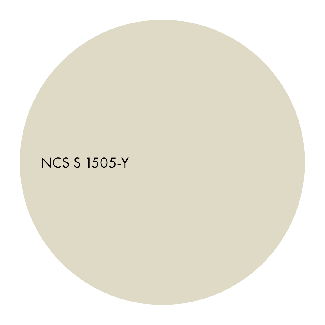
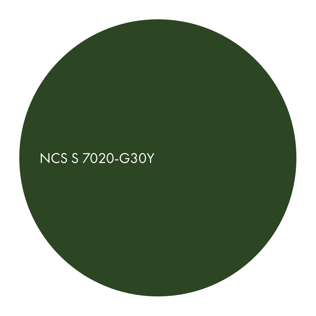
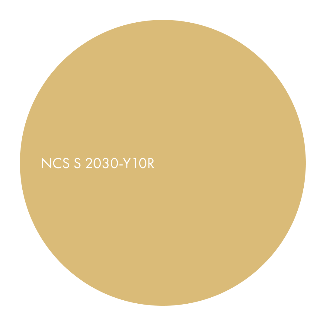
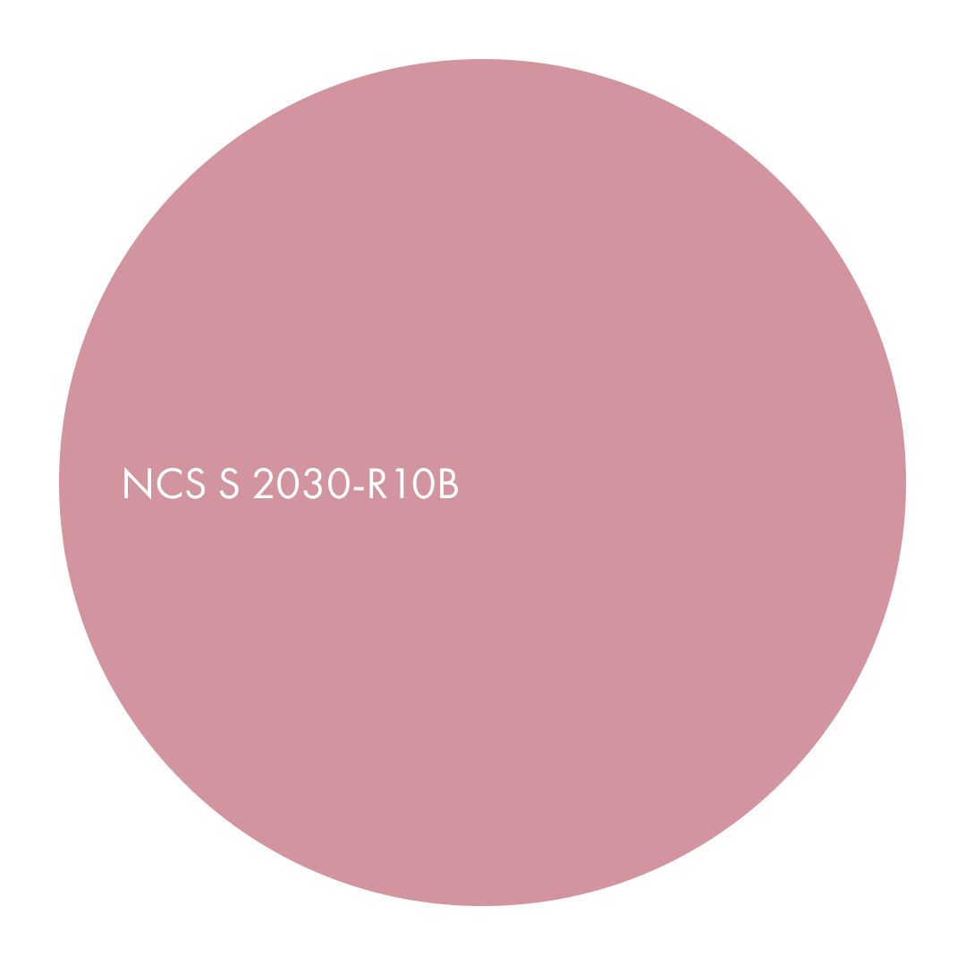
A colour area defined by muted, deep nuances that absorb light, emphasise texture and invite touch. These colours create grounded, intimate spaces where materials feel real and present.
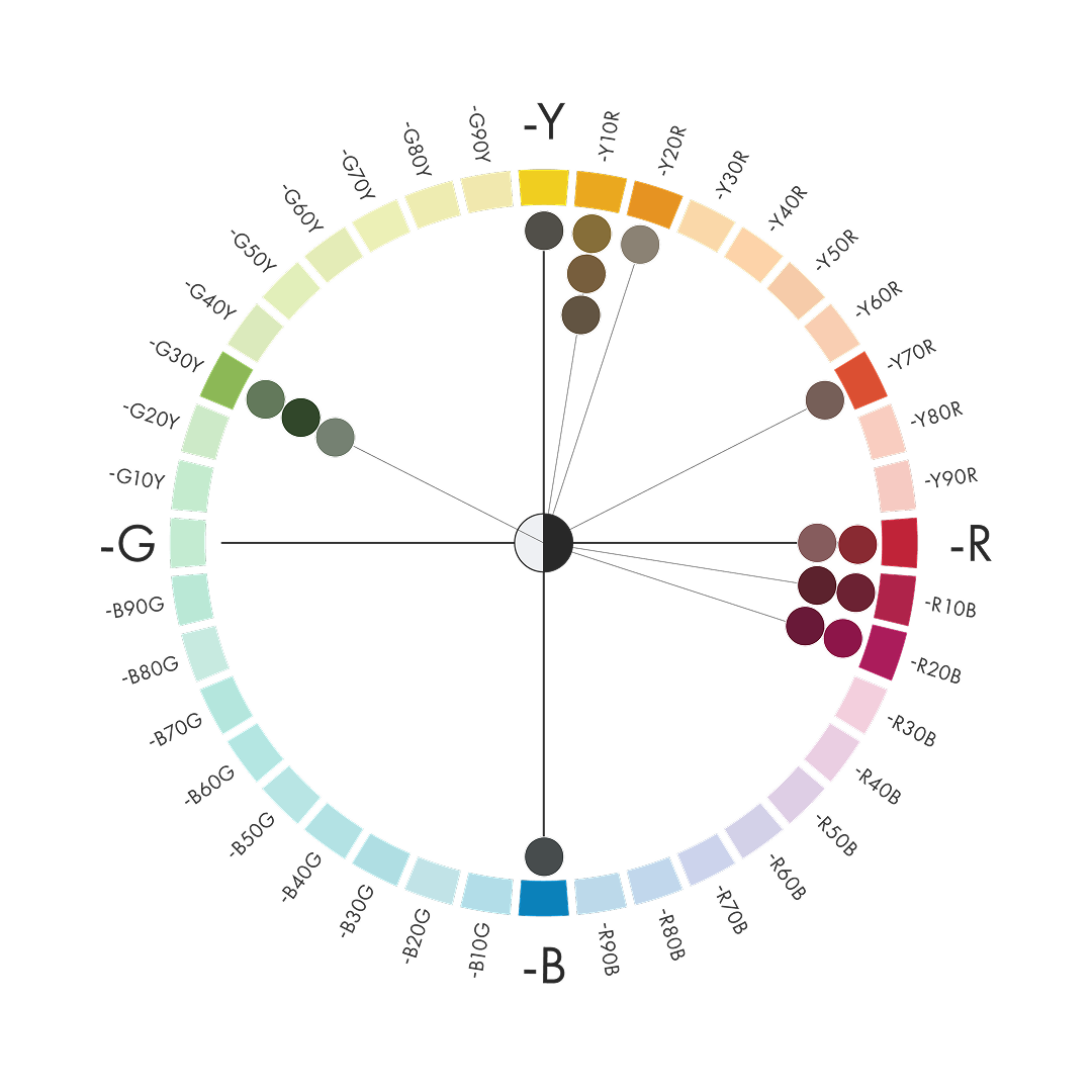
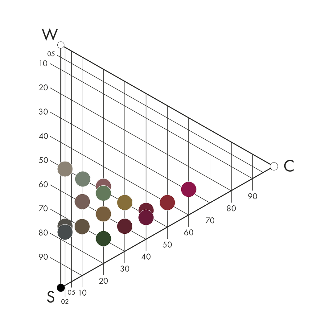
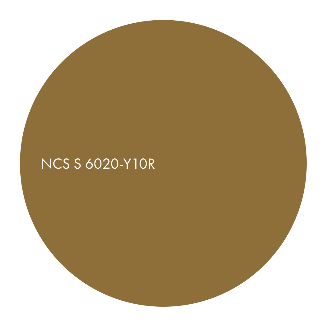
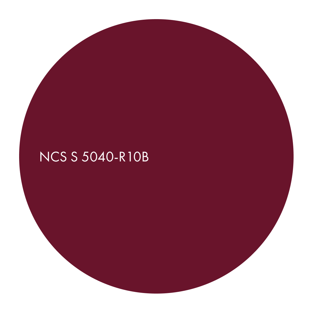
Dull dark, dark and deep nuances in the NCS System define Dull Dark. These hues behave more like materials than colours, carrying a sense of weight and presence that is felt as much as it is seen. Light moves slowly across these surfaces, revealing texture, softness and depth. The palette creates an atmosphere that feels close to the body and grounded in physical sensation. Colours such as NCS S 6020-Y10R, NCS S 7020-G30Y or NCS S 4050-R has a quiet authority not loud, but deeply atmospheric.
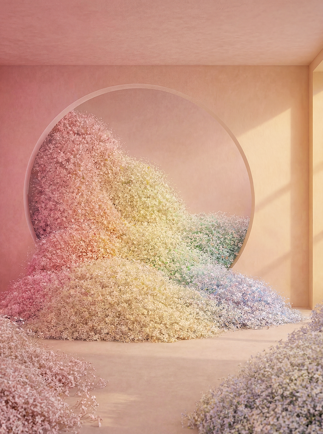
As our environments become increasingly digital and light-filled, there is a renewed desire for colours that reconnect us with materiality. Dull Dark offers hues that bring intimacy, tactility and a feeling of crafted warmth into architecture and interiors.

Hue tendencies: earthy reds, muted greens, deep yellow-reds, and dark neutrals

Chromaticness: Medium to strong

Nuance family: Dull Dark, Dark
-

Hue tendencies: earthy reds, muted greens, deep yellow-reds, and dark neutrals
-

Chromaticness: Medium to strong
-

Nuance family: Dull Dark, Dark
Dull Dark / Dark colours absorb and shape light, revealing texture and detail through shadow. They make materials feel closer, surfaces feel touchable and spaces feel grounded. This Colour Area reflects a growing need for depth without heaviness, tactility without drama, and intimacy without darkness.
Behaviour: absorbs light, emphasises texture, creates tactile depth
Applications: feature walls, cabinetry, textiles, panel surfaces, sculptural architectural forms
What shapes the Dark colour area? The Forecast Council identified a shared shift towards colours that reconnect us with physicality and material experience. As life becomes faster and more screen-based, there is a growing desire for hues that carry weight, tactility and emotional grounding.
- From Europe, designers highlighted the appeal of clay-like pigments and deep mineral tones that feel crafted rather than processed.
- From the United States, insights centred on creating depth in multifunctional spaces where darker tones help define zones and anchor the interior.
- From China and East Asia, the need for colours that add softness and physical presence to compact spaces was emphasised.Scandinavian experts noted the emotional value of deeper muted tones that offer calm through weight rather than brightness.
-
What shapes the Dark colour area? The Forecast Council identified a shared shift towards colours that reconnect us with physicality and material experience. As life becomes faster and more screen-based, there is a growing desire for hues that carry weight, tactility and emotional grounding.
-
- From Europe, designers highlighted the appeal of clay-like pigments and deep mineral tones that feel crafted rather than processed.
- From the United States, insights centred on creating depth in multifunctional spaces where darker tones help define zones and anchor the interior.
- From China and East Asia, the need for colours that add softness and physical presence to compact spaces was emphasised.Scandinavian experts noted the emotional value of deeper muted tones that offer calm through weight rather than brightness.
-
Tactile depth
-
-
Grounded expression
-
-
Soft shadow
From colour area to space
3 combinations of Dark. The combinations show how Dark unfolds in real environments. Each one explores a different expression of tactility, depth and warmth, offering designers a starting point for shaping atmosphere and material presence. Always keeping both other colours from the three colours areas that have been identified as important.
Tactile depth
This combination begins with NCS S 6020-Y10R, a deep earthy tone that behaves almost like compacted clay or pigmented plaster. On walls, it absorbs light softly, creating a sense of stability and tactile comfort.
A lighter supporting note such as NCS S 1505-Y brings quiet warmth, preventing the palette from becoming too dense. The third tone – NCS S 2005-B80G – adds a cool, mineral counterbalance that introduces refinement and spatial breath.
Tactile depth
-
This combination begins with NCS S 6020-Y10R, a deep earthy tone that behaves almost like compacted clay or pigmented plaster. On walls, it absorbs light softly, creating a sense of stability and tactile comfort.
-
A lighter supporting note such as NCS S 1505-Y brings quiet warmth, preventing the palette from becoming too dense. The third tone – NCS S 2005-B80G – adds a cool, mineral counterbalance that introduces refinement and spatial breath.


Material suggestions
- Clay or microcement wall finishes
- Brushed or smoked oak
- Wool or felt upholstery in muted earth tones
- Stoneware with matte glaze
Suitable for
Libraries, quiet lounges, restorative retreats, hospitality spaces with tactile focus
Grounded expression
Led by NCS S 7020-G30Y, a deep muted green, this combination creates a grounded and calm architectural envelope. It pairs beautifully with natural materials and low-gloss finishes.
The warm mid-tone S 2030-R10B adds a crafted, almost textile-like softness, while S 2030-Y10R brings a warm, sunlit contrast that lifts the palette without reducing its depth.
Grounded expression
-
Led by NCS S 7020-G30Y, a deep muted green, this combination creates a grounded and calm architectural envelope. It pairs beautifully with natural materials and low-gloss finishes.
-
The warm mid-tone S 2030-R10B adds a crafted, almost textile-like softness, while S 2030-Y10R brings a warm, sunlit contrast that lifts the palette without reducing its depth.


Material suggestions
- Dark-stained wood, especially walnut or chestnut
- Terracotta tiles or ceramics
- Matte lacquer in muted rose or berry tones
- Natural fibres: linen, hemp, handwoven textiles
Suitable for
Restaurants, co-working spaces, boutique retail, atmospheric residential interiors
Soft shadow
This combination centres on S 4050-R, a deep muted red that creates a dramatic but controlled backdrop. Its muted chroma prevents it from overtaking the room, making it ideal for creating intimacy.
A light supporting tone like S 0510-R20B introduces a soft, powdery counterpoint — perfect for objects, alcoves or curved architectural forms. S 1505-Y serves as a subtle warm grounding note to stabilise the palette.
Soft shadow
-
This combination centres on S 4050-R, a deep muted red that creates a dramatic but controlled backdrop. Its muted chroma prevents it from overtaking the room, making it ideal for creating intimacy.
-
A light supporting tone like S 0510-R20B introduces a soft, powdery counterpoint — perfect for objects, alcoves or curved architectural forms. S 1505-Y serves as a subtle warm grounding note to stabilise the palette.


Material suggestions
- Velvet or brushed wool textiles
- Burnished metal or oxidised bronze details
- Rich matte paint or soft-touch lacquer
- Dark terracotta or red clay objects
Suitable for
Intimate dining settings, gallery environments, evening spaces, sculptural interiors
All colours of area Dark


