

Tengbom is one of Sweden’s oldest architectural firms, founded in 1906. The company offers comprehensive expertise in architecture and interior design, where both large and small details play a central role in shaping inspiring and functional environments. Among those carrying this tradition forward is Nadia Tolstoy, who has worked as an interior architect at Tengbom for more than a decade. Nadia shares her perspective on colour, design and the importance of the Natural Colour System (NCS) in daily practice.
About Tengbom
Founded in 1906, Tengbom is one of Sweden’s most established architectural firms, known for designing sustainable, functional and meaningful environments. With approximately 350 employees across offices in Sweden and Finland, the company delivers expertise in architecture, interior design, urban planning, landscape, sustainability and digital methods.
Sustainability and quality are integrated into every project. Tengbom is certified according to ISO 9001 and 14001 and publishes an annual sustainability report. Collaboration is at the core of the company’s process, bringing together diverse perspectives from analysis to final design. This approach has earned Tengbom numerous awards and a reputation as a leading force in Nordic architecture.

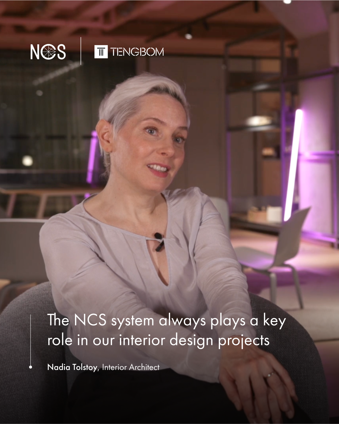
Nadia Tolstoy, Interior Architect at Tengbom
With over ten years at Tengbom, Nadia brings deep expertise in interior architecture, colour theory and spatial storytelling. Having worked both in Sweden and the United States, Nadia also contributes an international perspective on design cultures and their approach to colour and collaboration.
Favourite colour: NCS S 1502-Y20R
Tengbom on colour in the design process
Colour consistency across products and suppliers
At Tengbom, colour is an essential tool in creating identity and atmosphere. Whether through bold expressions, such as the pink ceilings in their own office, or more subtle palettes based on historic materials, colour shapes how spaces are perceived and experienced.
Nadia describes the NCS System as indispensable in the design landscape. Its precision and universality allow her team to communicate colour clearly across project teams, suppliers and clients. NCS is integrated from the earliest stages, translating digital brand profiles into physical palettes and ensuring that the final result reflects the intended mood and vision.
“The NCS System generally always plays a key role in all of our interior design projects. I can't even think of a project where we didn't at some point have a specified colour that was specified in NCS, or that we didn't use the NCS system for reference somehow in a project. It is completely part of every project that we do.”
– Nadia Tolstoy, Interior Architect at Tengbom

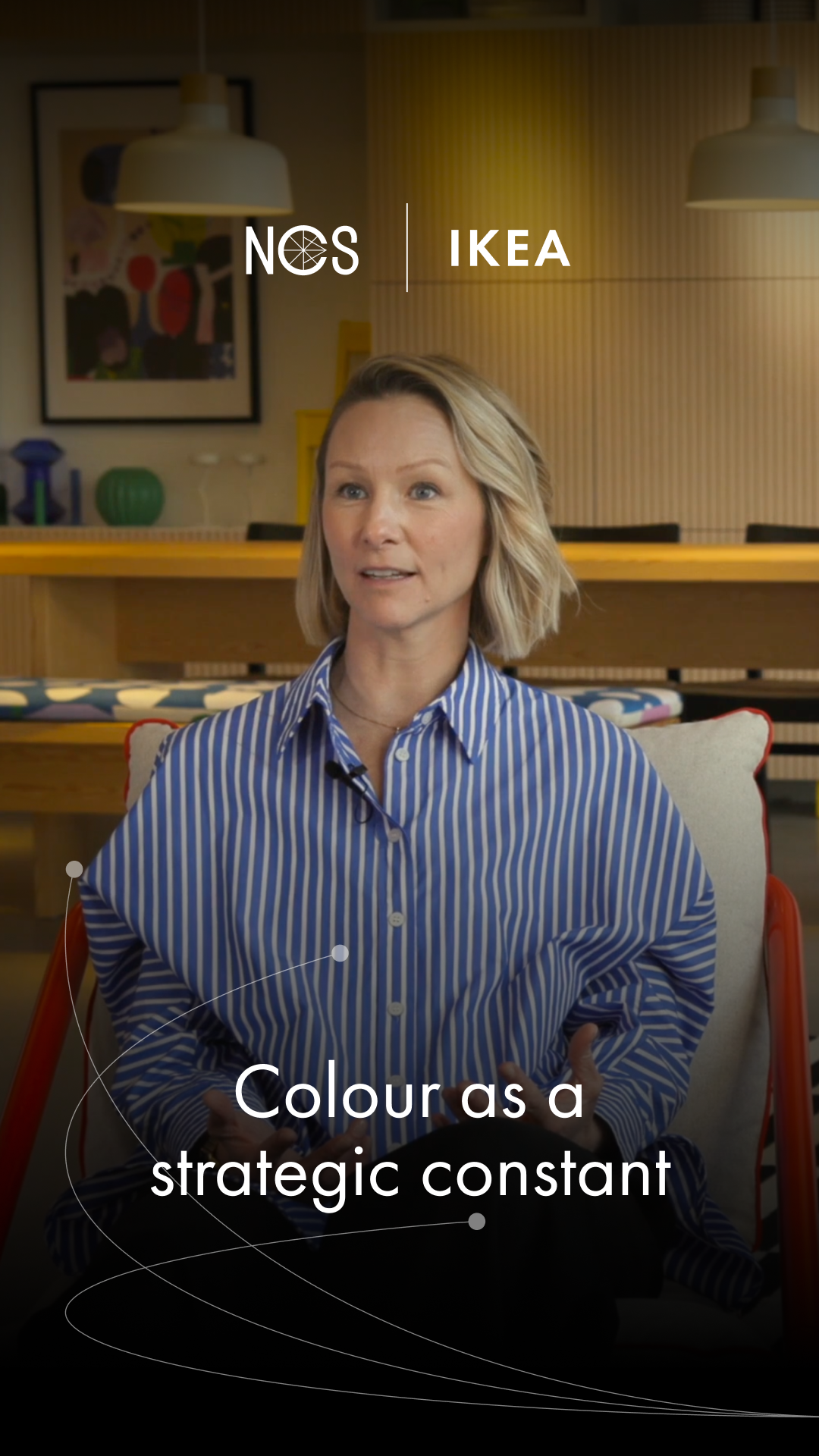
Colour as a strategic design component
Colour at Tengbom is more than aesthetics. It is a language for collaboration. Projects often begin with a vision or a mood board that is gradually refined into a colour palette. By using NCS, these palettes can be defined with accuracy and shared across disciplines without ambiguity.
This process strengthens the connection between brand identity and space. In some projects, colour is the primary driver of atmosphere; in others, it enhances materials such as wood or stone. In every case, NCS enables dialogue that is clear and consistent, both within the project team and with clients.
“Colour is light. Having worked as an architect for so long, I once in a while come across those moments where it's like 'Surely this is not the same NCS code in this light, as in this light. Surely these are two different colours', and then you look at them, and it is the same NCS code. Then it's really useful to have NCS; you can specify an NCS number and then everybody knows what you're referring to."
– Nadia Tolstoy, Interior Architect at Tengbom

The design tools that supports Tengbom's creative precision
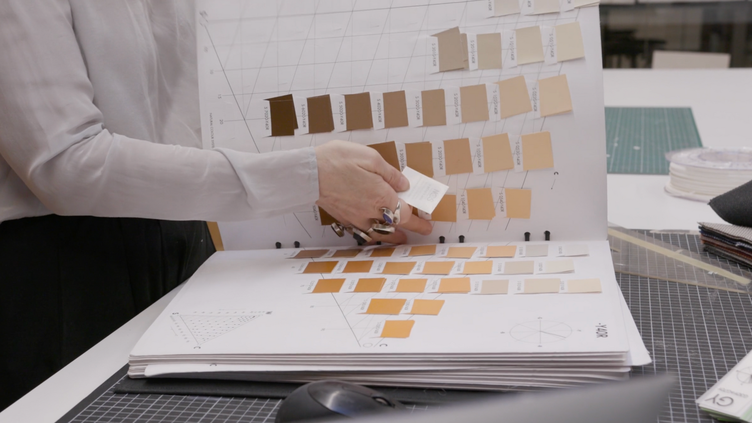
The most central product in Nadia’s colour work is the NCS Album – a large physical colour chart with loose colour samples of all 2050 Standard colours. This serves as the foundation for colour selection in almost every project. Nadia has several sets and almost always starts projects with the albums. They are essential for finding and comparing colour samples, with small colour swatches scattered throughout the office. The albums are Nadia’s absolute favourite, and she wishes she had one at home too.
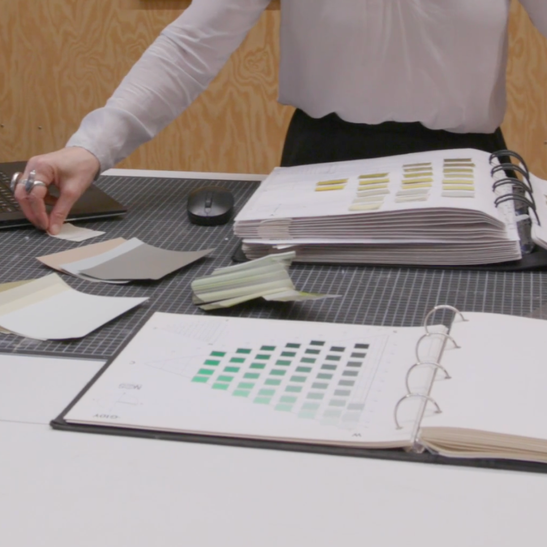
The Atlas 2050 is an important complement to the NCS Albums in Nadia’s and her colleagues colour work. While the albums are their go-to tool, sometimes the small pockets in the albums run out of certain colours – especially popular shades like grey or green. In these cases, the NCS Atlas 2050 use useful as the colours are fixed in place, making it a reliable backup for finding colours when the albums’ loose samples are unavailable. Arranged in the same way as the Album, with the NCS Colour Triangle for each hue, it always provides access to the 2050 Standard colours.
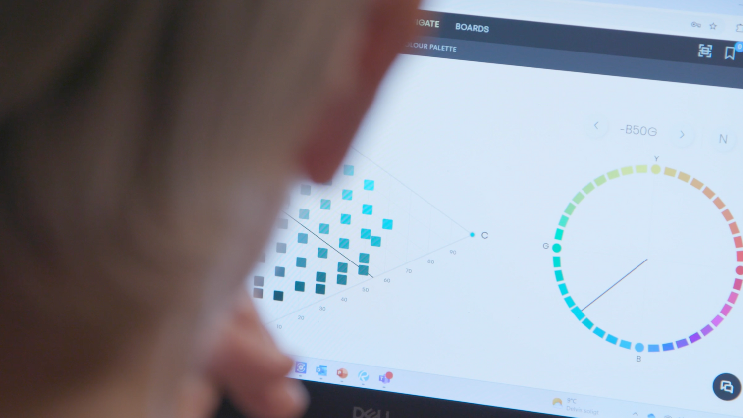
In addition to the physical tools, digital resources have also become increasingly important. Nadia and her team regularly use the NCS website and the digital colour tool NCS+. There, they convert client-provided colour codes of other colour standards into corresponding NCS codes. This is crucial when incorporating colours from, for example, brand guidelines into the physical environment. She also mentions that NCS is used to create digital mood boards and visualisations of colour palettes.
Do you want to learn more about working with NCS?
Please fill out the form below and we will reach out to you.
Discover more from Together in colour


Celebrating 80 years of NCS Colour
The initiativeTogether in colourhonours the 80 year anniversary of NCS Colour. A film series highlights the value of colour and the close partnerships that have shaped NCS Colour over the years – all together celebrating colour’s impact across industries.