


Evening is the deep register, and it is where blackness does the describing. These colours enclose; they hold shadow inside the surface, so a room reads as intimate and held even before the lights are dimmed.
Evening has two faces. There is your own time, the restorative dark, anchored by the return of the blues. And there is time to gather, the golden social hour, warm and convivial.
Deep blue and deep red-brown are the structural anchors. Their high blackness lets a large plane feel like a held room rather than a heavy one, as long as the depth feels like penumbra, filtered and soft, not like a black box.
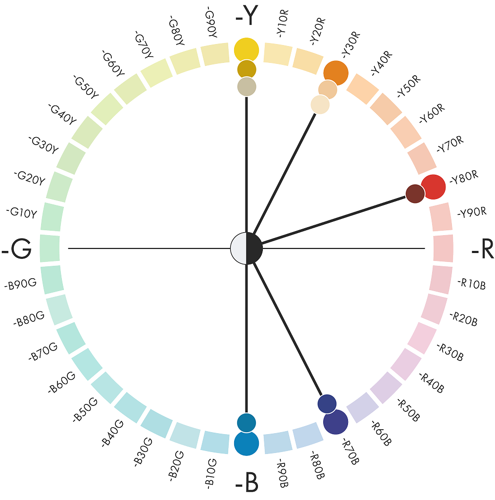
Hue: Deep blues moving from reddish blue to pure blue (R70B → B), set against warm yellows and red-browns (Y → Y80R)
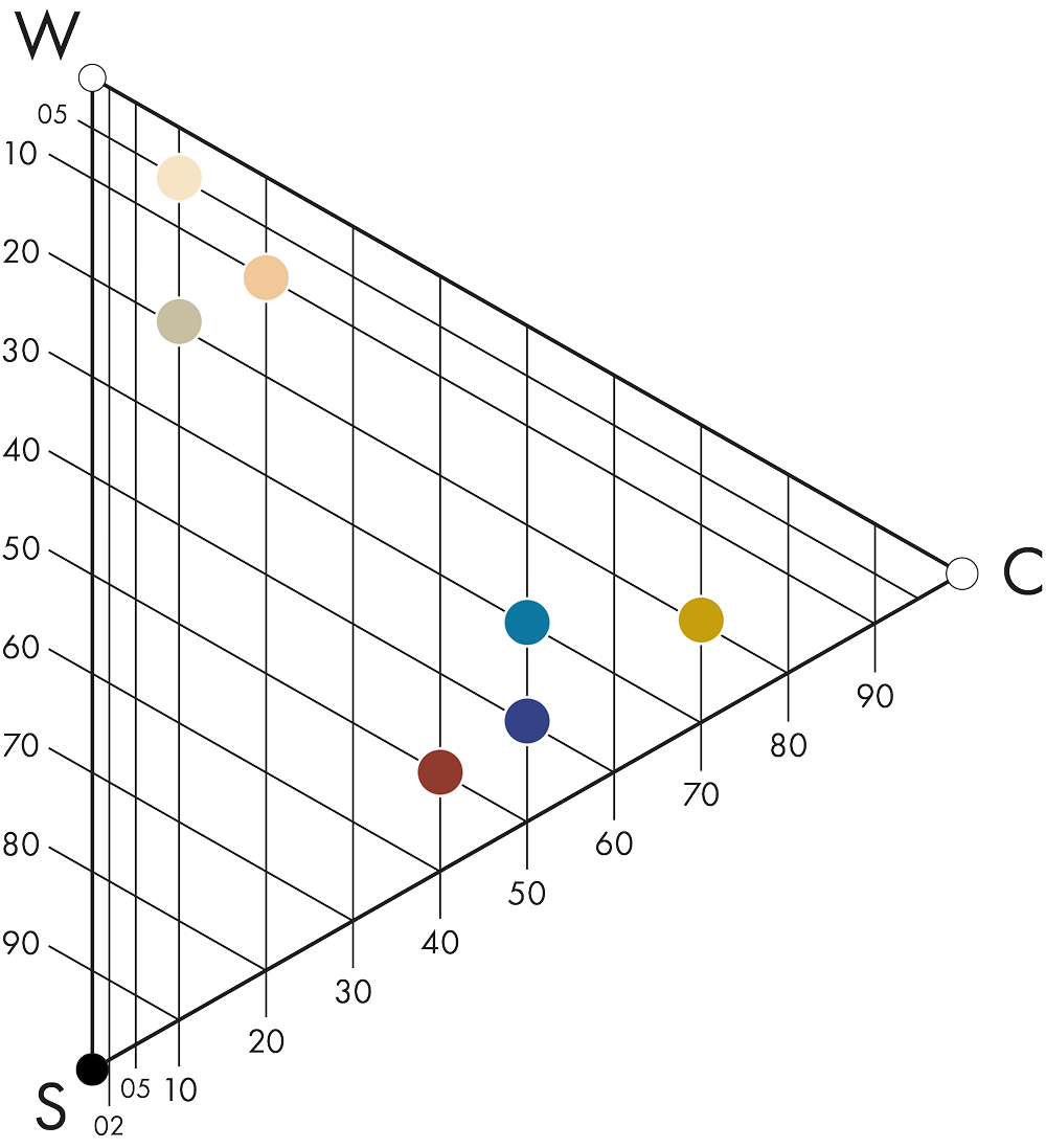
Nuance: Deep anchors with blackness of 30–50, balanced by lighter warm tones (05–20). Chromaticness from 10 to 70


What shapes the Evening colour area?
After work, in the evening, it is time to meet other people in different social contexts and to share thoughts, experiences and feelings that are real and human. Real-life social interaction is key.
This calls for darker, chromatic colours, a little bolder than in previous years but still balanced and without losing the sense of natural luxury. The deep ink blue appeared independently, and in the same notation, in three of the six forecasts we compared: a hero colour by consensus. It takes the most recognisable blue of the digital world and softens it into something crafted, lived-in and unmistakably human.
Evening materials absorb light and hold it: velvet, suede, oiled timber, honed dark stone. Against these, one warm reflective element, such as gold, brass or lamp-lit glass, keeps the depth generous rather than heavy.
The full story of Morning, Day and Evening is in the Colours Beyond 2028+ white paper.
From colour area to space
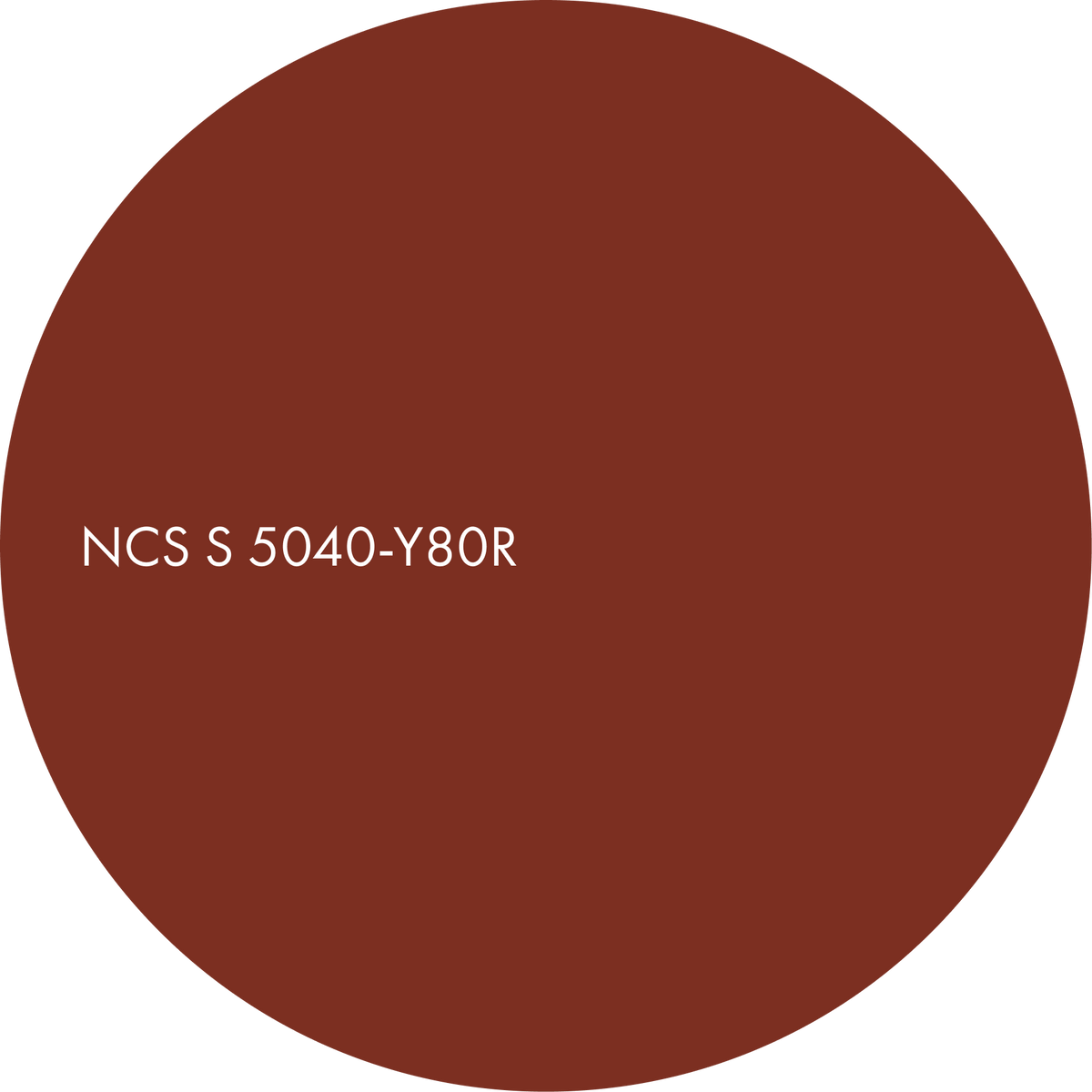
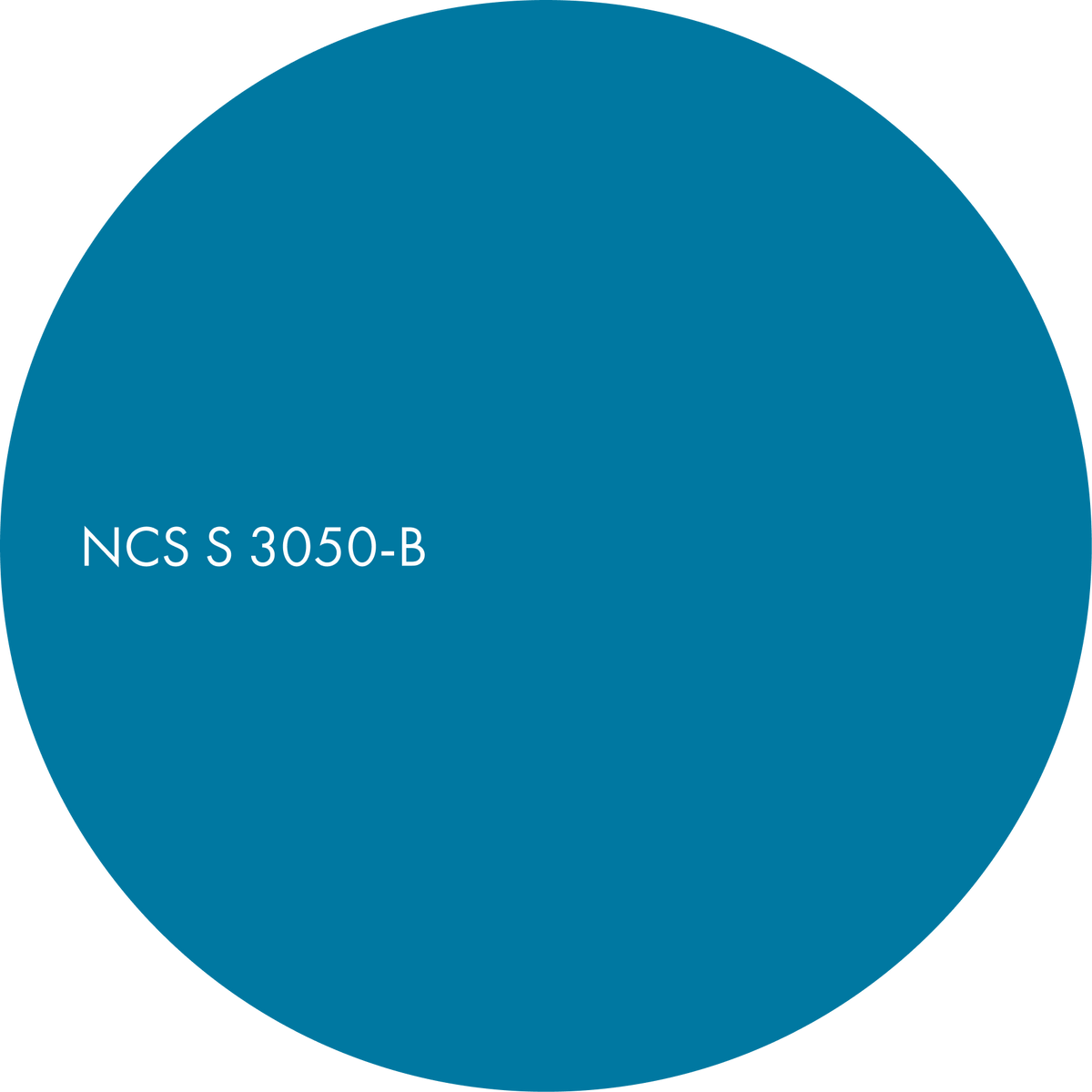
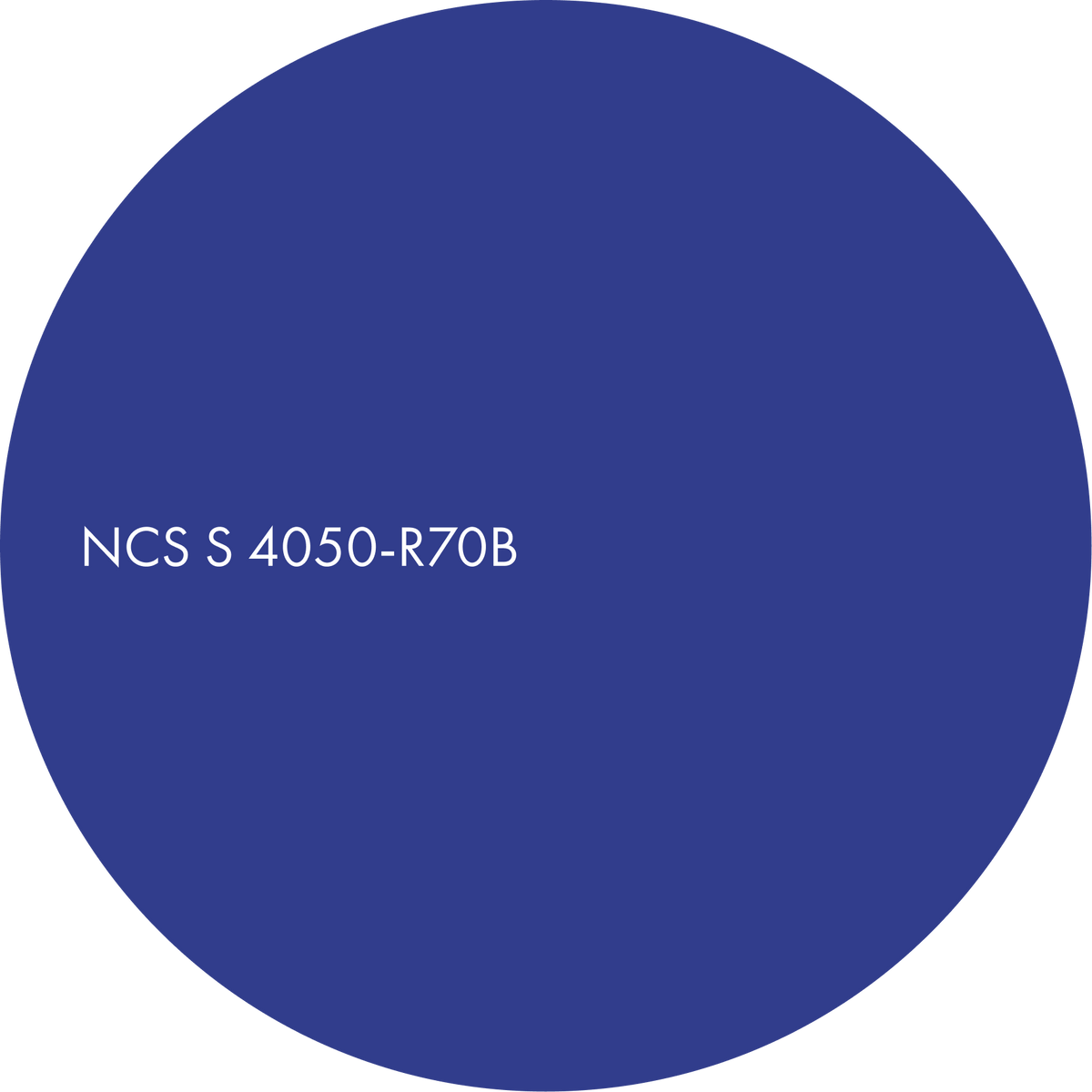
Evening is built on three hero colours: NCS S 5040-Y80R, S 3050-B and S 4050-R70B. Four supporting colours extend the palette, adding contrast in nuance for more dynamic combinations.
These colours contrast in both nuance and hue. Opposing hues set each other off in the way complementary colours do, so any of the seven can be combined to create your preferred evening mood.
The three combinations of Evening show how the colour area unfolds across surfaces and materials. Each one explores a different side of the deep register, from the warm, gathering evening to the restorative dark of your own time, offering designers an adaptable palette for intimate, social interiors. The third combination is available on sign-up.

Garnet embrace
The deep red-brown leads (S 5040-Y80R), set against a deep, pure blue (S 3050-B) and bridged by a deep violet-blue accent (S 4050-R70B).
Red-brown and blue sit far apart on the colour circle, warm against cool, with the violet-blue between them, so the room has real tension held in balance. Nuance is close across all three, which is what keeps this high-contrast, deep-toned scheme composed rather than busy.
This is the evening of gathering, deep and warm at once.

A deep red-brown with a rich, earthy intensity. Main.
A chromatic, deep blue with a calm depth. Secondary.
A darker, chromatic violet-blue with a velvety depth. Accent.

Material suggestions
– brick red-brown marbles and breccias
– sodalite and lapis-toned inlays
– ink-dyed and indigo cloths
– velvet in brick red and deep violet-blue
Suitable for
– dining rooms and bars
– restaurants and hotel lounges
– libraries and studies
Gilded lapis
Now the deep violet-blue leads (S 4050-R70B), softened by a quiet greige-yellow (S 2010-Y) and lit by a strong, near-pure gold (S 2070-Y).
The deep violet-blue and the low-chromatic greige-yellow balance each other with elegance. The two yellows share hue and blackness but differ sharply in chromaticness, so one sings and one settles.
This is the golden social hour made explicit, the warm, lamp-lit face of evening, generous and convivial.

A rich indigo-violet that feels rich and enveloping. Main.
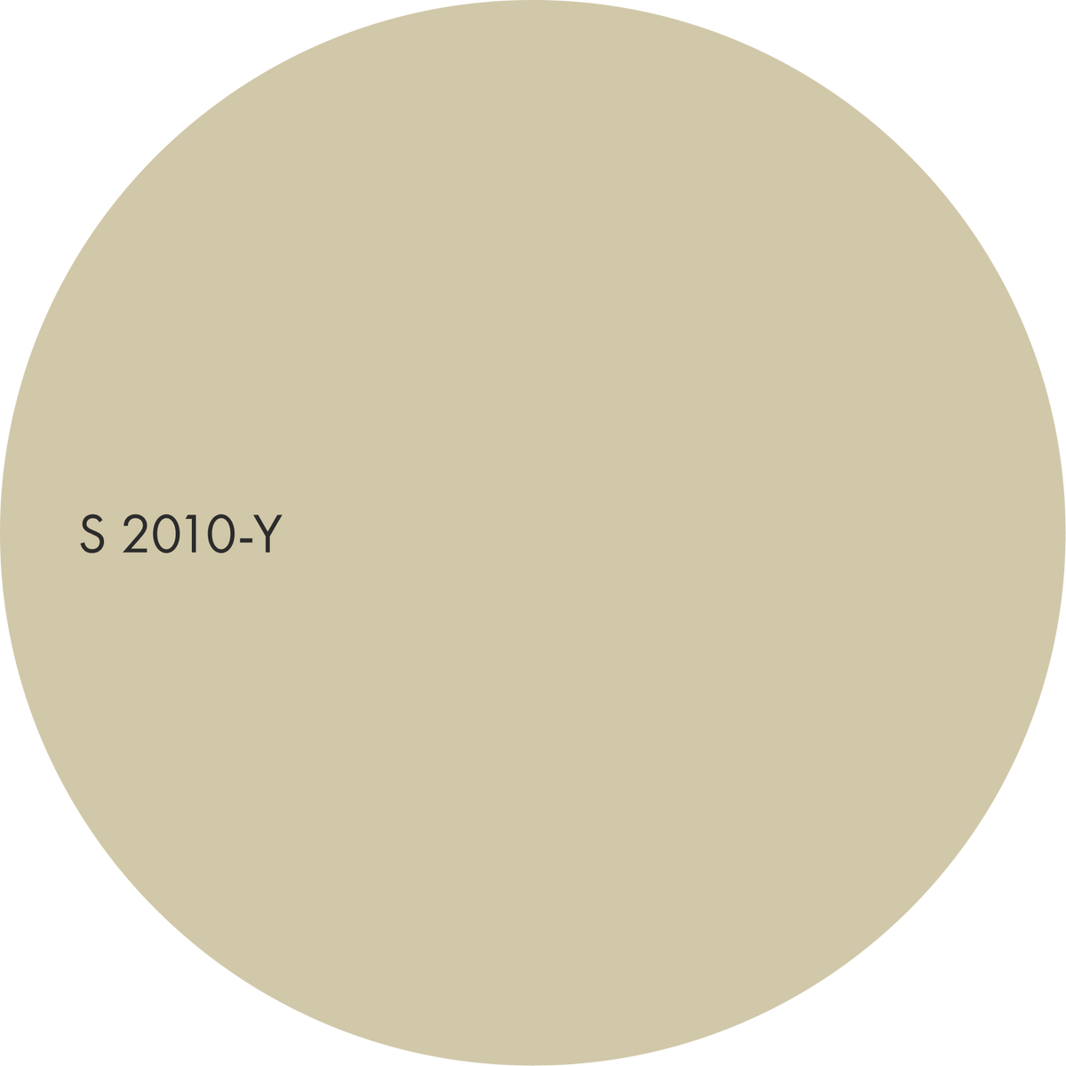
A soft, greyed yellow reminiscent of linen and natural stone. Secondary.
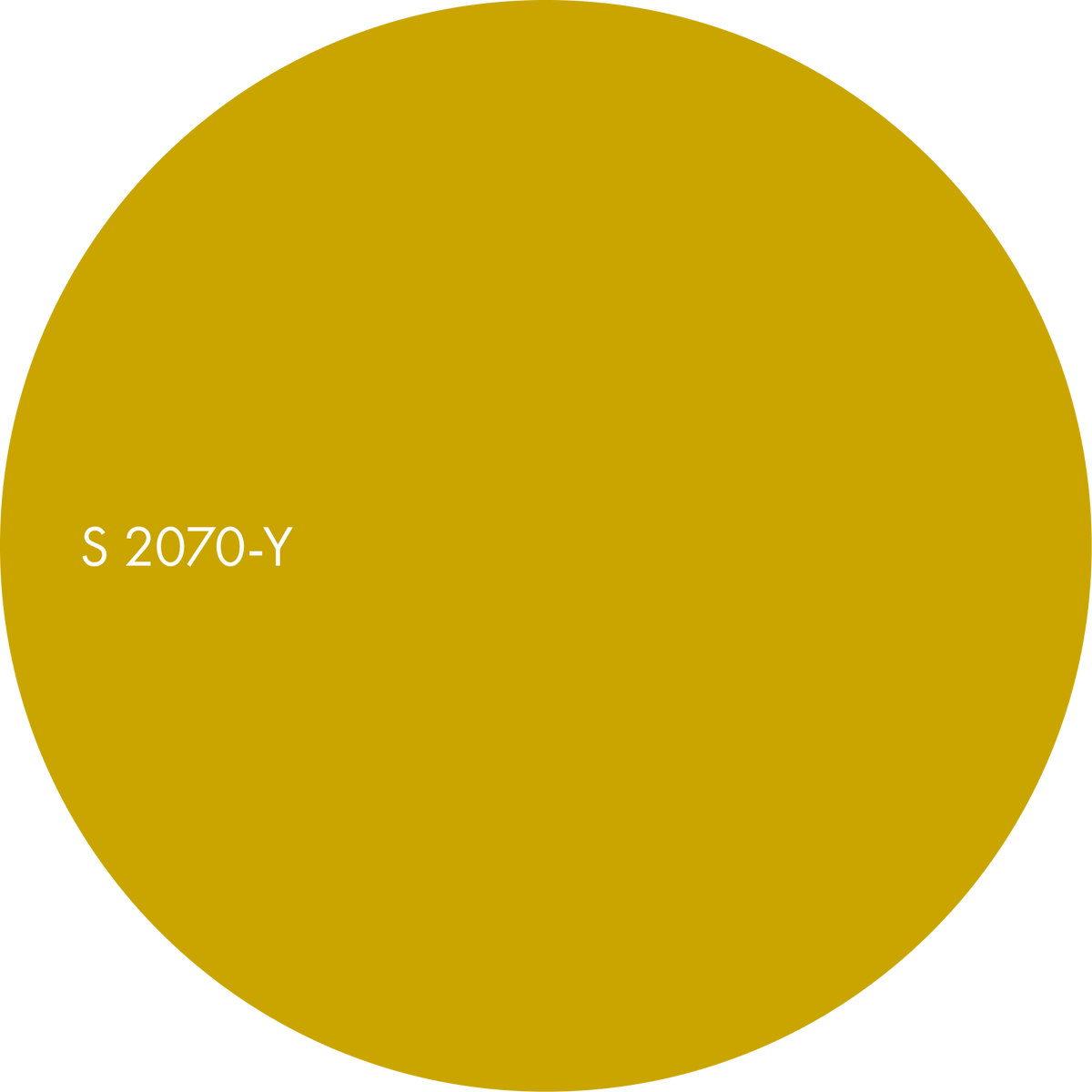
An intense golden yellow with real depth. Accent.

Material suggestions
– amethyst and cobalt cast glass around a lamp
– bronze, burnished brass and old gold
– white marble with violet veining
– mohair and heavy wool
Suitable for
– living rooms
– hotel lobbies and lounges
– event and social spaces
Azure elegance
A deep, pure blue is the main colour (S 3050-B), with a paler peach (S 0510-Y30R) and a soft apricot accent of the same hue (S 1020-Y30R).
Deep blue against warm Y30R is a strong warm–cool contrast, but because the two warm tones are light and low in chromaticness, the blue stays dominant and calm.
This is your own time: the restorative dark, with just enough human warmth to keep it kind rather than cold.

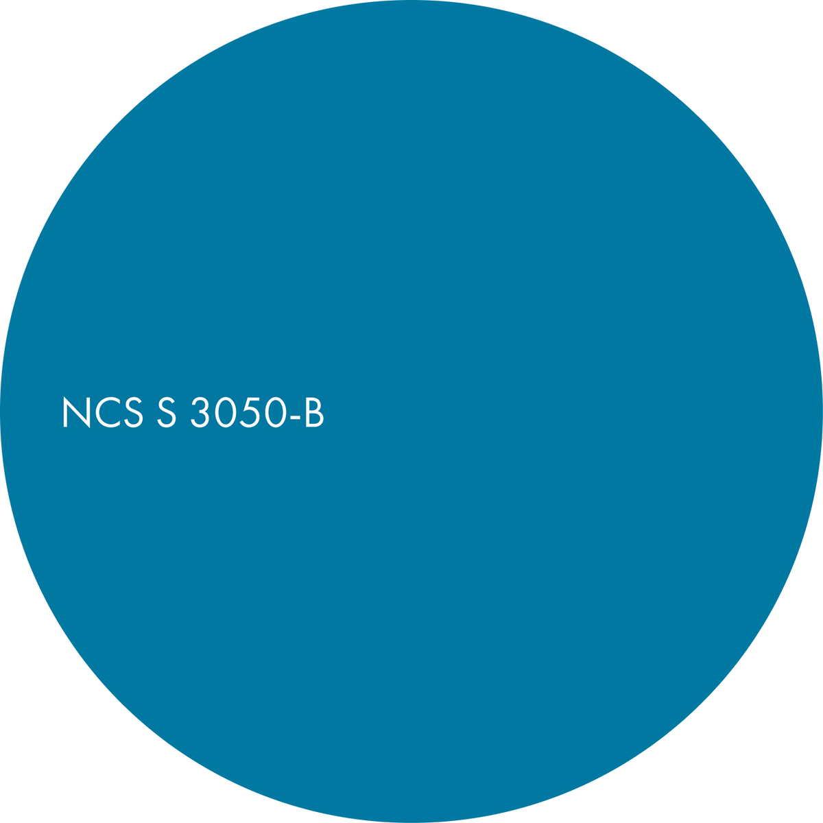
A chromatic blue with a sense of stillness. Main.
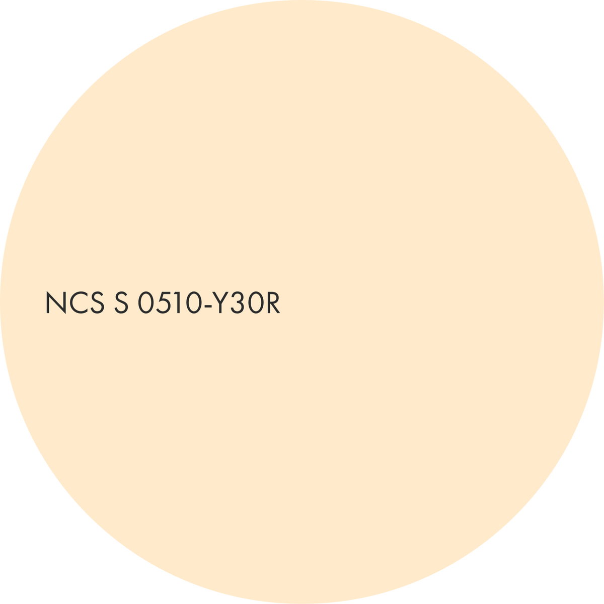
A pale cream with a peachy undertone. Secondary.
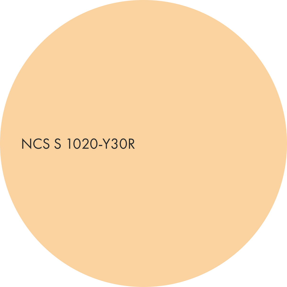
A soft apricot with a gentle warmth. Accent.

Material suggestions
– sodalite and lapis-toned marble, as a tabletop or inlay
– ash stained ink blue, with the grain showing through
– ink-dyed and indigo cloths
– amber glass around a lamp
Suitable for
– bedrooms
– spa and wellness spaces
– hotel rooms and quiet lounges
Discover more from Colours Beyond 2028+

Morning

Day
Colours of Evening


