


Morning is crisp and lean. Spatially, it is the room you step into, not the room you settle in: high whiteness, almost no blackness and barely any chromaticness, so the surfaces give light back rather than holding it.
It carries a mood of soft light that clears the mind, where stillness becomes a luxury and spaces restore rather than overwhelm. Think diffused light, semi-transparent glass and barely-there surfaces, as breathable and soft-focus as a second skin.
Hue here is only a temperature, a faint warm or cool lean that hints at where the light comes from. And Morning need not be pale throughout: one deep, quiet accent can give a space gravity without losing its calm.
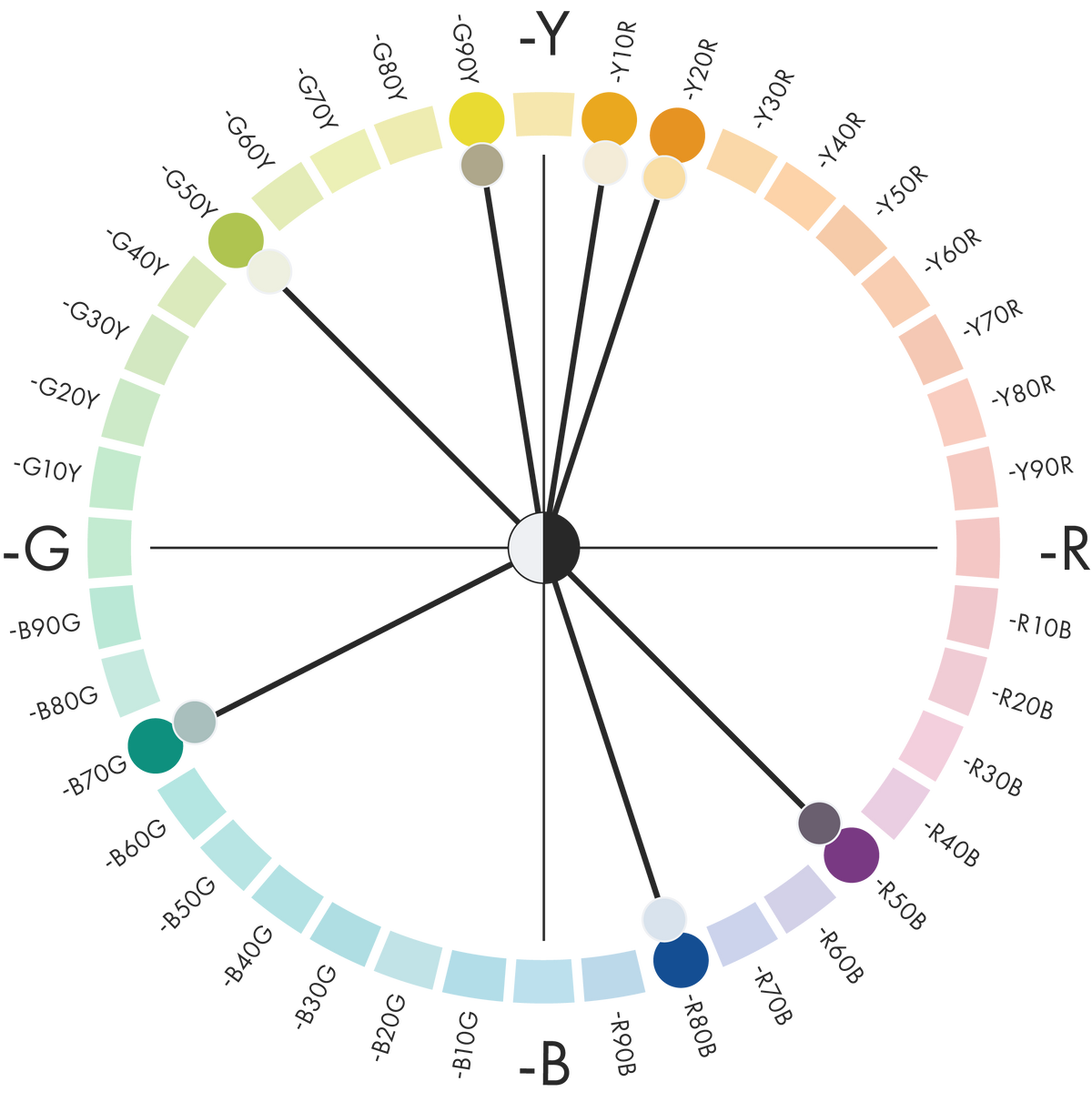
Hue: Warm yellow-reds (Y10R–Y20R), cool red-blues (R50B–R80B) and quiet greens (B70G–G90Y)
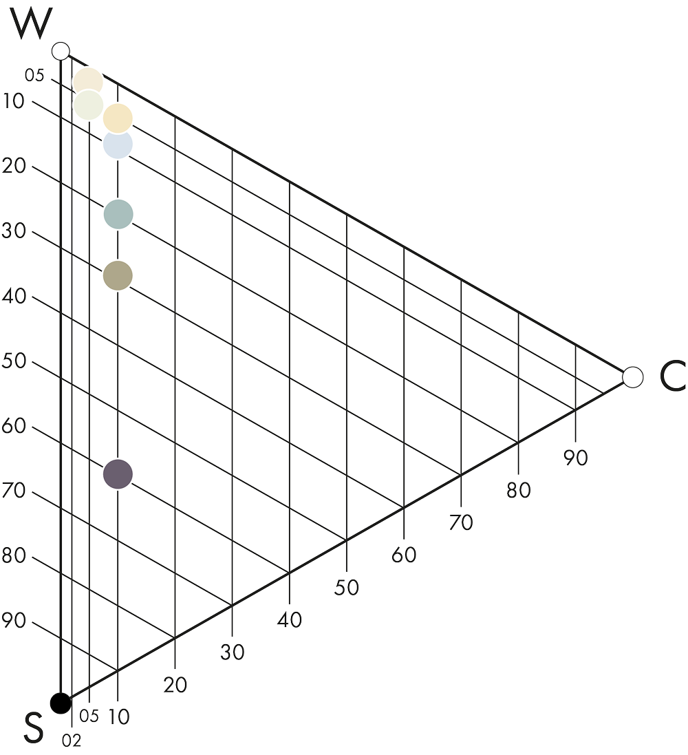
Chromaticness: Very similar across all seven colours (5–10%). Blackness: Mostly very low (05–10), with deeper accents up to S 6010-R50B


What shapes the Morning colour area?
Colours Beyond 2028+ rests on two main drivers: what is real and what is human. It has also been described as a reawakening of the senses at a time when screens have replaced most real touch.
Transparency and translucent materials reflect our need for trust and for what is real. We want to see what lies behind what is presented to us. One important colour direction for 2028+ is therefore towards colours perceived as translucent or transparent materials, with spots and sparks of colour.
Morning is where this direction becomes most literal. Glass is frosted, sandblasted, ribbed, cast or poured, never simply clear, and stone is chosen for its translucency, so that it glows when backlit. What reads as colour is really a tint that the light picks up on its way through.
The full story of Morning, Day and Evening is in the Colours Beyond 2028+ white paper.
From colour area to space
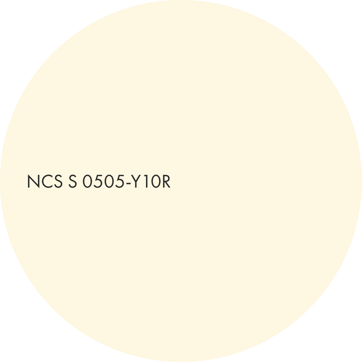
A near-white warm colour (S 0505-Y10R) does almost all the work, so the room reads as daylight on the wall.
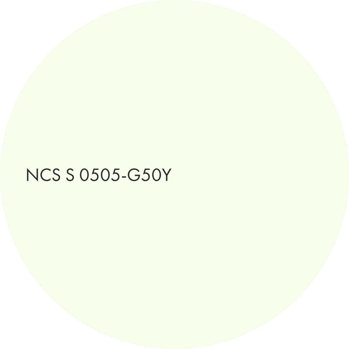
The secondary colour is its cool-green twin at the same nuance (S 0505-G50Y). The two contrast in hue but are identical in depth, so the contrast is felt as a faint change of temperature, never as a border.
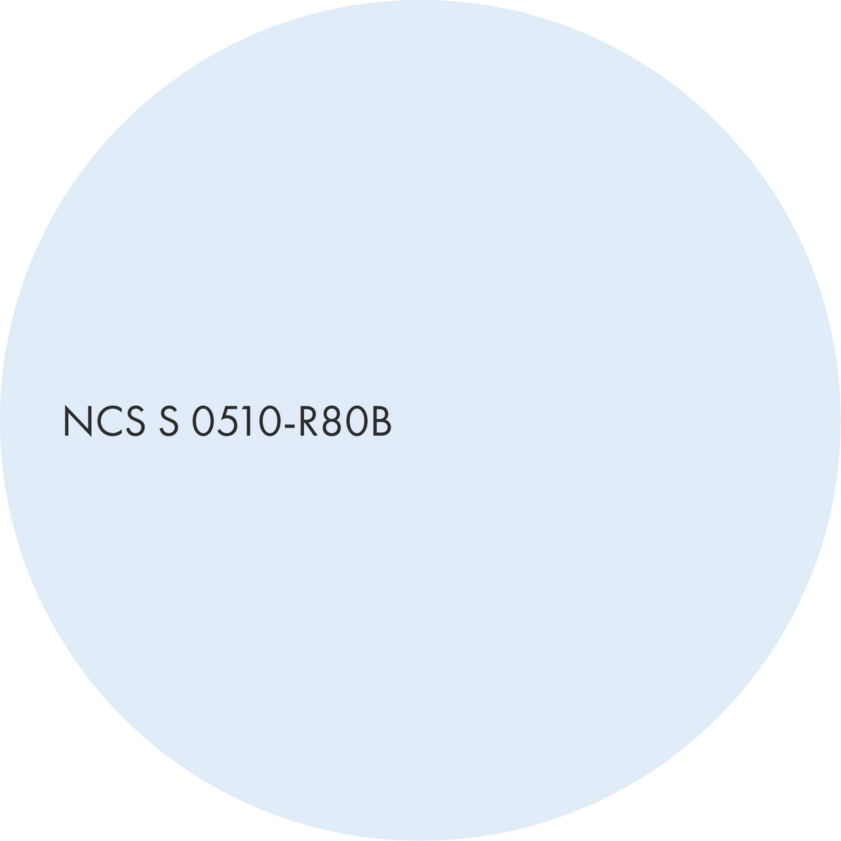
The single cool blue accent (S 0510-R80B) is a note of clear sky that keeps the whole from becoming bland.
This is the quietest, most breathable morning: air, with one cool breath in it.

Translucid freshness
A near-white warm colour (S 0505-Y10R) does almost all the work, so the room reads as daylight on the wall.
The secondary colour is its cool-green twin at the same nuance (S 0505-G50Y). The two contrast in hue but are identical in depth, so the contrast is felt as a faint change of temperature, never as a border.
The single cool blue accent (S 0510-R80B) is a note of clear sky that keeps the whole from becoming bland.
This is the quietest, most breathable morning: air, with one cool breath in it.

A soft, warm colour with high whitenes and with a gentle touch of yellow. Main.
A whisper of yellowish green, barely more than a tinted white. Secondary.
A pale blue with a faint violet tint, like the sky just after dawn. Accent.

Material suggestions
– honed cream onyx and alabaster
– pistachio onyx
– frosted glass with a blue-grey haze
– sheer voile and linen
Suitable for
– entrances and hallways
– bedrooms
– spa and wellness spaces
– calm workplaces
Sea shine
Here a natural, near-white green leads (S 0505-G50Y) and steps up in depth to a soft grey-teal (S 2010-B70G). The combination is warmed by a pale cream accent (S 0510-Y20R) at the same low blackness as the main colour.
The grey-teal shares the low chromaticness of the cream, so it settles the room without asserting itself. The contrast lies mainly in hue rather than nuance, which is why the space stays serene while still feeling composed.
This is the morning atmosphere of a room that opens onto planting or water.

A whisper of yellowish green, barely more than a tinted white. Main.
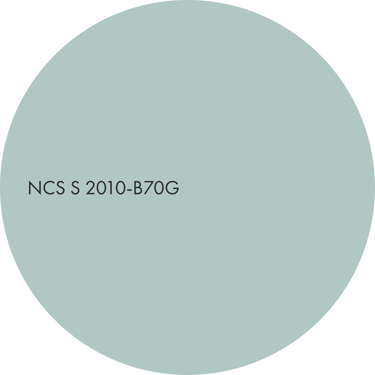
A soft, greyed green with a cool hint of blue. Secondary.
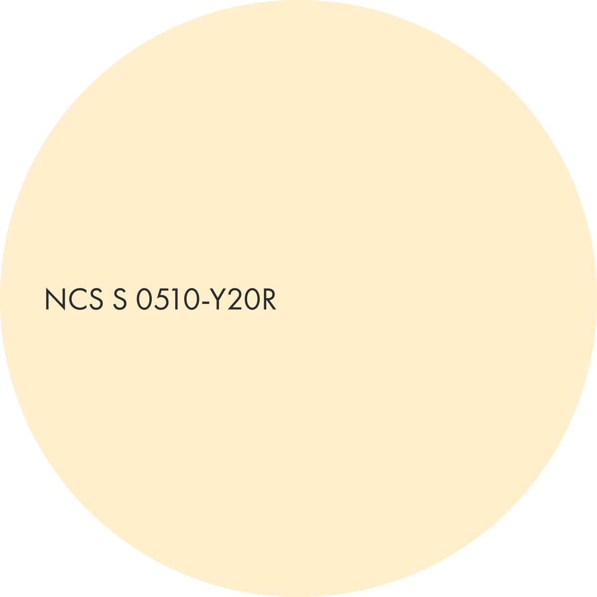
A pale, buttery yellow with a soft glow. Accent.

Material suggestions
– sea-glass and cast glass with green-blue edges
– lime plaster and tadelakt
– bleached ash and limed oak
Suitable for
– bathrooms and spas
– garden rooms
– hospitality spaces that open onto planting or water
Moonstone gravity
The pale sky blue becomes the main colour (S 0510-R80B), and a deep, low-chroma violet-grey anchors the composition (S 6010-R50B). A muted olive accent completes it (S 3010-G90Y).
Morning here is luminous but no longer weightless. The deep note reads like the last shadow in the corner of an early-morning room, and it lets the atmosphere feel calm and serious at once.
Chromaticness stays low throughout, so even the dark tone whispers.

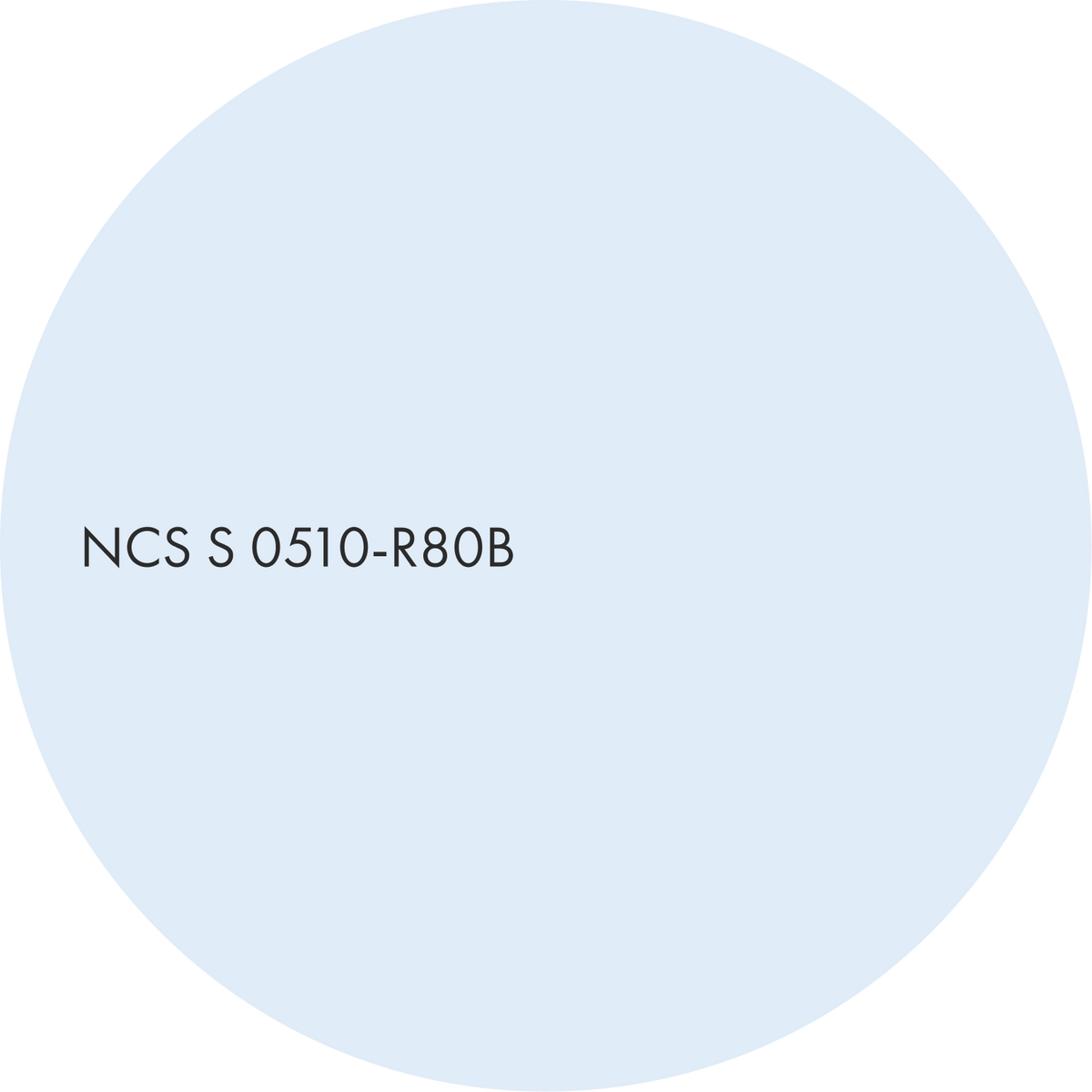
A pale, slightly violet-tinged blue that feels clear and serene. Main.
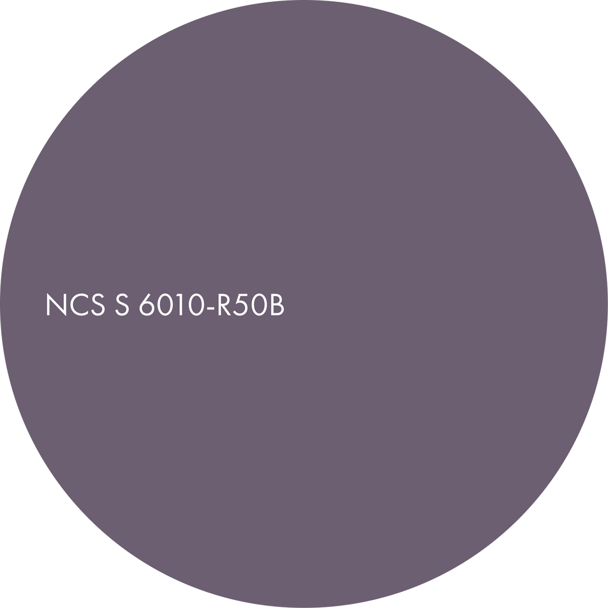
A deep, greyed violet with a dusky, almost smoky character. Secondary.
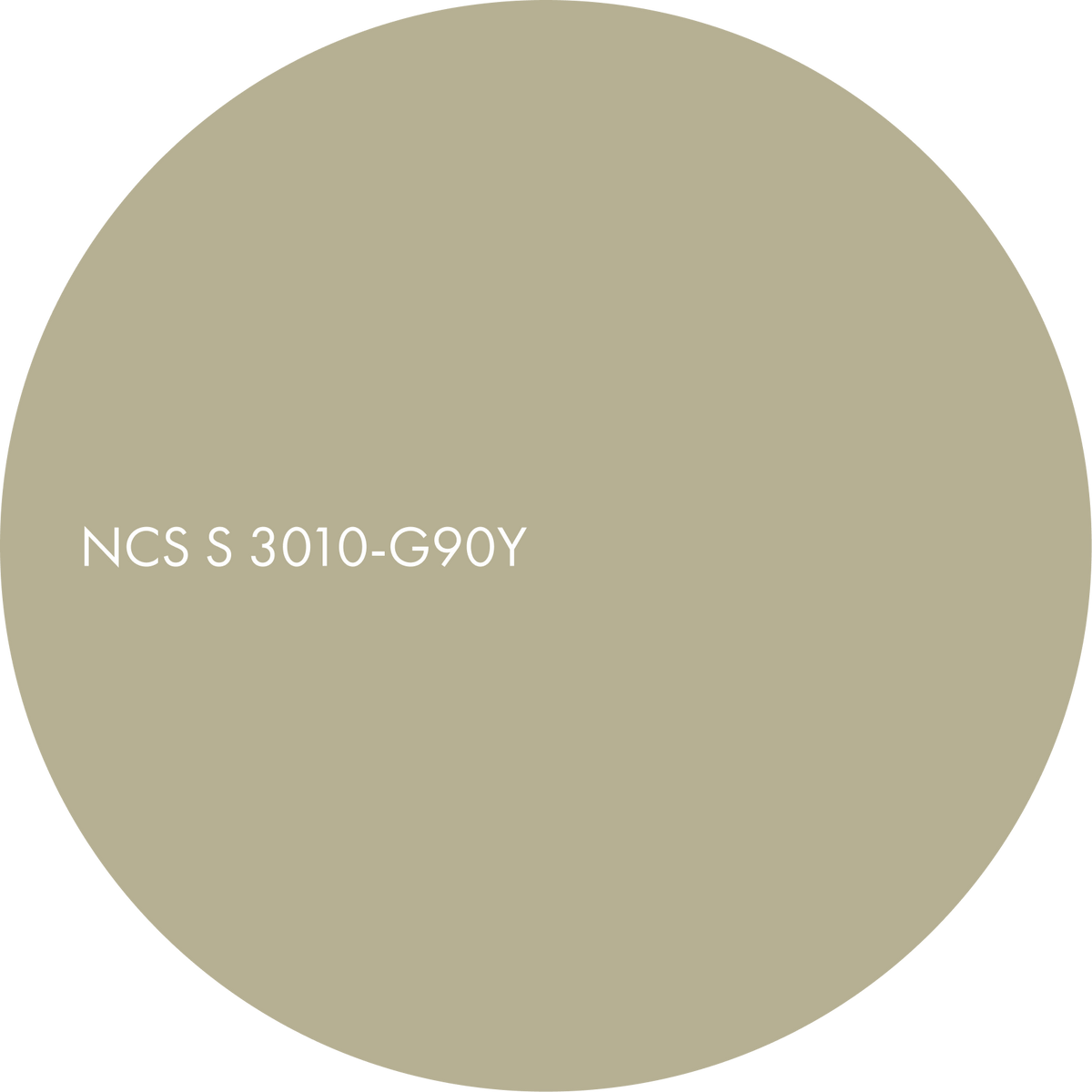
A muted, greyish yellow reminiscent of dried grass and lichen. Accent.

Material suggestions
– pale quartzite with a blue drift
– glass blocks with a blue-grey haze
– lime plaster and marmorino
– limed oak
– a brushed aluminium detail
Suitable for
– Bedrooms
– Studies and libraries
– Hotel rooms
– Quiet workplaces
Discover more from Colours Beyond 2028+

Day

Evening
Colours of Morning


