
Working with the 100 new colours
We have collaborated with two designers, each with an extensive portfolio, working with renowned clients and brands.
Allow us to introduce Swedish interior designer Cecilia Rosvall (@designbycilla) and Italian textile designer Silvia Stella Osella (@silviaosella_).

Cecilia Rosvall
Cecilia's trademark is creating colourful and inspiring rooms. She will create a bedroom design using a selection of the new colours. We will follow her process from the moodboard to the result.

Silvia Stella Osella
Silvia Stella Osella is an Italian textile & surface designer and colour consultant based in Milan. She will create a wallpaper using a selection of the new colours. Follow her process below.
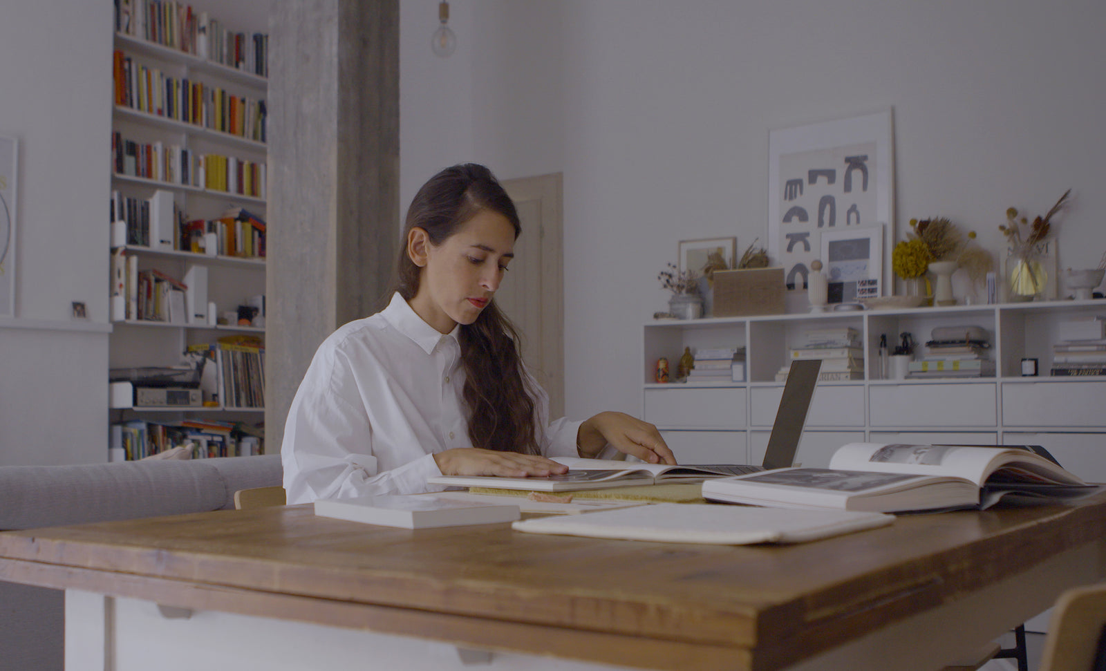
Redesign with Cecilia Rosvall
Bedroom makeover.
Follow along as Cecilia remakes her bedroom in collaboration with us. To create a subtle yet colourful impression of her bedroom, Cecilia chose to use NCS S 3005-B50G as her wall colour, the soft cool pink NCS S 3005-R for interior decor, and the warmer NCS S 3005-Y20R for the shelving. See how it turned out!


Moodboarding
Cilla chose her colours from our new 100 colour selection. She started with a bluish tone, a yellower colour and a red tone. She wanted her final colour palette to be a harmonious colour combination that still had edge.

“To me, Nordic Green NCS S 3005-B50G is a colour which suits both large and small spaces of different kinds.”
The chosen palette

S 3005-B50G

S 3005-R

S 3005-Y20R
“For my bedroom design, I chose NCS S 3005-B50G or 'Nordic Green' as the foundation for the colour scheme. Depending on the direction of room, the colour will be perceived as more blue or more green."


Our new Nordic Green, NCS S 3005-B50G, is a midtone which indulge us in a mood of calm and relaxation. It is a colour that is perceived as neither chromatic nor neutral. Cecilia wanted to use this specific new NCS colour since it neither too dark nor too light. Her bedroom is facing the north, and often, blue-green nuances in these cases are perceived as more purple. But, like Cilla says:
“Since it is a fair amount of green in this colour, NCS S 3005-B50G, the result was quite magical, and goes perfectly together with our bed with its textiles in teal”.
Soft pink interior decor
The soft pink nuance NCS S 3005-R, which can be perceived as slightly aubergine, goes excellently with the muted blue-green wall.
“Who knows, perhaps I will even paint the ceiling with this colour! It is such a cool combination I think.”


“I love muted pastels and amongst the 100 new NCS standard colours there are a lot of favourites! They are also so beautiful to combine, and are easy to combine in combinations based in blackness.”

String shelf painted in a warm midtone
With Cecilia's green midtone walls and soft pink interior decor, she chose the warmer NCS S 3005-Y20R for the colour of her String shelf. The combination of the three colours creates a palette that is both harmonious and edgy – just like she aimed for.
Design with Silvia Stella Osella
Wallpaper creation.
For Silvia Stella Osella, Textile Designer and Colour, Trend and Sustainability Consultant, colour plays a special part from the beginning of her working path, whether she is designing a wallpaper, creating textile collections or consulting companies to pick the best shades for their products.

At the heart of her design process is the art of crafting a space or concept that truly reflects the client's vision and the unique character of the project. Ensuring that every colour choice serves a purpose is vital. Silvia's main purpose is to always design with sustainability in mind.
“Designing consciously also means finding the right colours, the ones that can really embody meaningful stories happening around us, and those that hopefully will last over time."
Silvia often finds her inspiration by attending fairs, analysing trends, following conferences and more.
”What many call 'inspiration', for me is actually 90% played by research! Then, of course, there's more to it: and this comes from my travels, art shows, books...,”
This derives from her firm wish to create something meaningful, something that people actually want to stay around for a long time.

It is hard to talk about colours and design without touching upon the subject of creativity. We ask Silvia, what does this word mean to her?
”It means something I couldn't imagine living without and that permeates basically every aspect of my life. I don't see it simply as something I have built a career on, but rather a way of experiencing life that - in my opinion - everyone has, just in different shapes and forms!”
The key colours from Silvia's project

S 1502-Y20R

S 4502-Y50R

S 3005-Y

S 3005-B

S 8005-B

"Lately I am playing a lot with unusual neutrals, I think these shades have a lot of potential! Both in the Nordic midtones and the Great Greys I have found great new colour tones to integrate in my wallpaper design."
Silvia tells us that she really likes the depth the 100 new colours convey.
“I truly feel that the colour stories selected from NCS embody perfectly so many atmospheres, something very contemporary but familiar and reassuring at the same time."
Silvia explains that the most fun part to her job is that every project is so different, one to another.
“Having a great set of tools like the ones from NCS allow me to translate my ideas and creativity into a universal language. I am currently designing a new wallpaper for 2024, and these hues gave me so many inputs!"
As Silvia typically works with a broad variety of clients and projects, each project also tend to play out differently.

"I am lucky enough to work on many different kinds of projects, both in the interior and the fashion fields, and that's the most fun part! I love how all this variety allows me to learn new things everyday."
More about our 100 new colours
Our 100 new colours are in the low-chromatic area to offer more options and greater control when working with these colours. Perfect for interior, exterior and product design. With the update of 100 new NCS Standard colours, also comes updates to our Design Tools.
Explore more products of 2050
NCS Design tools


