

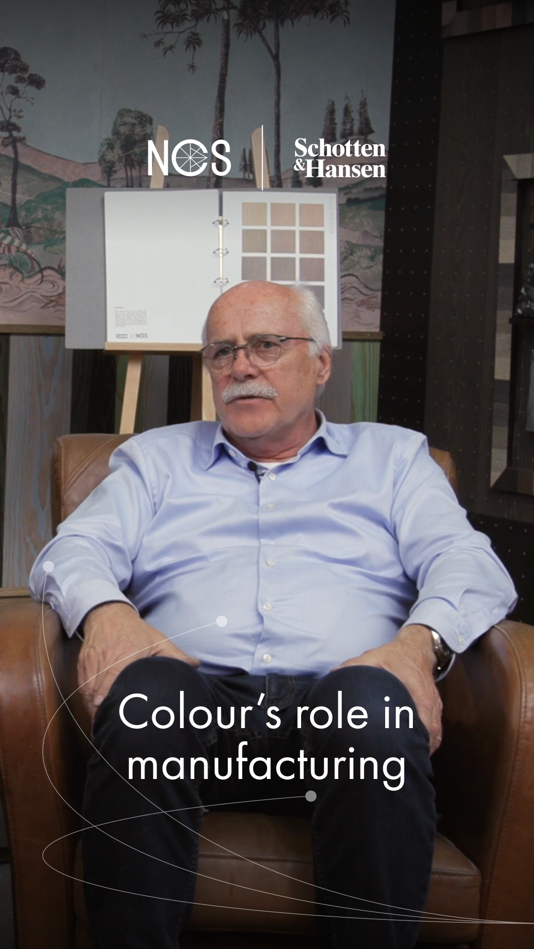
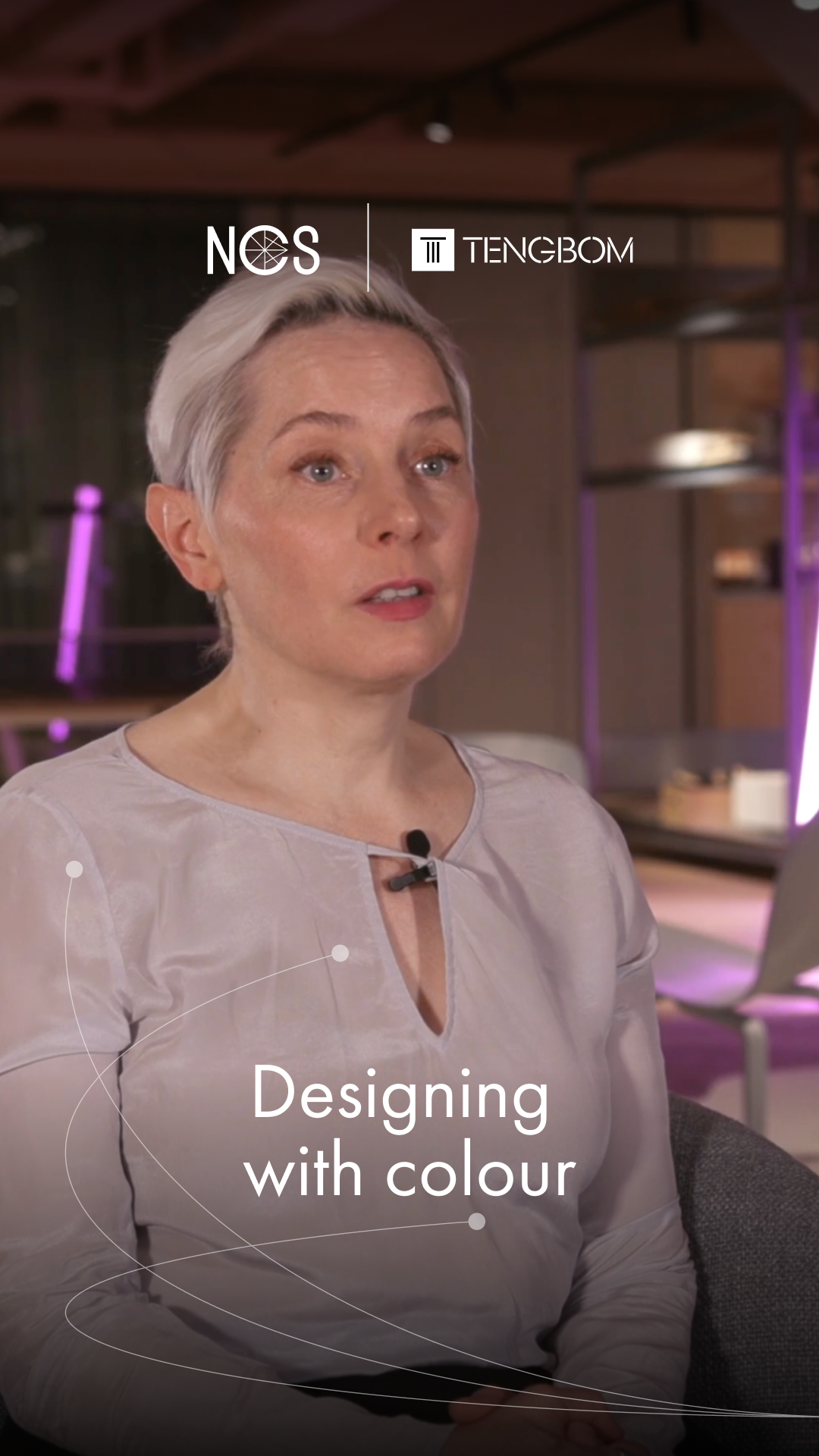
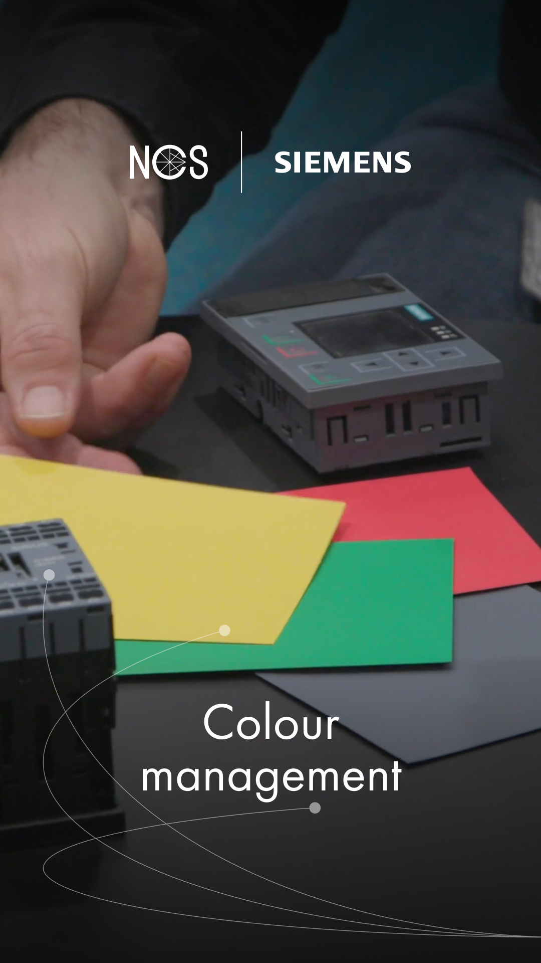
IKEA has long been synonymous with innovative design and functionality for the many people, and a central part of this work is the colour choices that shape its products. Two key individuals in this effort are Jerry Svensson and Emma Wiklund, who both play important roles in how IKEA works with colour and expression through the NCS System.
About IKEA
Founded in Sweden in 1943, IKEA has grown from a small mail-order business into one of the world’s largest home furnishing retailers, today present in more than 60 markets. Its mission has always been the same: to improve everyday life for the many people by making well-designed, functional home furnishing accessible at affordable prices.
Beyond products, IKEA aims to make a positive impact by acting responsibly throughout its value chain, from sustainable materials to production and distribution. Its values – being down-to-earth, thinking long-term and always working together – continue to guide the company as it evolves to meet customer needs and the challenges of the future.
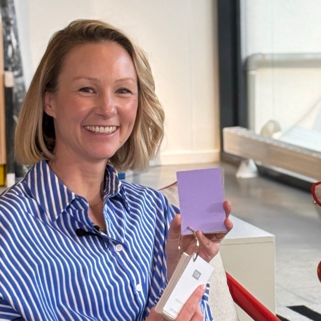
Emma Wiklund, Capability Developer, Expression Portfolios, Range
Emma works in product development with a focus on creating and managing IKEA’s colour portfolio. Acting as a bridge between vision and production, she uses the NCS System to build a product range that reflects IKEA’s identity and colour portfolio while functioning seamlessly in global manufacturing and everyday use.
Favourite colour: Lilac

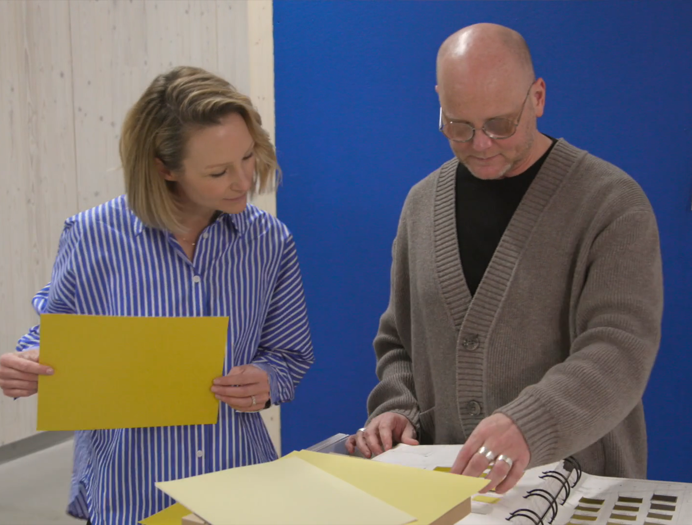
Jerry Svensson, Global Range Identity Leader
Jerry plays a key role in IKEA’s product development by shaping the brand’s overall expression through colour, form, and materials. With the help of the NCS System, he ensures that IKEA’s colour identity remains consistent, functional, and relevant across different markets, while staying true to the brand’s democratic design philosophy.
Favourite colour: Acidic yellow
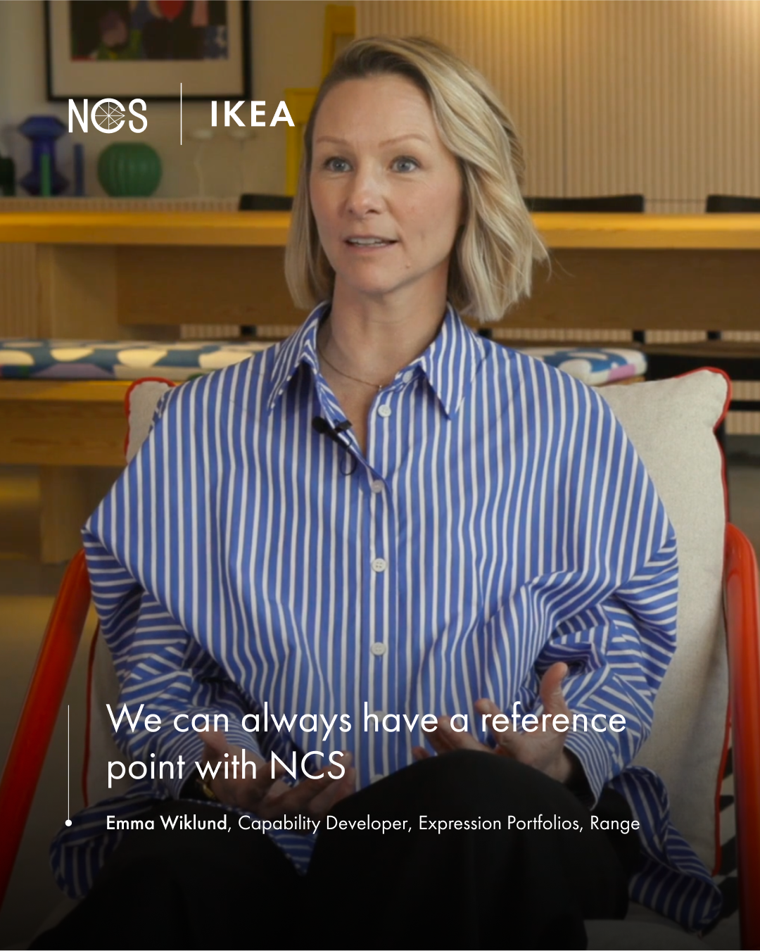
“This common language so we can actually communicate and talk about the same thing. We can always have a reference point, and that's good to have NCS then that is well known and recognised.”
– Emma Wiklund, Capability Developer, Expression Portfolios, Range at IKEA
IKEA on how the NCS System supports their product development and product design
Colour as a central part of the identity
Colour is one of IKEA’s most important design tools, used to express emotion, create coherence and define the character of its range. To work consistently across a global supply chain, IKEA relies on the NCS System as a shared language for colour. This ensures clear communication between designers and suppliers, reduces misunderstandings and secures quality control.
With NCS as a foundation, IKEA defines its own curated palette of around 90 colours. These are used to coordinate products, create consistency across physical and digital channels, and enable IKEA to be bold and playful in its choices while ensuring every colour works in practice.

Colour strategy: From vision to execution
The NCS System has been part of IKEA’s design process for decades, providing a structured model to define, adjust and produce colours. Using NCS strengthens internal colour literacy, supports clear dialogue with suppliers and streamlines the entire workflow – from initial vision to final product. It transforms colour into a long-term strategic asset rather than a seasonal decision.
Building identity through a common colour language
At IKEA, colour is part of their strategy to create recognition, consistency and long-term value. With a presence in more than 60 markets, the company relies on the NCS System as the only truly systematic way of working with colour. This shared language makes it possible for designers, suppliers and manufacturers across the world to communicate clearly and always refer to the same point of reference.
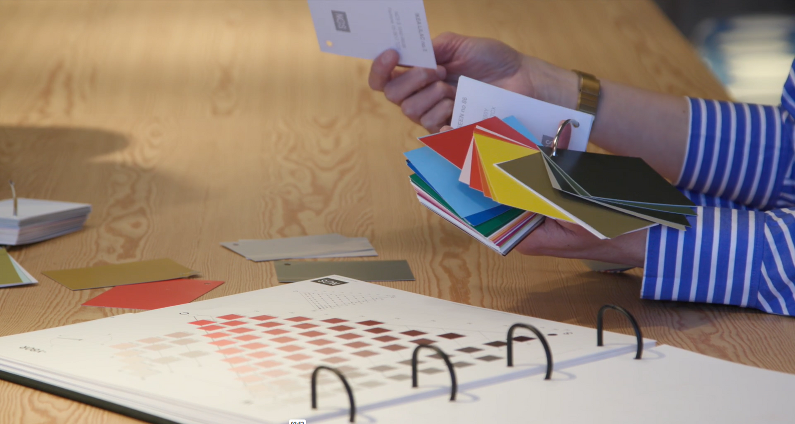
The IKEA fan deck
Each year, IKEA develops and refines a curated palette of around 90 colours. These are made available as physical samples in a fan deck produced by NCS Colour, one of the customised colour solutions provided by us. Emma describes its popularity among her and her colleagues in bringing the colour portfolio to life.
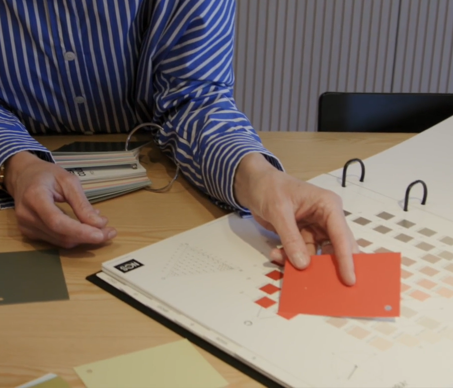
Supported by NCS Products
Central to Jerry and Emma’s work is theNCS Album 2050, a comprehensive physical colour design tool with loose samples. It serves as the starting point in almost every project, regardless of scale. As projects progress, largerNCS Colour Samplesin A4 size are used to ensure colours can be evaluated in context and under different conditions.
Flexibility through a shared language
With NCS as the base, IKEA’s colour workflow remains flexible and seamless. The combination of physical and digital NCS tools supports creative exploration, technical precision and a consistent, scalable colour management. Resources like theNCS Atlas 2050andNCS+are appreciated in the early phases of product development, enabling IKEA to balance bold ideas with reliable implementation.
“There are a lot of different ways of communicating colour, but NCS is the only sort of systematic way of working with it."
– Jerry Svensson, Global Range Identity Leader at IKEA
Do you want to learn more about working with NCS?
Please fill out the form below and we will reach out to you.
Discover more from Together in colour

Celebrating 80 years of NCS Colour
The initiativeTogether in colourhonours the 80 year anniversary of NCS Colour. A film series highlights the value of colour and the close partnerships that have shaped NCS Colour over the years – all together celebrating colour’s impact across industries.